This analysis delves into city demographic intricacies, employing a spatial approach to dissect and visualize age group distribution. The objective is to extract insights that transcend conventional data representations, offering a nuanced understanding of the state’s population dynamics.
We are utilizing the MAPOG Map Analysis Tool for this purpose, which allows for a comprehensive and interactive examination of demographic data across various spatial domains. The domains of use cases we are focusing on include Urban Planning and Development, Public Health and Social Services, Education and Workforce Development, Economic Development, Housing and Real Estate, and Transportation and Infrastructure. Using the MAPOG tool, we aim to create a Demographics Map that provides detailed visualizations and insights. This Demographics Map will be instrumental in aiding stakeholders to make well-informed decisions across these sectors.

Two key concepts underpin our exploration. Firstly, the spatial grid creation sets up the organizational framework essential for navigating diverse geography. Secondly, employing quantitative styling enriches data presentation, using a carefully curated color scheme to represent distinct age categories, fostering a more intuitive interpretation.
Step-by-Step Guide
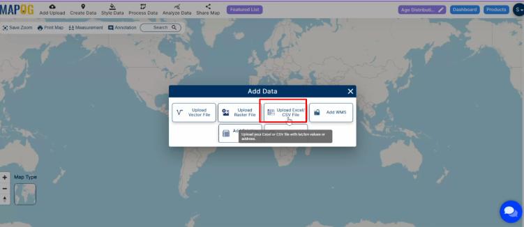
Data Upload: To start, we meticulously upload age-wise data in CSV format, ensuring essential details like location and age groups are included.

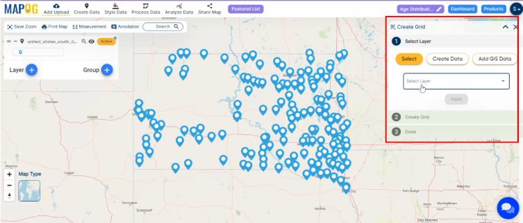
Grid Creation: The development of a spatial grid follows, systematically breaking down South Dakota into manageable units. This grid serves as the canvas upon which we’ll paint a visual representation of age distribution, offering a structured approach to unraveling demographic patterns.

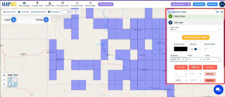
Quantitative Styling: The application of quantitative styling breathes life into the grid. A thoughtfully chosen color palette distinguishes age ranges, transforming our grid into an intuitive map that facilitates a deeper understanding of the age dynamics across the state.

Findings and Result
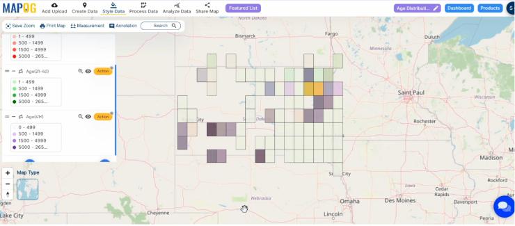
Navigating the map unveils distinct patterns, showcasing concentrations of various age groups. This provides a snapshot of City demographic landscape and reveals spatial nuances that traditional data might overlook.

Industry and Domain:
This analysis holds major implications for various industries. Policymakers gain a strategic tool for informed decision-making in healthcare, education, and social services. Urban planners can design communities catering to diverse age groups, fostering inclusive and sustainable development. Researchers gain a valuable resource for studying population dynamics, contributing to a deeper understanding of societal shifts over time.
Private businesses can also gain from this. They can use this data to adjust marketing, create products, and provide services suited to the main age groups in specific areas. Healthcare providers can use the age group distribution to predict healthcare needs and ensure suitable facilities are available where they are most needed.
Conclusion:
Our exploration of demographics map, employing a spatial grid and colors, surpasses traditional data analysis. This visual story enhances comprehension and serves as a valuable resource for stakeholders keen on the state’s changing dynamics. Utilizing the MAPOG Map Analysis Tool, we offer a detailed understanding of population, portrayed through colorful age distribution, aiding well-informed decisions in various sectors.
Other Articles
- Create a Map to find suitable sites for constructing a new house
- Create Map for Analyzing Water Quality using Heat Map Style
- Create Map – School Map Area Coverage Through Buffer Analysis
- Mapping Safety Create GIS Map : Game-Changing Approach to Hospital Risk Analysis
- Create Map for Real Estate Developer for Best Site Selection
- Create Map for Landfill Optimization: Spatial Analysis Approach