In the realm of Geographic Information Systems, the ability to visualise spatial data is crucial for understanding patterns, making informed decisions, and communicating information effectively. One fundamental aspect of data visualisation is the representation of specific locations or features on a map using points. Customising these points with distinct icons adds clarity, context, and visual appeal to the presentation of spatial information. This article delves into the process of plotting points on a map and subsequently assigning them custom icons within MAPOG. And thus, empowering users to craft visually compelling maps tailored to their specific needs.
Key Concept–Plotting Points on a Map
For creating and customizing points in MAPOG, we rely on road accident location data. With the Create Point tool in MAPOG, users can import datasets containing point coordinates, visualise them on a map, and manipulate their symbology to suit the accident location data. MAPOG Basic style offers a myriad of customization options, including the ability to choose from a diverse array of default icons or import custom symbols. Delve into additional articles on our blog including Create Biosphere Reserves Map: Iconic Fauna Representation with GIS and Strategic Logistics Mapping: Optimizing E-commerce Delivery with Isochrone Analysis, employing the point creation tool to tailor miscellaneous applications on various industries.
Follow the below process Step-by-step for Plotting Points on a Map
Step 1:Open Map Analysis
Open Map Analysis interface from MAPOG platform.
Step 2: Plot Accident Locations
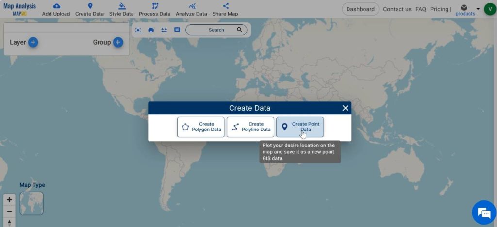
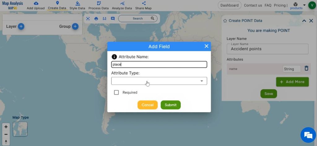
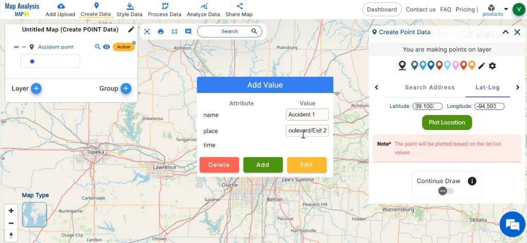
First, plot the points on the map using the latitude and longitude data of accident locations. For this click on Create data and then select Create Point Data.
Save the point layer with a suitable name and add necessary attributes for the point layer.
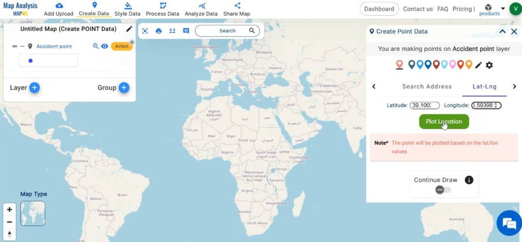
We have three options for adding points in MAPOG. They are drop a point on the map, add points using the address of a location and add points using latitude-longitude of the location. In this case, we are adding points using the latitude and longitude of the accident location. Enter the latitude and longitude data and click on “Plot Location”.
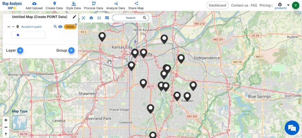
Repeat the same process to plot all the accident locations into the map.
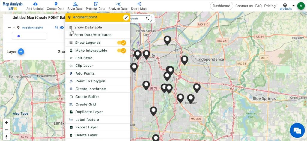
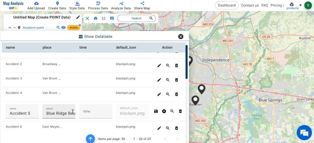
Step 3: View the Datatable
View the datatable, by clicking on Action followed by the Show Datatable option.
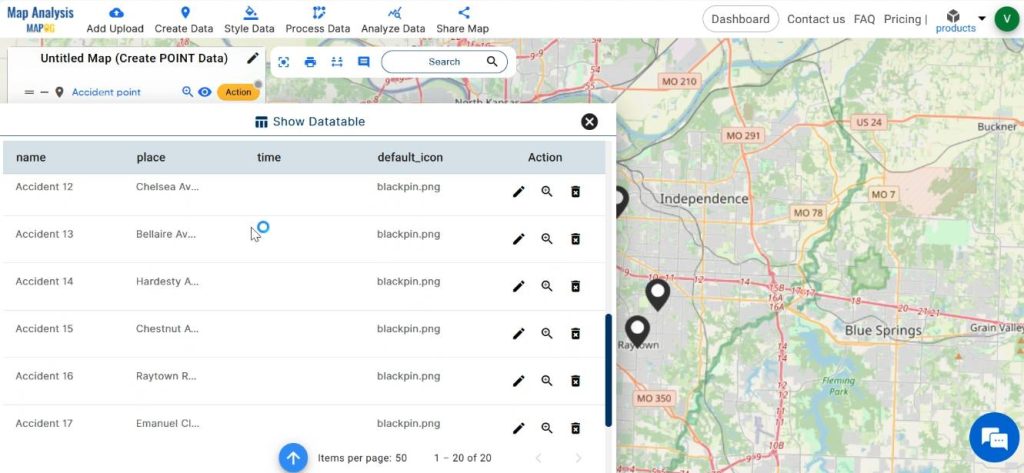
The Edit attributes option facilitates editing any of the data in the datatable and thus making any desirable changes.
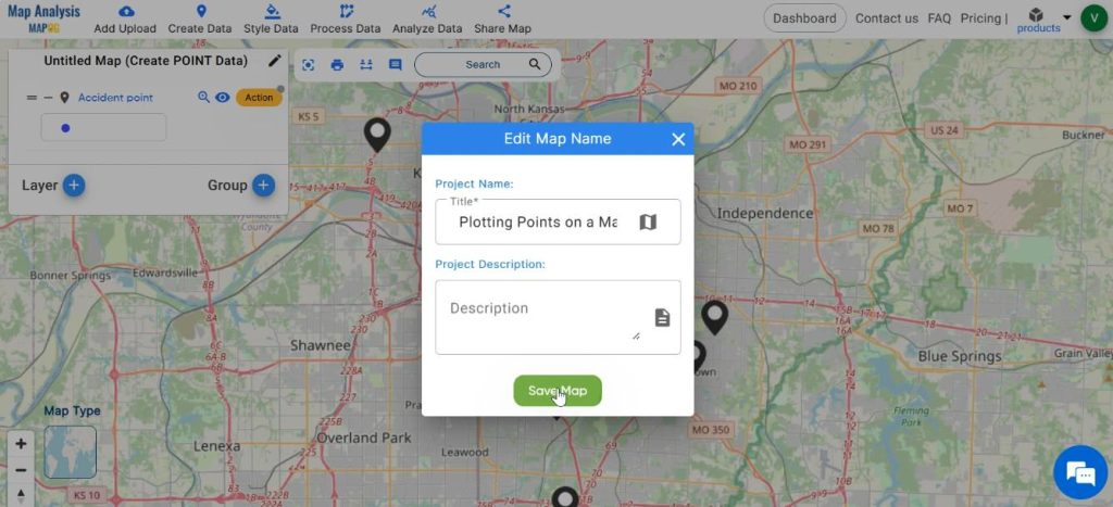
Step 4: Save the Map
For saving your project, click on the pencil icon near the “Untitled Map” text. Enter a suitable name, and if desired, provide a brief description of your project. Finally, save the map by clicking on the “Save Map” button.
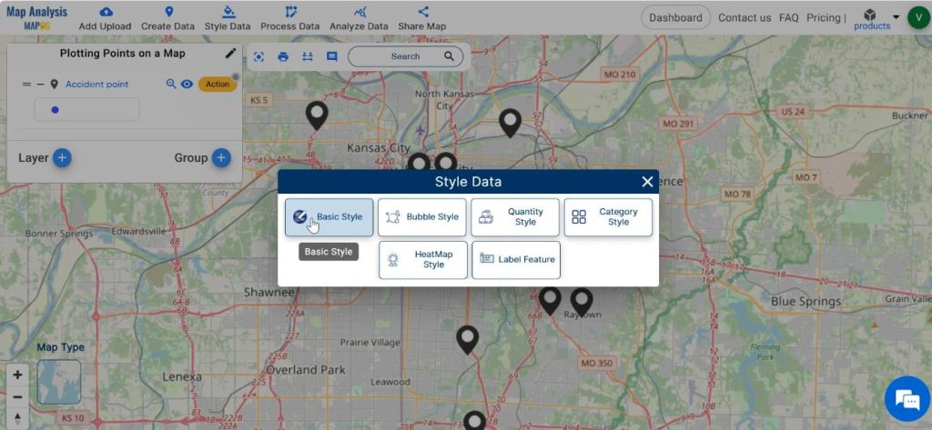
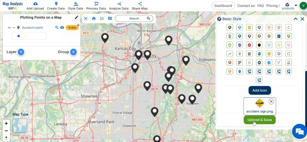
Step 4: Customize the Map
For customizing the map, click on Style Data and then select Basic Style.
Select the layer. Either choose any of the given icons in the list or you can add your own icons. For customising icons click on Add icon, then browse the icon from file.
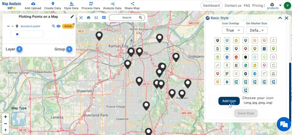
Finalise the style by clicking on Upload & Save.
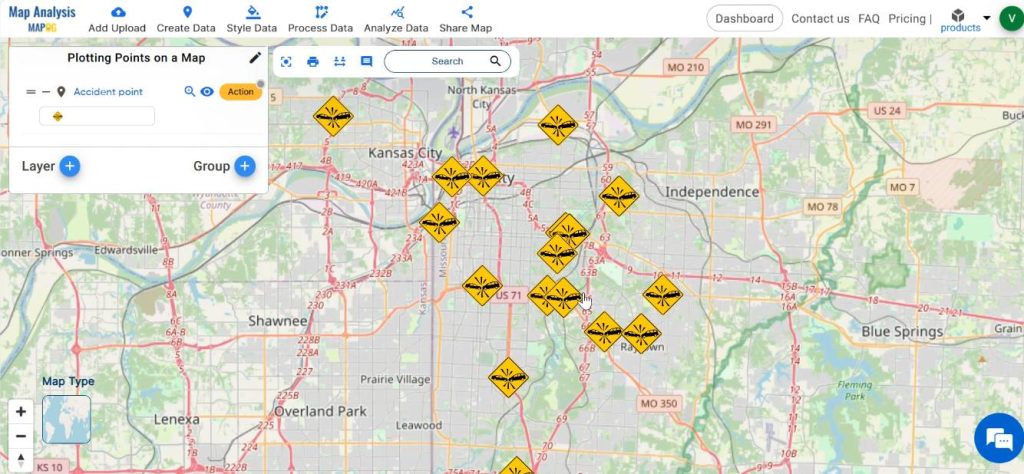
At last, we have plotted accident locations precisely on the map and customized the points with suitable icons.

Major Findings
Accident locations serve as critical indicators of road safety issues, highlighting areas prone to traffic incidents, injuries, and fatalities. By analyzing spatial patterns of accidents, stakeholders can identify high-risk zones, discern underlying factors contributing to accidents, and formulate targeted interventions to improve road infrastructure, traffic management, and public safety measures. Customizing icons associated with accident points enhances their visual prominence and facilitates rapid recognition, thereby fostering more effective communication of spatial insights and actionable intelligence.
Industry and Domain
- City planners: City planners rely on accident data visualisation to identify areas with high accident frequencies. They can prioritise infrastructure improvements, such as road redesigns, traffic signal optimization, and the implementation of pedestrian crossings, to enhance road safety and promote sustainable urban development.
- Transportation Authorities: Transportation agencies utilise this data to analyse accident patterns and optimise transportation networks.
- Policymakers: This data facilitates evidence-based decision-making, resource allocation, and the implementation of targeted safety measures.
Conclusion– Plotting Points on a Map
In conclusion, the integration of MAPOG with accident visualisation offers a powerful framework for understanding, analysing, and addressing road safety challenges. By harnessing the spatial insights derived from accident data and customising their visual representation, stakeholders can foster informed decision-making, prioritise resource allocation, and implement targeted interventions to enhance road safety and protect public well-being.
Explore more content on our blog:
Plotting Airports on MAP: Simplifying Logistics and Planning
Create Point, Line, Polygon on Map
Create Map – DIGITIZING SOLAR, HYDROELECTRIC, WIND AND BIOMASS POWER PLANTS – RENEWABLE ENERGY