Welcome to MAPOG‘s exploration of COVID-19 mortality patterns through heatmap analysis. In this journey, we delve into the spatial distribution of COVID-19 fatalities, leveraging dynamic visualizations to gain crucial insights. Join us as we navigate the intricacies of heatmap analysis, uncovering patterns that inform collective responses to the pandemic. Let’s embark on this insightful exploration together.
Key Concept:
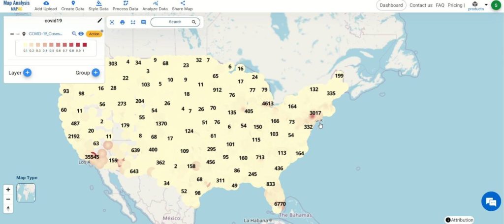
The key concept we’re exploring today is the utilization of heatmap analysis to visualize and understand the spatial distribution of COVID-19 mortality patterns. Through dynamic visualizations, we aim to uncover insights that guide strategic responses to the pandemic. Additionally, we’ll explore how MAPOG‘s capabilities extend across various domains such as urban planning, business, environment, public health, tourism, education, renewable energy, route planning, data visualization, and security, offering versatile solutions for spatial data analysis
Step-by-Step Process:
Step 1:
Access MAPOG‘s map analysis platform and navigate to the analysis tool.
Step 2:
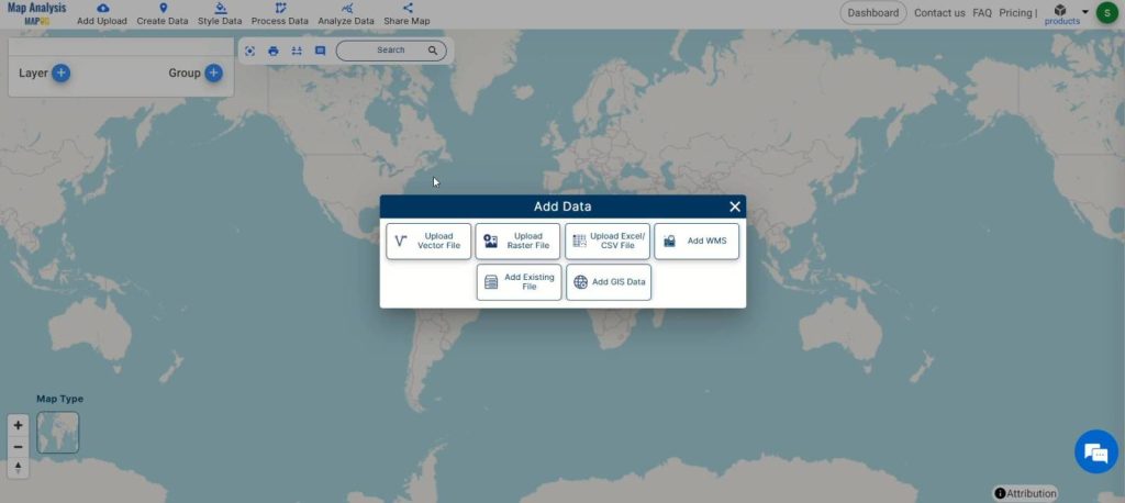
Initiate the process by selecting “Add Upload” and choose “Upload Vector File” to input COVID-19 mortality data.
Step 3:
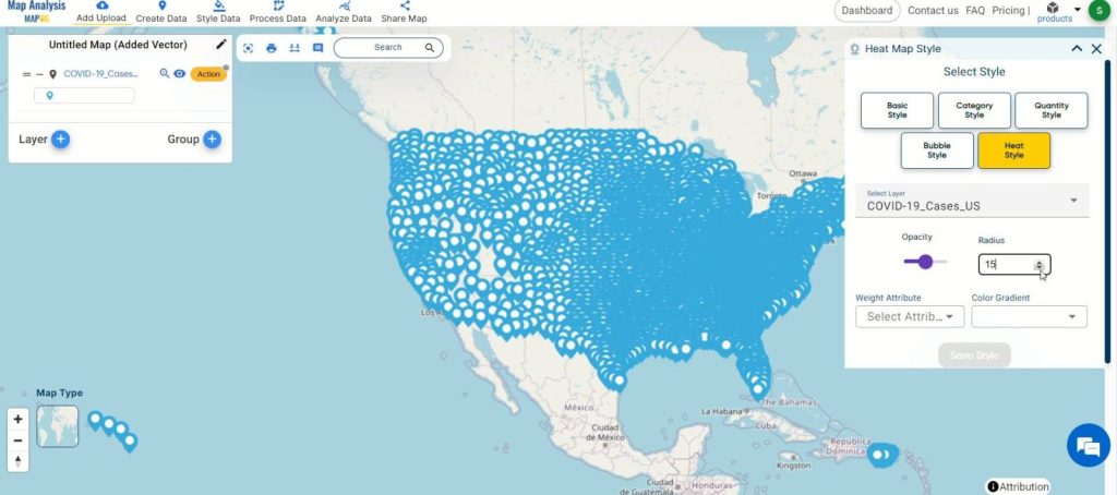
Open the layer style by clicking on the action menu of the layer and select “Edit Style.”
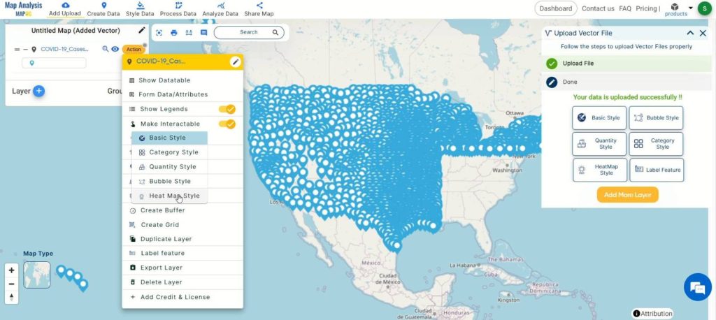
Step 4:
Choose “Heat map style” to create the heatmap visualization.
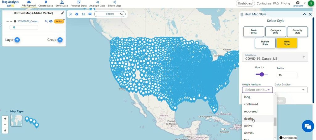
Step 5:
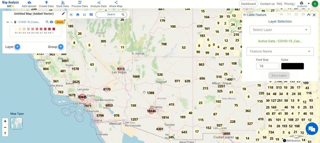
Select the attribute for visualization and customize the heatmap according to your preferences.
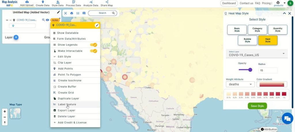
Step 6:
Label points easily using the “Label Feature” option in the action button of the layer.
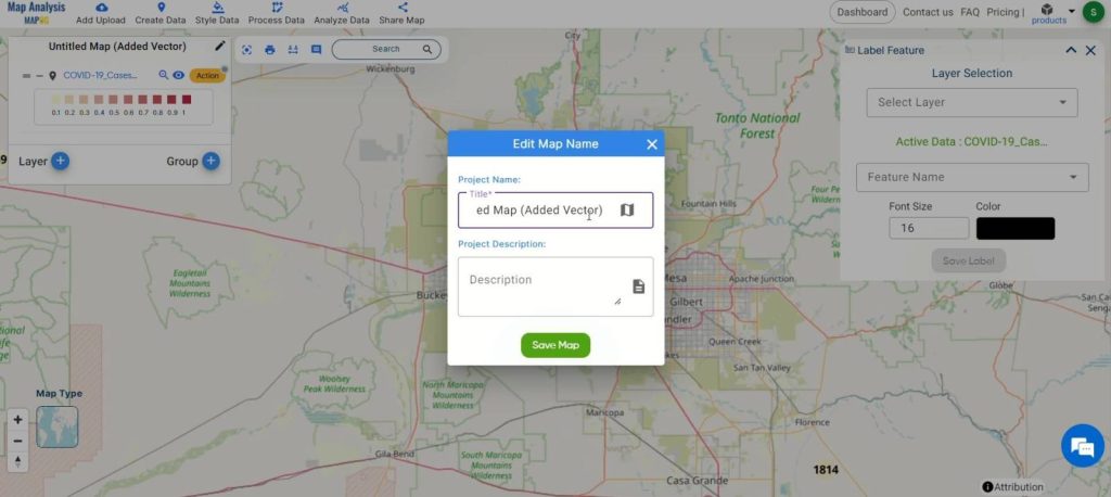
Step 7:
Rename the map if desired by clicking on the pencil icon and then save the changes.
Major Findings:
The heatmap analysis of COVID-19 mortality patterns reveals significant spatial trends and hotspots, aiding in the identification of areas with higher fatality rates. By visualizing mortality patterns, we can pinpoint regions requiring immediate attention and allocate resources effectively. Additionally, the analysis highlights the importance of proactive measures and collective efforts in combating the pandemic. This comprehensive approach enables policymakers, healthcare professionals, and communities to implement targeted interventions and mitigate the impact of COVID-19 on vulnerable populations.
Domains and Industries Benefiting
- Healthcare
- Public Health
- Government
- Research
- Emergency Management
Conclusion
In conclusion, the utilization of heatmap analysis within MAPOG proves to be a powerful tool in understanding the spatial distribution of COVID-19 mortality patterns. By visualizing data in this manner, stakeholders across various domains, including healthcare, public health, government, research, and emergency management, can glean valuable insights to inform decision-making and pandemic response efforts. This underscores the importance of harnessing innovative spatial data analysis tools like MAPOG in addressing complex challenges such as the COVID-19 pandemic. For further inquiries or assistance, feel free to reach out to us at support@mapog.com.
Other Articles
- Create Population Density Map : Add WMS Data
- Create Map for Landfill Optimization: Spatial Analysis Approach
- Crime Data Mapping: Finding Patterns and Trends Using GIS
- Mapping Safety Create GIS Map : Game-Changing Approach to Hospital Risk Analysis
- Create Map for Real Estate Developer for Best Site Selection
- Create Map for Landfill Optimization: Spatial Analysis Approach