Welcome to our exploration of the world’s top university nations through a quantitative lens. Using MAPOG map analysis, we delve into the geographical distribution of universities globally.
Join us as we uncover insights that inform education policies and international partnerships.
KEY CONCEPTS
Our goal is to create a world map of countries with the highest number of universities using the Quantity Style of MAPOG Map Analysis
Learn more about the analyses using the Quantity Style here Creating Quantity Style Map: Styling Natural Wealth
Steps for Creating a World Map using the Quantity Styling
Below are the steps to follow to create the map
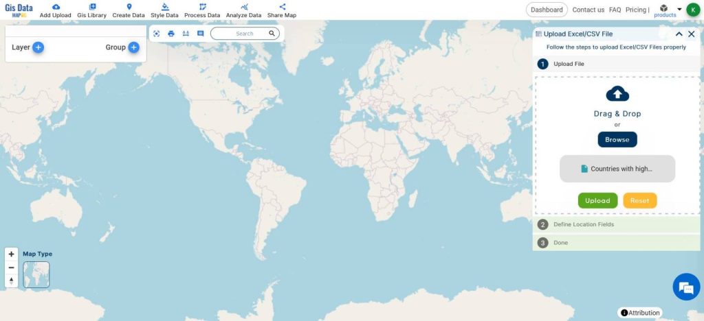
- Open Map Analysis
- From Add Upload, Upload Excel/CSV File
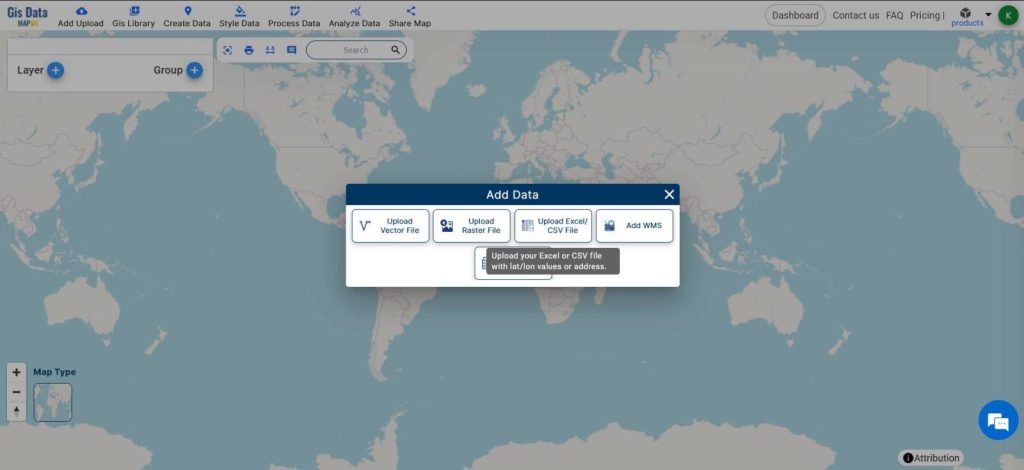
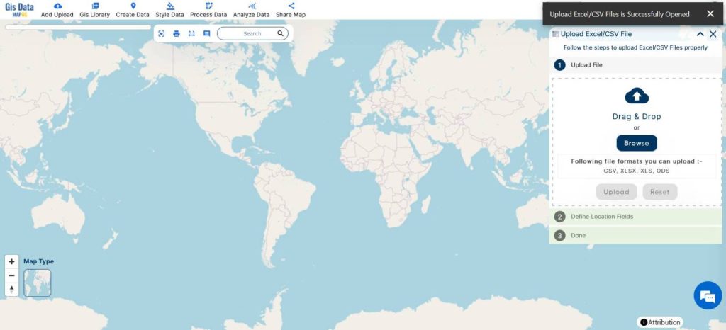
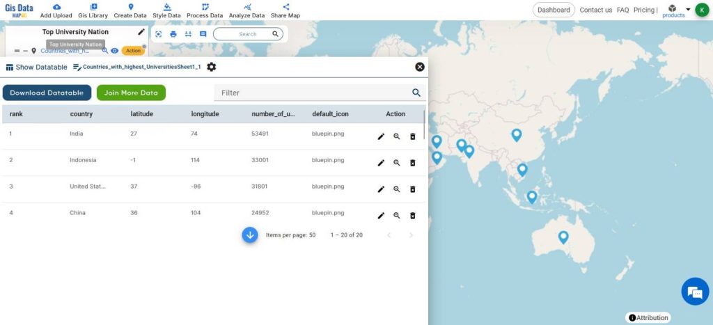
- Browse and select the Excel sheet with a list of the top university nations.
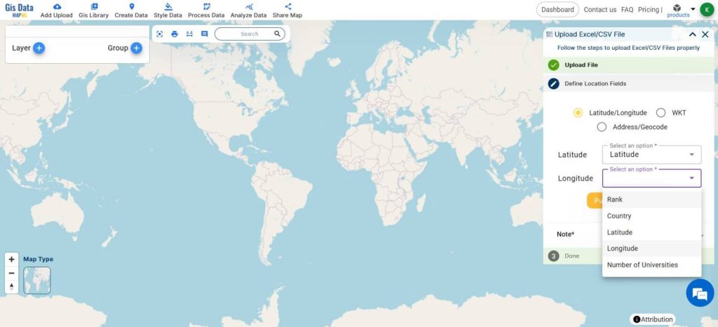
- Specify the Latitude and Longitude columns.
- Click Upload.
- To apply quantity styling, we need to check if the Attribute type of the column with ‘number of universities’ is ‘numbers’ type or not.
- If not, follow these steps to change it to ‘numbers’ type.
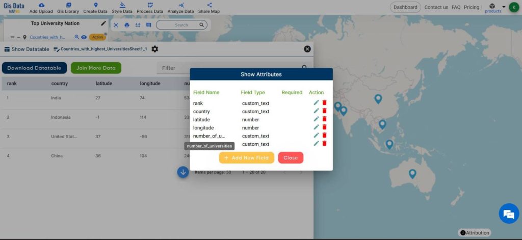
- From the layer actions, click Show Datatable
- Click on the Settings icon from the top of the database
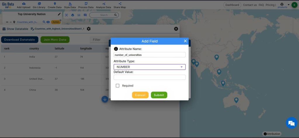
- Click on the Edit Action icon, and change the field_type of No. of university field to NUMBER
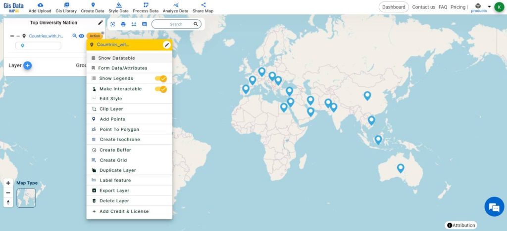
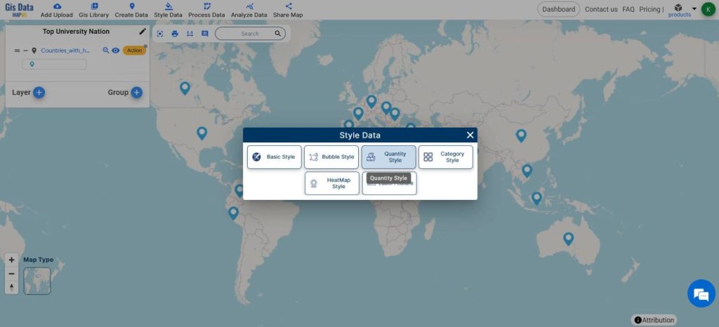
- From Style Data, Choose Quantity Style
- Select the Layer
- Tick the Quantity Circles option
- Choose the ‘number of universities’ Attribute
- Set the Parts to 10
- Color – it’s your choice
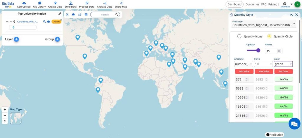
I will change the classes’ minimum values based on my data and preferences. You can do it according to yours.
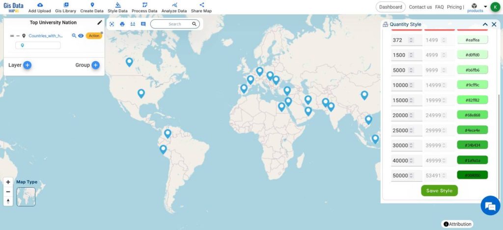
- Click on Save Style
- Select Label Features from the Layer Action
- Set the attribute to Country
- Font size 10
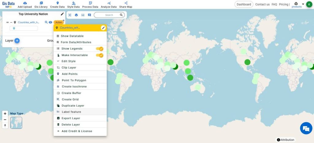
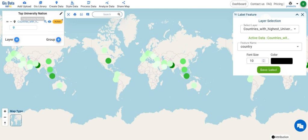
- Save Labels
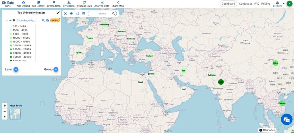
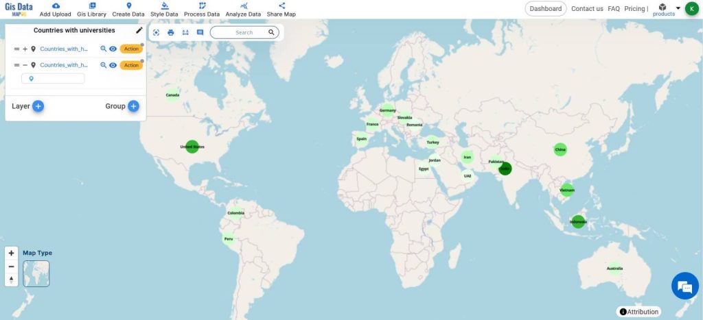
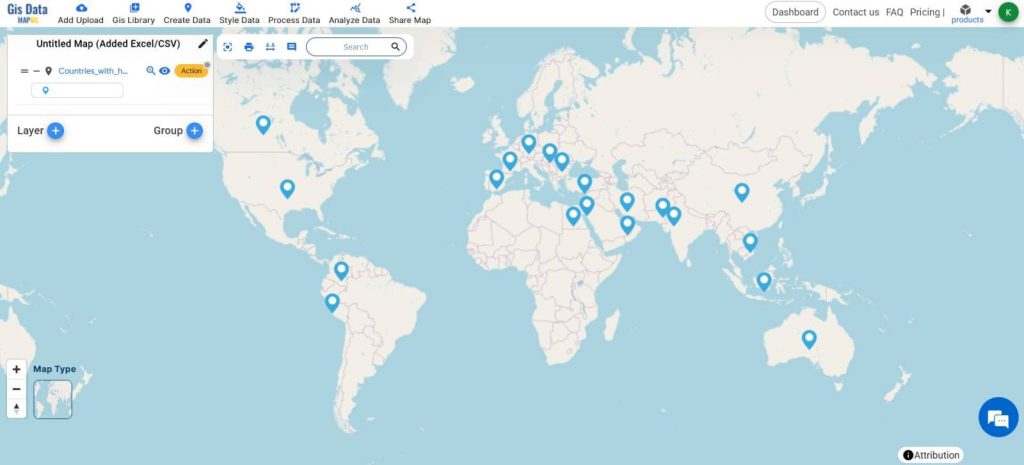
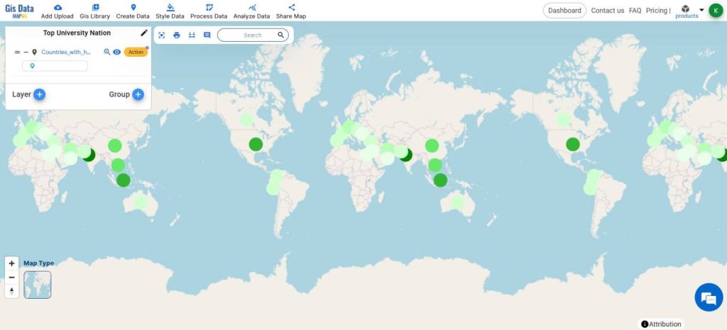
A simple and minimal map will be created with circles with different colors showing the top university nations and the labels.

This analysis helps us understand where universities are most concentrated worldwide. It helps leaders decide where to invest in education and where collaborations can be strengthened. Ultimately, it supports smarter decisions for improving global education.
MAJOR FINDINGS
- University Concentration: The analysis identifies regions with dense clusters of universities, highlighting areas of educational prominence and excellence.
- Global Educational Hubs: Certain countries emerge as central hubs for higher education, attracting students and scholars from around the world.
- Regional Disparities: Discrepancies in university distribution between developed and developing regions underscore challenges in accessibility and resource allocation in education.
BENEFICIAL DOMAIN: Policy Planning and International Collaboration
- Policy Planning: The analysis aids policymakers in allocating resources efficiently by identifying regions with a high concentration of universities, and guiding strategic decisions in education investment and development.
- International Collaboration: By visualizing the distribution of universities worldwide, the analysis facilitates the identification of potential partners for academic exchange programs, research collaborations, and student exchanges, fostering international cooperation in education.
For any inquiries or support needs, feel free to contact us at support@mapog.com.
CONCLUSION
In conclusion, MAPOG map analysis offers invaluable insights into the global landscape of higher education.
By highlighting the distribution of universities and identifying key trends, this analysis provides a roadmap for policymakers to strategically allocate resources and foster international collaborations.
With MAPOG’s innovative approach, we can continue to navigate the complexities of the education sector, driving positive change and innovation in the pursuit of knowledge worldwide.
VIEW OUR PREVIOUS BLOGS
Mapping Zones With Specific Farming Fields : Planning Sustainable Irrigation