Voter turnout, the percentage of eligible voters who participate in an election, is crucial for assessing democratic health and civic engagement. High turnout signifies robust participation, while low turnout highlights areas needing intervention. Using MAPOG, we can uncover voter turnout patterns with Bubble Style. This will provide clear and actionable insights.
Key Concept:
MAPOG visualizes voter turnout data with bubble style, varying bubble sizes, and colors. Adding administrative boundaries, labels, and legends enhances clarity and usability, offering a detailed view of regional voter participation. The data links used here are provided at the end of the article. Check out our other blog Mapping Population Data: Analyzing through bubble styling.
Process For Uncover Voter Turnout Patterns With Bubble Style:
Step 1: Accessing MAPOG
Begin by opening the MAPOG Map Analysis Interface.
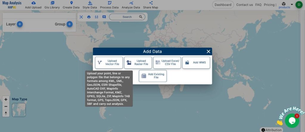
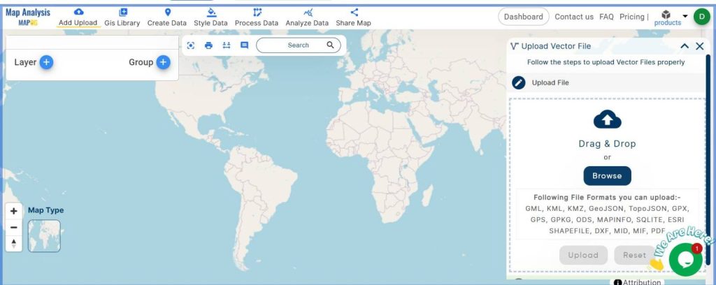
Step 2: Uploading Data
Next, upload your dataset containing voter turnout information:
- Click on ‘Add Upload’ from the menu toolbar.
- Select ‘Upload Vector File‘, browse, and upload your voter turnout dataset.
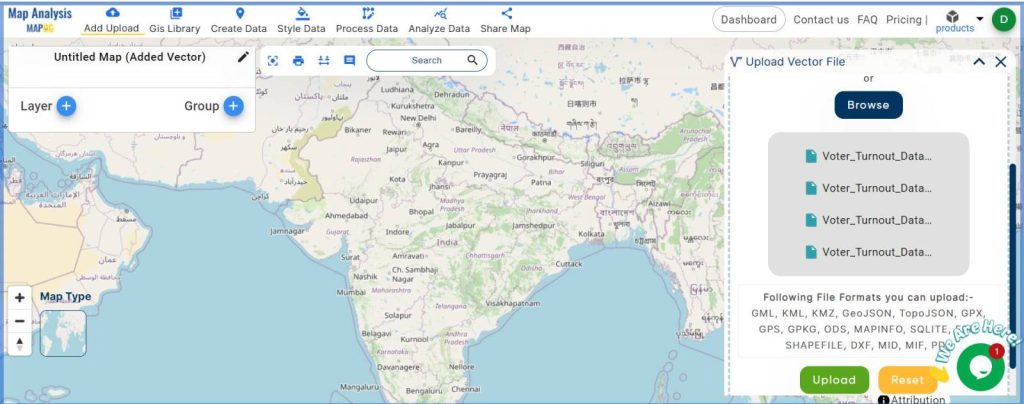
Step 3: Name Your Map
After your data is uploaded, rename the untitled map:
- Press the pencil icon beside the untitled map. Go to ‘Edit map name’ and provide a relevant name for your map.
- Click “Save Map” to preserve your work.
Step 4: Styling Your Data
To visually represent the voter turnout:
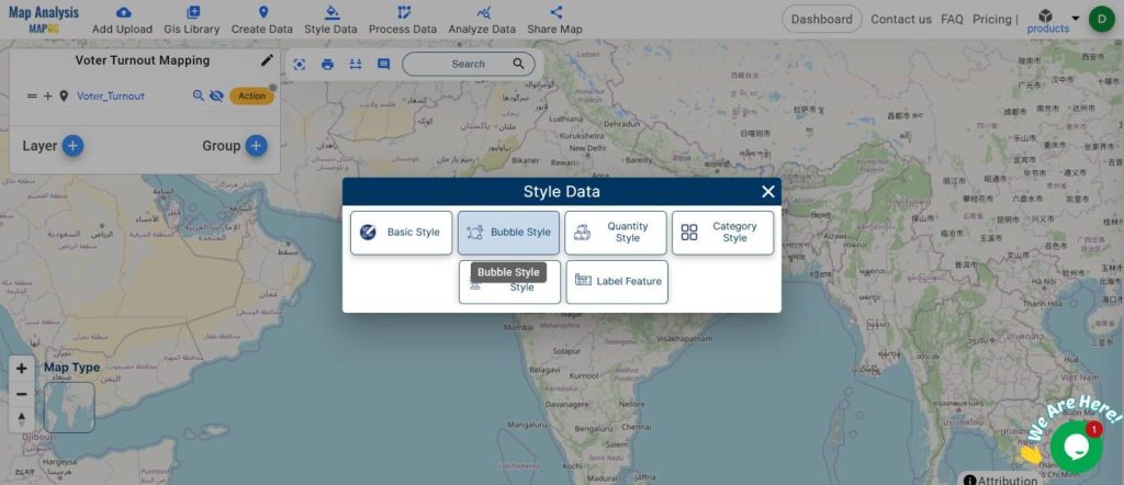
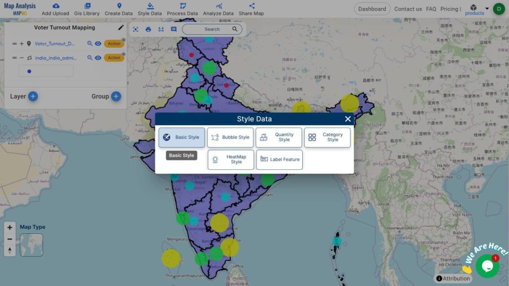
- Navigate to ‘Style Data’.
- Choose ‘Bubble Style‘ for map styling.
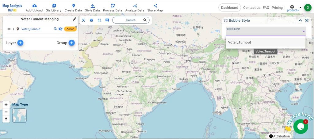
- Select the layer that contains your voter turnout data.
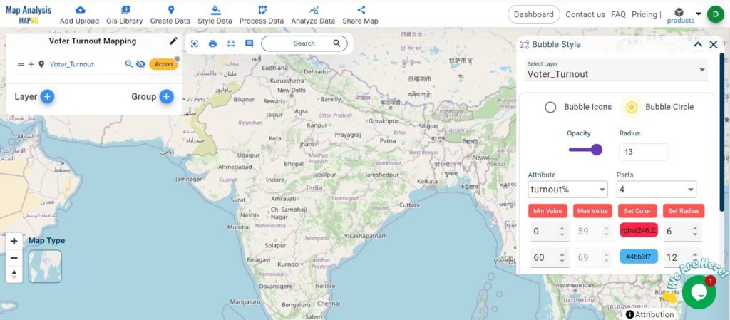
- Choose the Bubble Circle option.
- Select the attribute based on which you want to do the style.
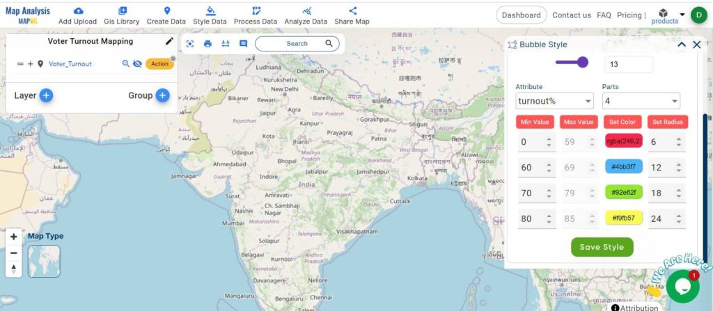
- Set the values as per your need.
- Adjust bubble sizes and customize colors to highlight the data effectively.
- Click ‘Save Style’ to apply these settings.
Step 5: Adding Administrative Boundaries
For added precision:
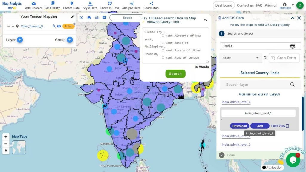
- Go to the ‘GIS Library‘.
- Enter the country name to locate relevant administrative layers.
- Choose the required administrative layer and hit add.
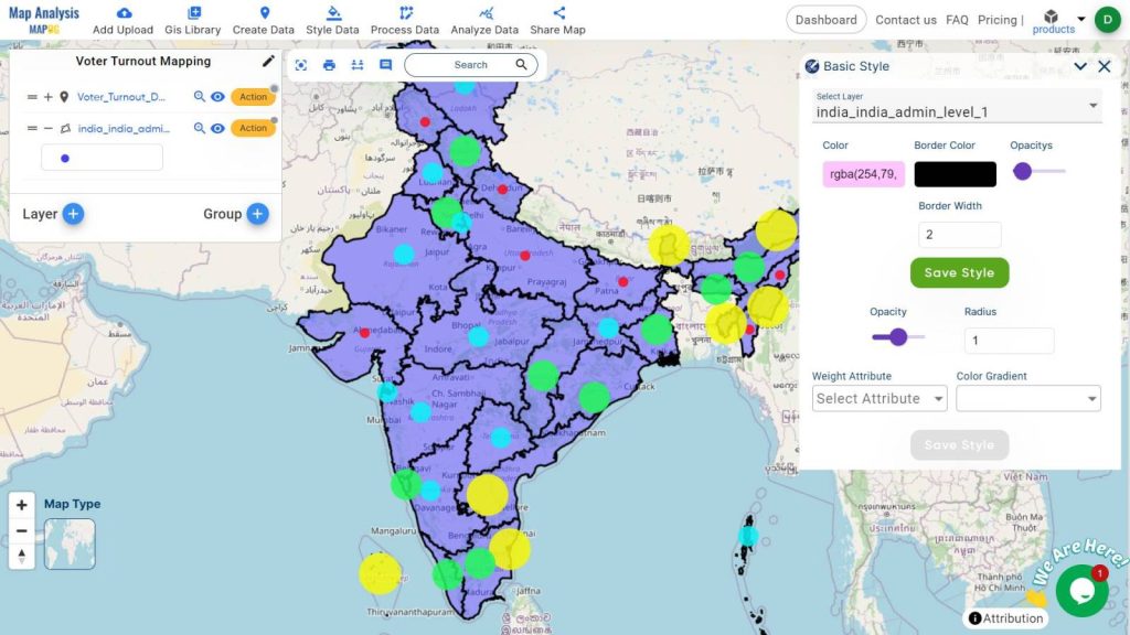
- For style, this data go to ‘Style Data’, then choose ‘Basic Style’. Select the layer, then customize the color as per your choice then ‘save style’.
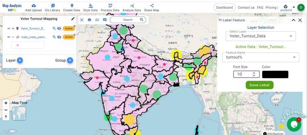
Step 6: Adding Labels
For added interactivity and clarity:
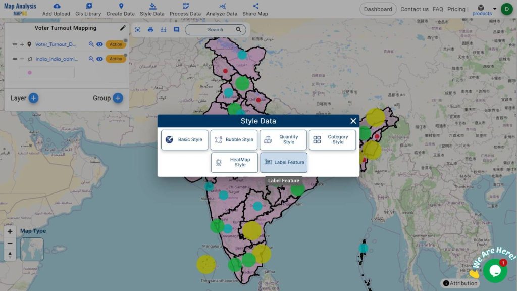
- Go to ‘Style Data‘ and select ‘Label feature‘.
- Choose the layer and attribute you want to display as a label on the map (e.g., turnout percentage).
- Customize the font size and color, then save these settings.
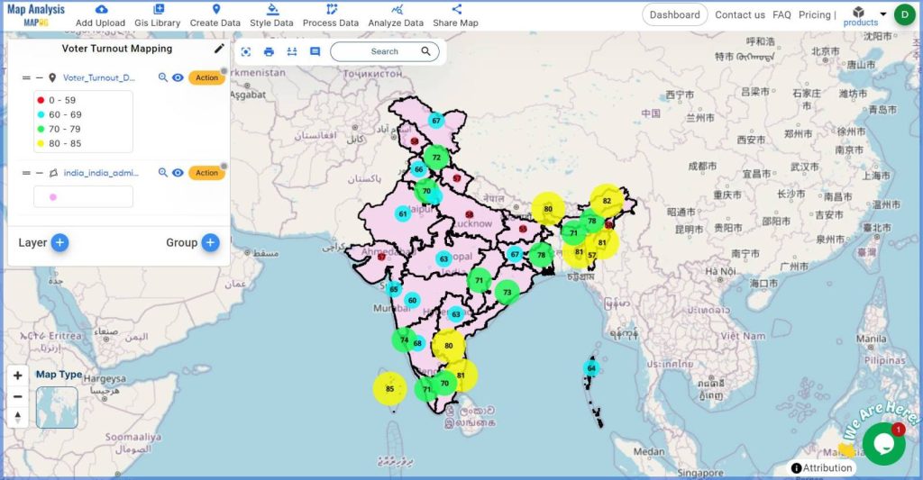
Step 7: Displaying the Legend
To enhance understanding:
- Go to the action button and enable the ‘Show Legend’ option.
- This will display a legend on your map, aiding in data interpretation.
Step 8: Final Output Map
The final output map will feature larger bubbles for areas with higher voter turnout and smaller bubbles for regions with lower turnout. Labels will provide specific percentages, and the legend will help users interpret the data easily. Including administrative boundaries offers additional geographical context, making the map more informative and useful.
Major Findings:
- Regional Disparities: Identify areas with significantly higher or lower voter engagement.
- Enhanced Clarity with Labels: The labels feature provides precise voter turnout percentages, making it easier to pinpoint specific areas of interest.
- Interpretive Aid with Legend: The legend clarifies bubble sizes and colors, improving overall map readability.
- Contextual Accuracy with Administrative Boundaries: Adding administrative layers helps locate and analyze turnout data within precise geographic divisions, aiding more localized strategies.
Industry and Domain Applications
Electoral commissions, political analysts, and researchers can leverage these maps for various purposes:
- Electoral Strategy: Tailoring campaign strategies to increase voter turnout in underperforming areas.
- Targeted Campaigns: Political parties can focus their efforts on regions with low turnout.
- Policy Interventions: Policymakers can design targeted interventions to boost voter participation in specific areas.
- Resource Allocation: Efficiently distributing resources and efforts to regions most in need of intervention.
- Academic Research: Providing a visual basis for studies on voter behavior and electoral engagement.
Conclusion:
Using MAPOG to visualize voter turnout data transforms complex datasets into clear, actionable insights. This process not only aids in understanding regional participation patterns but also supports better decision-making and resource allocation. We hope this guide helps you create impactful maps for your projects.
List Of The Data:
Previous Blog Links:
- GIS Analysis in Urban Planning: Reshaping Transportation Future Insights of state/city
- Make Routes for Military Aerial Planning- Through Bearing angle and Distance calculation – Online Route Compass
- Create Map for Real Estate Developer for Best Site Selection
- Creating Travel Guides: Mapping with GIS Buffer Zones