Understanding the spread of COVID-19 across different regions is crucial for effective resource allocation and policy-making. By leveraging Mapping COVID-19 Impact GIS analysis, specifically using MAPOG Map Analysis, we can visualise COVID-19 data on maps, revealing patterns and trends that raw numbers alone might not show.
Key Concept of Mapping COVID-19 Impact
The core idea is to use GIS, through MAPOG Map Analysis, to visualise COVID-19 data on maps. This approach allows us to see regional patterns and trends, making it easier to identify areas that need more attention and resources. Alongside this guide, datasets will be provided for practical application. Additionally, articles like “Creating Travel Guides: Mapping with GIS Buffer Zones” and “Creating GIS Solutions for Urban Agriculture Map” offer deeper insights into GIS applications.
Mapping COVID-19 Impact using MAPOG’s Excel attribute is straightforward.
Our analysis involves several steps to map and understand the regional variations in COVID-19 cases:
Here’s a step-by-step guide:
Step 3: Data Integration:
Import COVID-19 data into MAPOG Map Analysis, organised by region.
Click on the “GIS Library.”
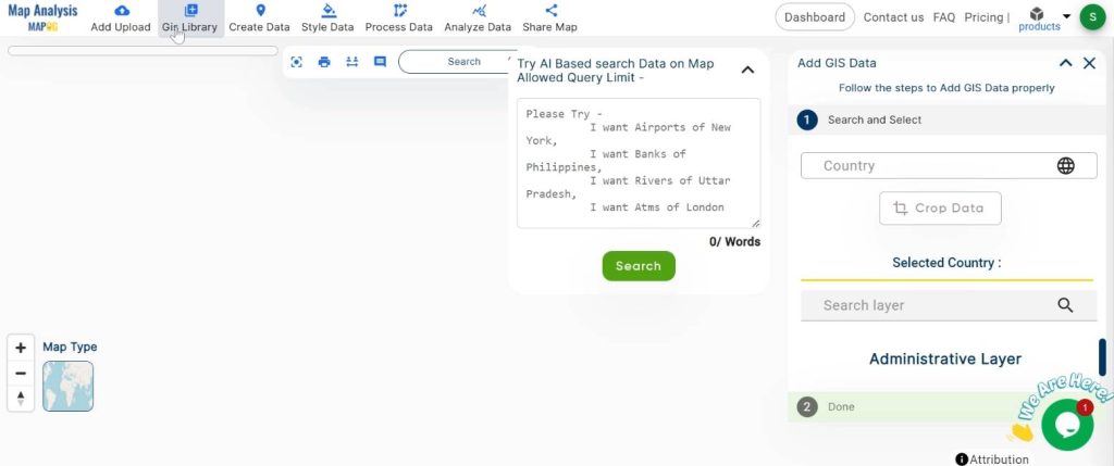
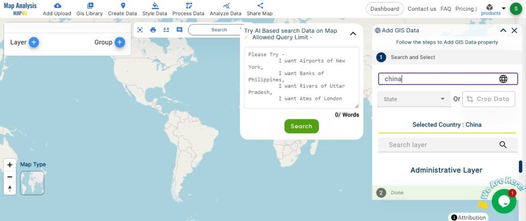
Search for the country name.
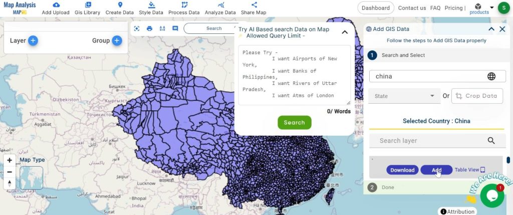
Select the required layer.
Step 2 : Name the map and Rename:
Name the untitled map
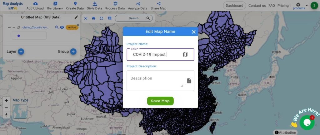
Rename the Layer
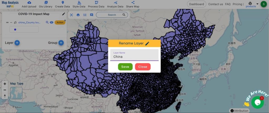
Step 3: Join Data by Excel Attribute:
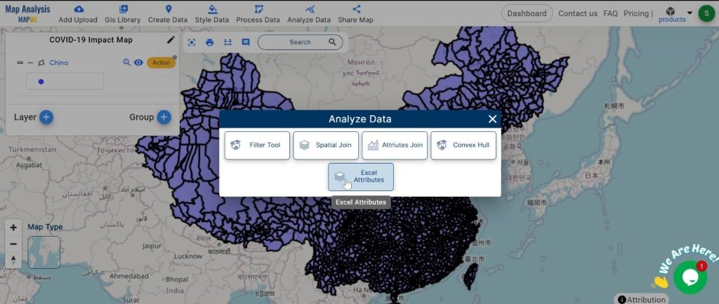
Link the uploaded data with geographic regions using Excel attributes.
Click on the “Analyze data” button and choose “Excel Attribute.”
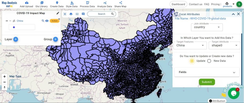
Upload the Excel data and set the join layer and attribute. Click “Submit.”
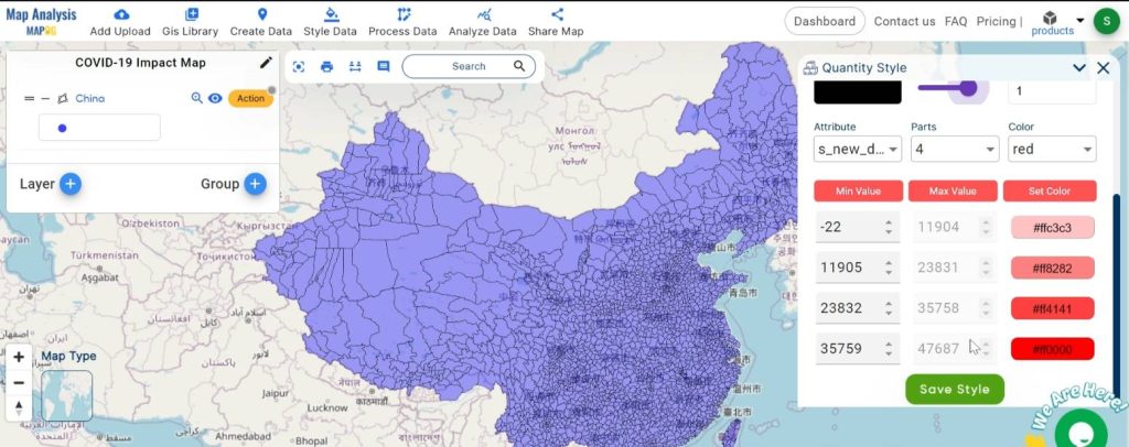
Step 4: Style the Data by Quantity:
Apply category styles to visualize data quantities effectively.
Click on the “Action” button and choose “Quantity Style.”
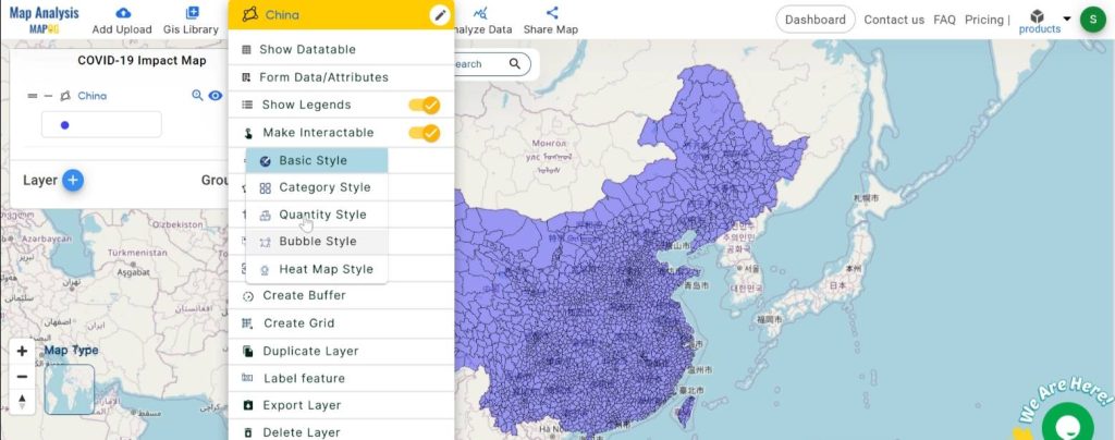
Set the attribute range and colour. Click “Save Style.”
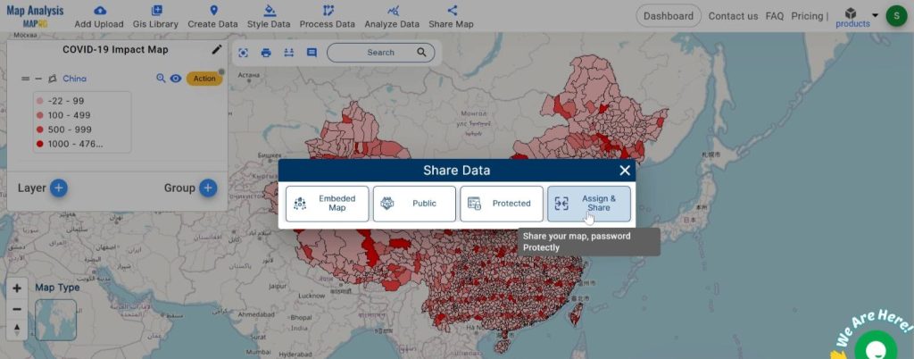
Step 4: Share the Map:
Distribute the final map to stakeholders for analysis and decision-making.
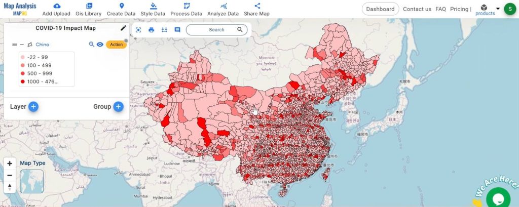
Major Findings
Using GIS analysis, we identified several important trends:
- Hotspots: Regions with higher concentrations of COVID-19 cases.
- Low Case Counts: Areas with fewer cases, possibly due to effective containment measures.
- Trends Over Time: Changes in the spread of COVID-19 over different periods.
Domain and Industry
Our analysis intersects disaster management and data analysis, providing insights valuable to emergency responders, disaster relief organizations, policymakers, and others involved in managing and mitigating the impact of the COVID-19 pandemic.
Conclusion
GIS analysis of COVID-19 data using MAPOG Map Analysis offers crucial insights for decision-makers. By understanding the virus’s spread across different regions, resources can be allocated more effectively, and targeted interventions can be implemented to control its spread. This approach aids in better managing the ongoing pandemic and preparing for future health emergencies.
Link of the Data:
Explore the data further through our GIS Data product, uncovering valuable information for in-depth analysis and understanding.