Healthcare is an industry in which the basis for many decisions could be driven by data. For instance, healthcare services can be effectively analyzed with spatial insight into resource allocation and disease distribution, which, in turn, determines the accessibility of care. Therefore, this article presents some of the best GIS tools available for healthcare professionals and organizations that could significantly enhance analysis.
Why Use GIS for Healthcare Analysis?
GIS allows healthcare professionals to visualize and analyze data spatially, making it easier to:
- Identify Gaps: Pinpoint areas lacking adequate healthcare services.
- Track Disease Spread: Map and monitor the spread of diseases over time.
- Optimize Resource Allocation: Plan the placement of clinics, hospitals, and vaccination centers for maximum accessibility.
- Assess Accessibility: Understand how populations interact with healthcare infrastructure.
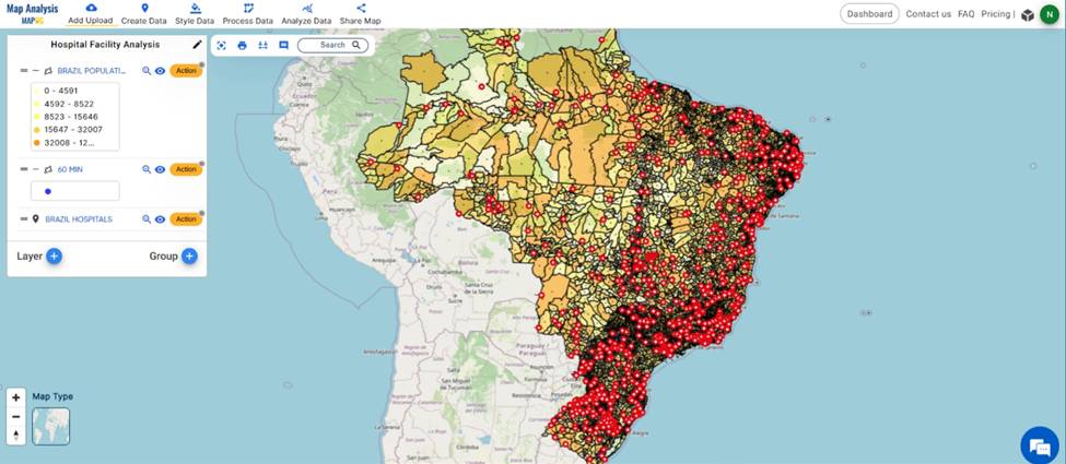
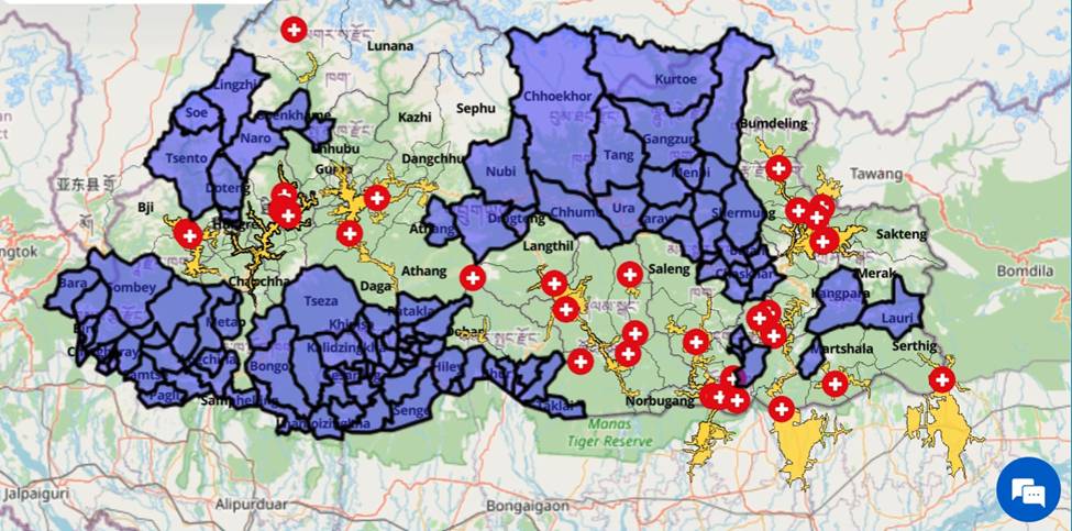
MAPOG is a GIS-based platform that specializes in the creation of interactive maps. This tool is particularly useful for visualizing healthcare data in an easy-to-understand way for stakeholders and the public. For instance, one can map the distribution of hospitals in a region and overlay population density data to identify underserved areas.
Key Features:
- Interactive map creation.
- Ability to add points, lines, and polygons.
- Customizable base maps, including various feature tools and built-in data layers.
Example Use Case: If you’re analyzing healthcare accessibility in rural areas, you can use MAPOG to visualize clinic locations and overlay travel time data using the isochrone tool, helping to highlight communities that need additional support.
How GIS Tools Can Enhance Healthcare Services
GIS tools can revolutionize the way healthcare services are planned and delivered. For example:
- Mapping disease hotspots can guide vaccination campaigns.
- Analyzing travel times to healthcare facilities can improve service accessibility.
- Overlaying environmental data with health statistics can reveal underlying causes of health issues.
Conclusion
MAPOG add an interactive dimension, making complex healthcare data accessible and actionable using GIS tools. Whether you’re planning a public health campaign or analyzing hospital locations, these tools can help you make informed decisions.