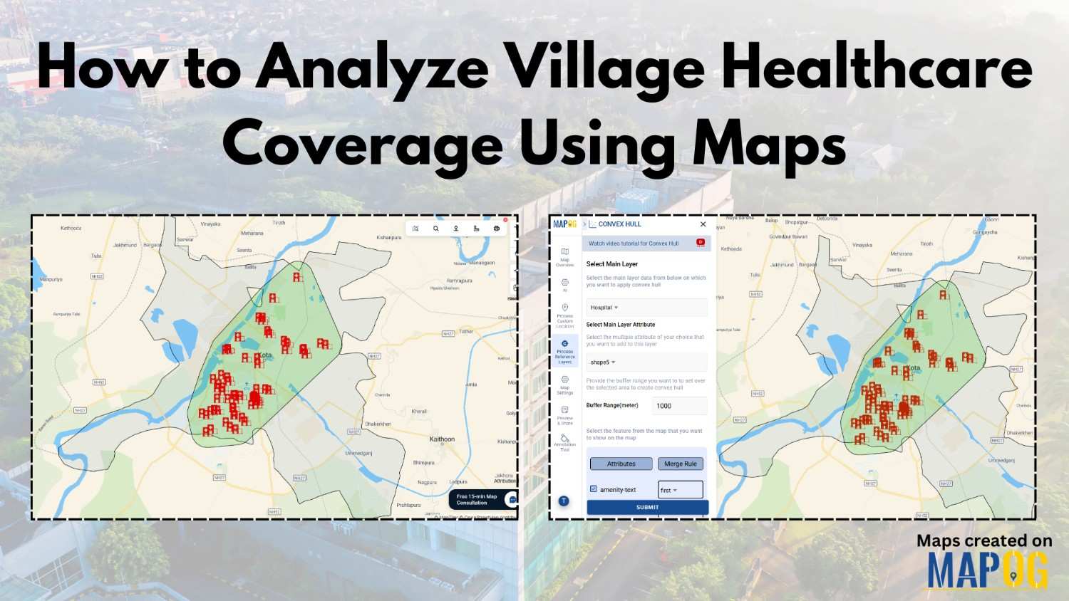
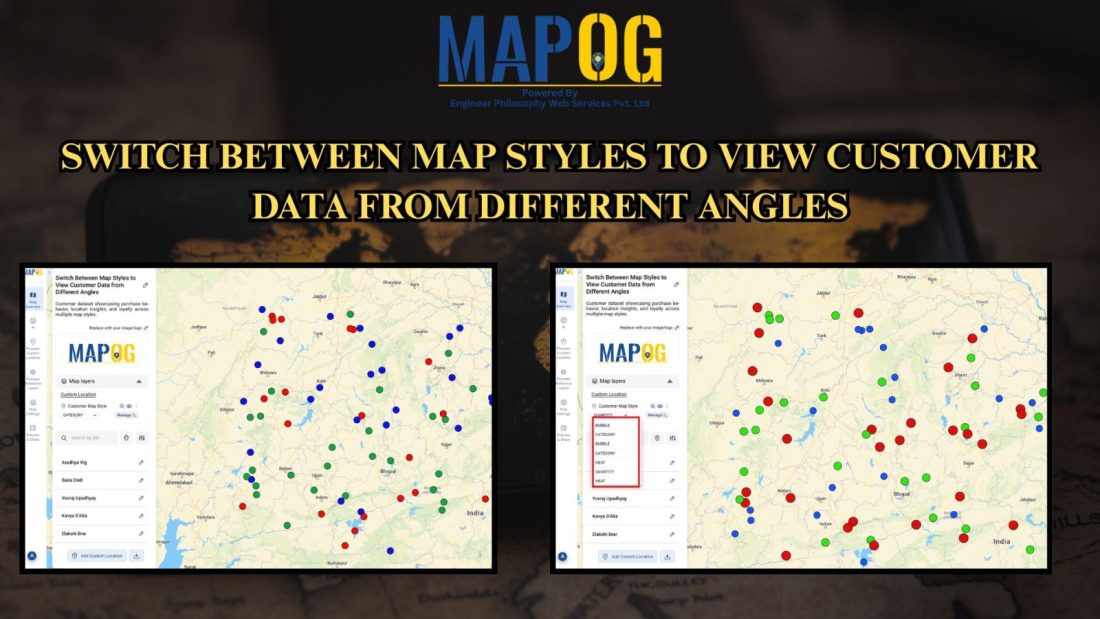
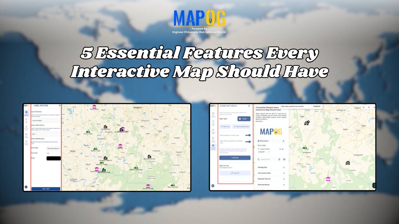
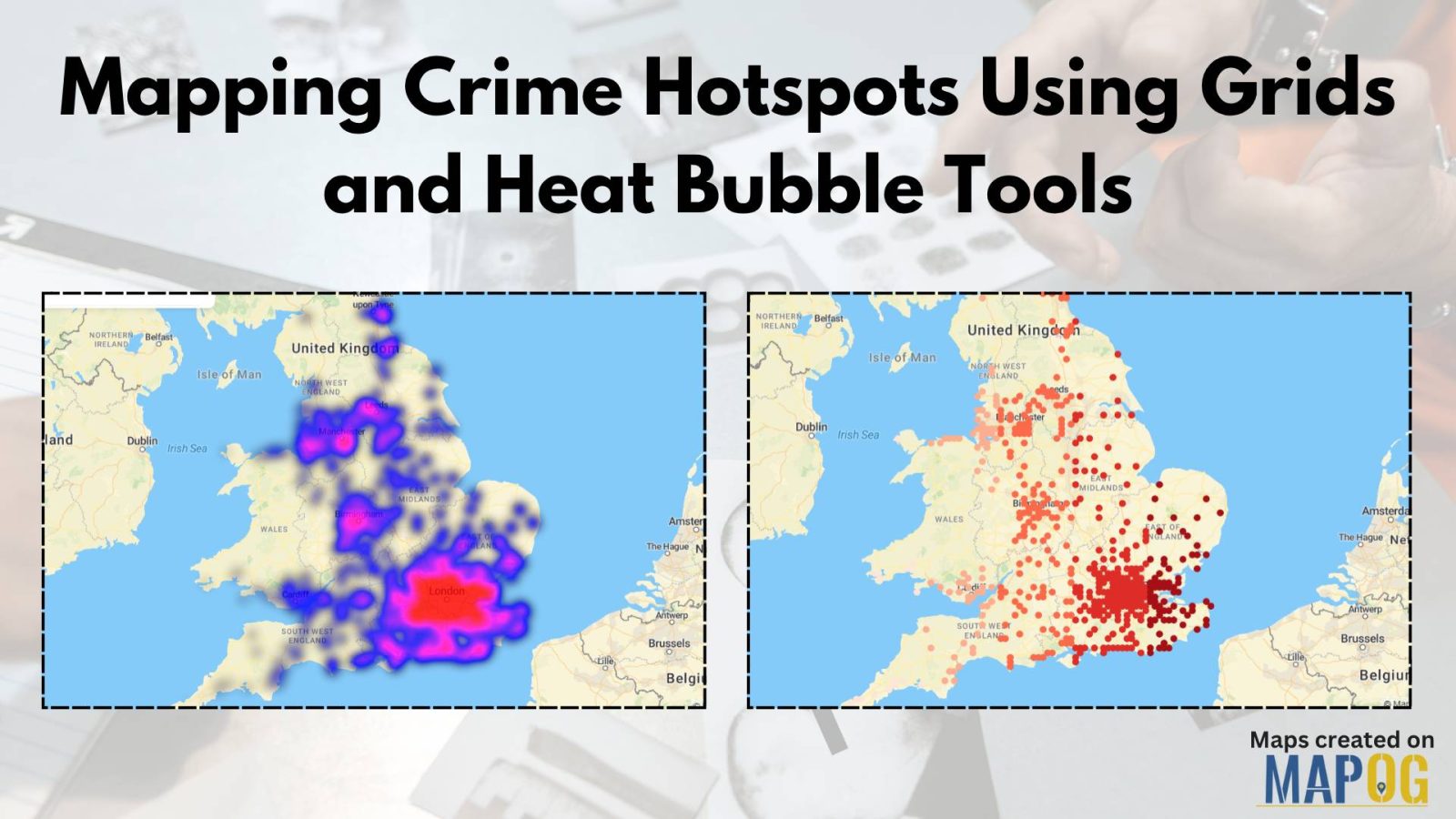
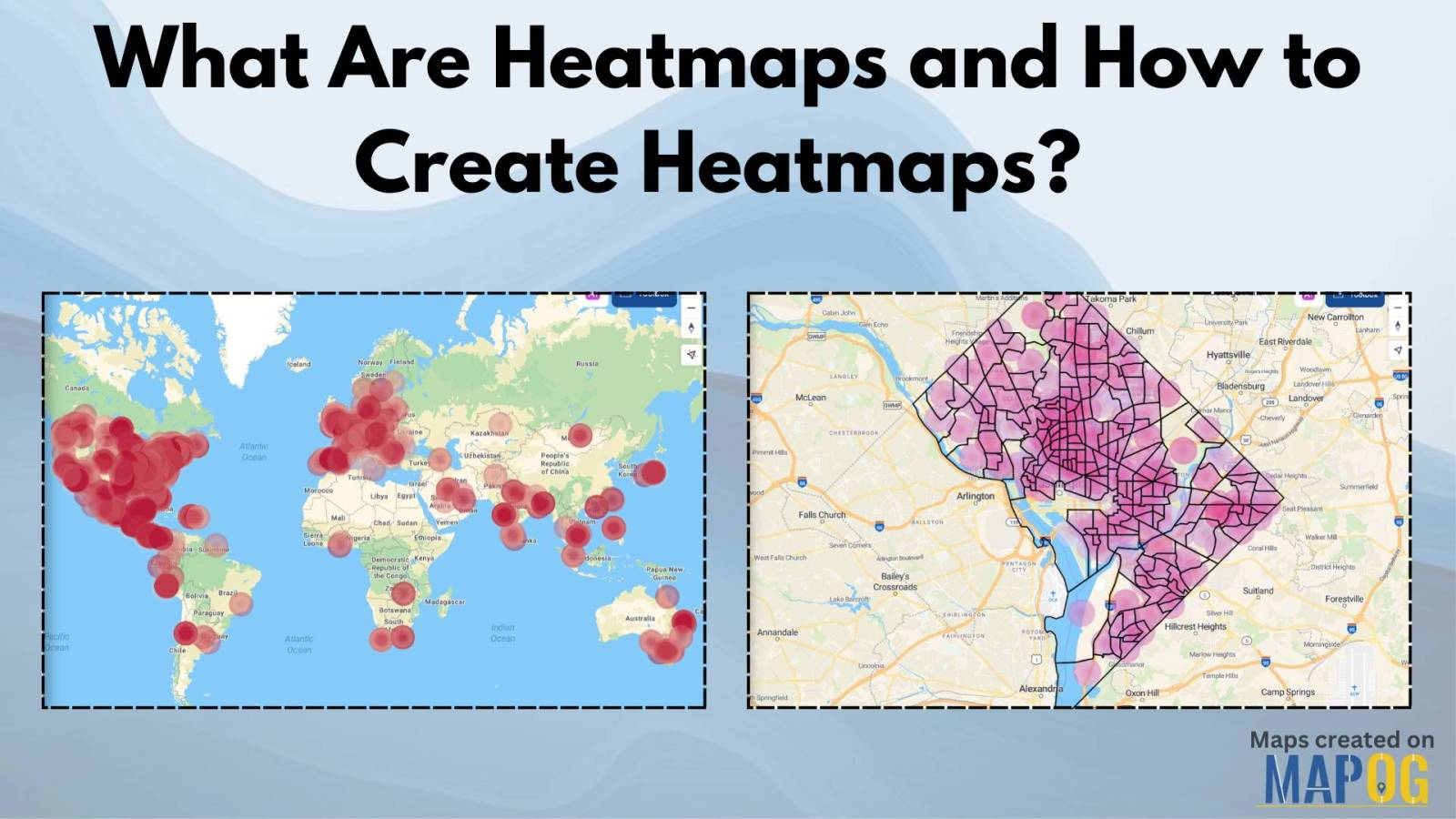
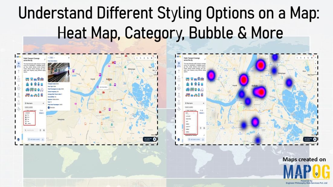
Heatmap

Customer Coverage Map

Create a Customer Coverage Map for Your Sales Team

Ever feel like your sales team is working hard but not necessarily in the right places? You’re not alone. Many businesses struggle to see exactly where their customers are and how effectively their sales reps are covering each region. A Customer coverage map helps you visualize where your customers are located, how well your team … Read more

Switch Between Map Styles

Switch Between Map Styles to View Customer Trends, Hotspots & Spending Patterns

Transform raw data into interactive visuals showing customer locations, spending, and trends. Furthermore, Switch Between Map Styles reveals interactive map insights like top buyers, regional demand, and performance gaps, enabling faster, data-driven decisions without coding. Key Concept: Switch Between Map Styles However, by smoothly Switch map styles, you can easily explore one dataset from multiple … Read more

5 Essential Features Every Interactive Map Should Have

Interactive maps for tourism planning transforms raw data into dynamic visuals, helping manage tourism efficiently. Additionally, the 5 essential features every interactive map should have are Real-World Updates, Custom Icons & Labels, Heatmaps, Pop-Ups and Collaboration. Key Concept: interactive maps for tourism planning Interactive maps highlight attractions, heritage sites, hotels, and amenities while integrating layers like … Read more

Mapping Crime Hotspots

Mapping Crime Hotspots Using Grids and Heat Bubble Tools

Mapping crime hotspots is a critical approach in understanding and preventing urban crime. By visualizing clusters of criminal activity, law enforcement and urban planners can make informed, data-driven decisions. One modern way to do this effectively is through interactive mapping platforms that offer grid-based analysis and visual heat bubble styles—such as MAPOG’s intuitive tools. This … Read more

Mapping Noise Pollution Levels in Cities Using Heat Maps and Buffer Tools

Mapping Noise Pollution Levels: Using Heat Maps and Buffer Tools

Noise pollution is an increasingly critical yet often overlooked environmental challenge. In urban areas, it stems primarily from traffic, construction, railways, and industrial activities. Fortunately, with the rise of Geographic Information Systems (GIS) especially tools like heat maps and buffer zones for Mapping Noise Pollution Levels. We can now visualize these invisible pollutants. As a … Read more

wildlife monitoring and prevention using gis tool

How to use GIS for Wildlife monitoring and prevention

As biodiversity faces unprecedented loss, conservationists are using advanced mapping technology to fight back. Geographic Information Systems (GIS) have evolved into powerful tools for wildlife monitoring and protection, enabling teams to plan migration corridors, predict poaching hotspots. This technology is empowering rangers and researchers to make faster, smarter decisions, helping reverse biodiversity loss. Key Concept … Read more

What Are Heatmaps and How to Create Heatmaps?

What Are Heatmaps and How to Create Heatmaps?

Ever wondered how to visualize data patterns effectively? Heatmaps are an excellent way to analyze trends, highlight intensities, and make data-driven decisions. Whether for website analytics, business insights, or geographic trends, heatmaps simplify complex datasets into easy-to-understand visuals. The best part? You can create heatmaps for free using tools like MAPOG’s Heat Map Style. Let’s … Read more

GIS Heat Maps for Disease Tracking: Visualizing COVID-19 Death Rates

In this article, we will explore how to create and analyze heat maps to understand disease spread, specifically focusing on COVID-19 death rates. Utilizing the powerful MAPOG Map Analysis tool, we’ll walk through the process of visualizing data using heat maps, making it easier to identify patterns and make informed decisions. This step-by-step guide will … Read more

How to Create Heat Maps for Forest Cover Analysis Using GIS

Forest Cover Maps a fundamental tool within GIS, serves as a potent visualization method. It utilizes colors to represent the density or intensity of data across a geographic area, offering valuable insights into various phenomena. Key Concept to Creating Forest Cover Maps: Using Heat Map Style Heat maps are super helpful when we want to … Read more