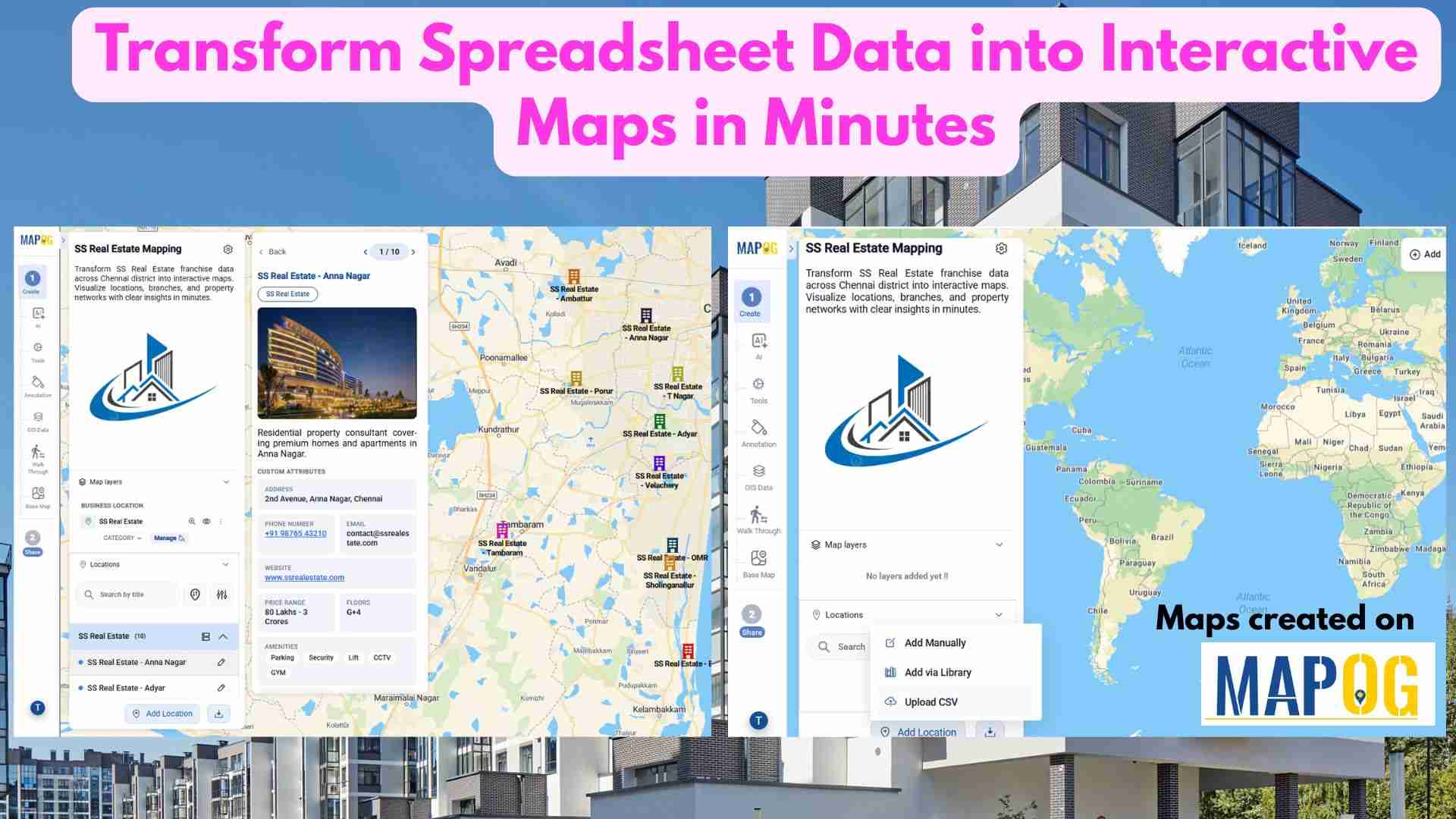
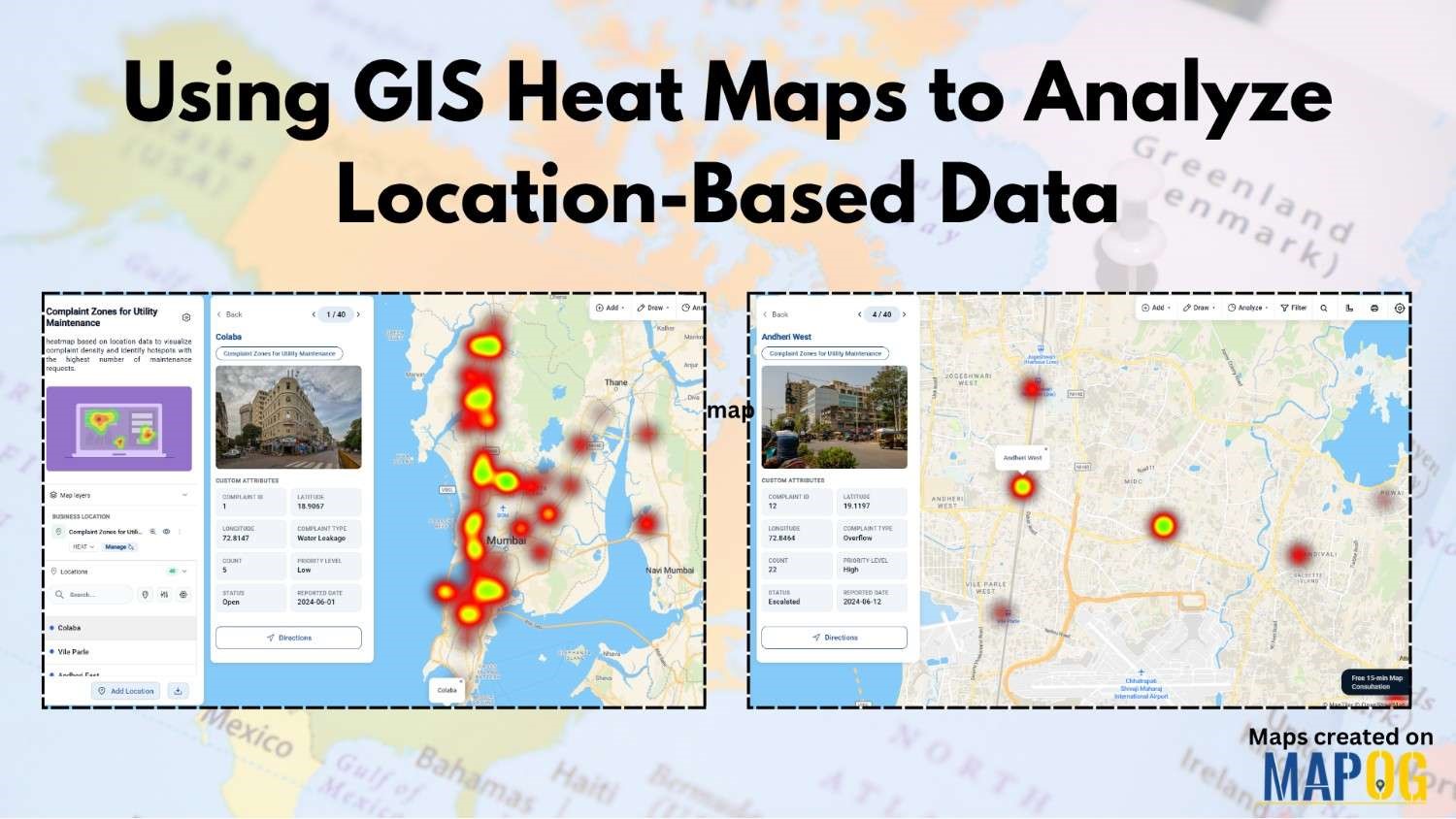
Point data

Add POIs to Property Maps

How to Add POIs to Property Maps to Make Listings More Attractive

In today’s competitive real estate market, presentation is everything. Buyers and investors don’t just want to see where a property is—they want to understand what surrounds it. Adding Points of Interest (POIs) such as schools, restaurants, parks, hospitals, and transit hubs transforms simple property maps into a powerful storytelling tool. It helps viewers visualize lifestyle, … Read more

How to Filter Your Map Points Easily Using Category Filters

In a world where maps have become increasingly interactive and data-rich, organizing your map points is no longer just a “nice-to-have” feature — it’s essential. Whether you’re building a travel guide, a real estate visualization, or even a business dashboard, learning how to Filter Your Map Points easily using category filters can, therefore, make your … Read more

5 Essential Features Every Interactive Map Should Have

Interactive maps for tourism planning transforms raw data into dynamic visuals, helping manage tourism efficiently. Additionally, the 5 essential features every interactive map should have are Real-World Updates, Custom Icons & Labels, Heatmaps, Pop-Ups and Collaboration. Key Concept: interactive maps for tourism planning Interactive maps highlight attractions, heritage sites, hotels, and amenities while integrating layers like … Read more

Color-Code Map Points by Category (Online, No-Code)

To begin with, Color-Code Map Points is a simple yet powerful way to transform raw data into clear, visual insights. Moreover, this approach enables governments, planners, and communities to classify projects, services, or assets into instantly understandable categories on a single interactive map. As a result, we can instantly track and visualize metro stations in … Read more

Convert Excel/CSV to an Interactive Map (Free, No-Code)

Converting Excel/CSV into an interactive map is a practical method for visualizing location-based information without programming skills. In other words, users upload spreadsheet data , such as addresses, coordinates, or place names into a mapping platform that displays it spatially. Therefore, no-code tools like MAPOG make this process accessible enabling users to geocode locations, categorize … Read more

Track Task Progress on a Map

Track Task Progress on a Map Dashboard (Completed vs Pending)

Tracking everyday projects on spreadsheets often turns messy, especially when tasks spread across different teams and locations. Instead of flipping through endless reports, a smarter way is to track task progress visually on a map dashboard. This approach gives you an instant view of what’s done and what’s pending while also keeping everything more organized. … Read more

How to Create a Safari Itinerary Map for Your Trip

Create & Share a Safari Itinerary Map for Your Trip

If you’re planning a safari, visualizing your journey on a map can turn your travel plans into an interactive and shareable experience. From visiting to all safari locations and back, mapping your safari helps you track routes, highlight wildlife hotspots, and organize activities. Using MAPOG, you can create a rich safari itinerary map that’s engaging, … Read more

Famous Alumni Map Discover Notable Personalities and Their Universities

Famous Alumni Map: Showcase Notable University Graduates, Achievements & Success Stories

Universities are the birthplaces of leaders, innovators, and change makers. Mapping notable alumni with MAPOG showcases their achievements, highlights global impact, and inspires future generations by tracing where their journeys began through a famous alumni map. Key Concepts: Why Create a Famous Alumni Map? Alumni achievements are often scattered, but a digital map highlights them … Read more

Mapping Public Amenities to Spot Underserved Areas and Plan New Developments

Public Amenities Mapping with GIS: How Cities Can Improve Schools, Hospitals, Parks & Community Services

Mapping Public Amenities to transform your city into a granted transparent, inclusive, and well-planned urban space with GIS-powered public amenity mapping. This modern approach enables governments, planners, and communities to visualize essential services such as schools, hospitals, parks, libraries, and more on a single interactive map. By identifying underserved areas as much as cities can … Read more

Interactive Healthcare Map Locate Hospitals, Clinics, Diagnostic Labs & Health Centers

How to Create an Interactive Healthcare Map: Visualize Hospitals, Clinics, and Diagnostic Labs

Healthcare is vital for every community, and using an interactive healthcare map makes it easier to locate the nearest hospital, clinic, or diagnostic lab. With tools like MAPOG, it’s now possible to visualize the entire healthcare network of a city on a single platform. An interactive healthcare map makes it easy to categorize facilities, and … Read more