“Digitizing renewable energy power plants” with MAPOG, in this exploration, we simplify the process of turning intricate data into a straightforward visual guide for a sustainable tomorrow. While our example focuses on the broader global context, these principles can be applied anywhere. Join us as we guide you through the steps, making green energy mapping accessible and fostering sustainability for everyone.
KEY CONCEPT FOR DIGITIZING RENEWABLE ENERGY POWER PLANTS:
Explore the journey of green energy mapping, your ultimate guide to a Sustainable future with us. By digitizing power plant locations using MAPOG, we will create a clear visual guide for a sustainable future. Also, check our blog on Creating GIS Solutions for Urban Agriculture Map.
STEPS FOR DIGITIZING RENEWABLE ENERGY POWER PLANTS:
Step 1:
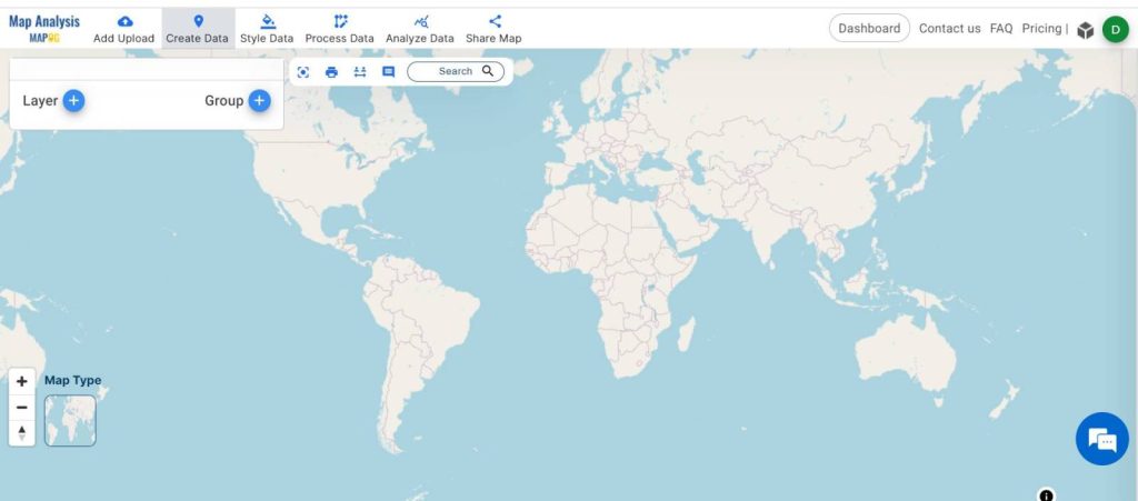
Open ‘Map Analysis’ interface. Then click on the “Add Upload” option from the menu toolbar.
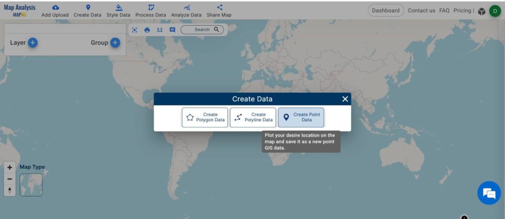
Now a panel window opens on your screen, named “Create Data”, now click the “Create point data” option.
Step 2:
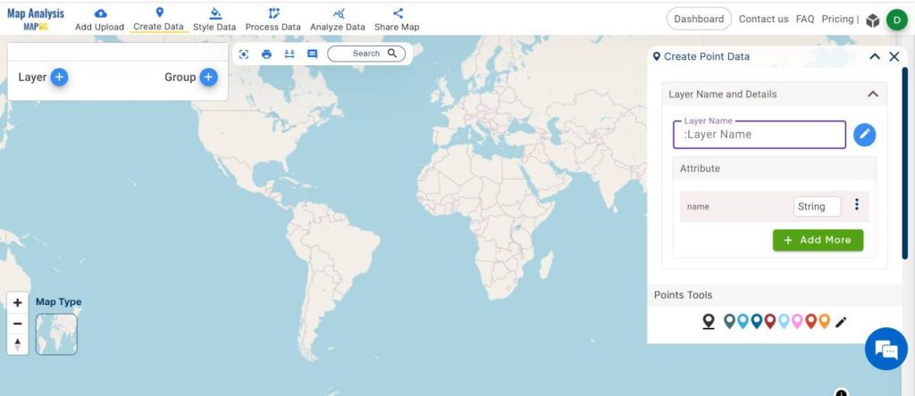
Now the “Create Point Data” tool opens on the right side of your screen. You can give a suitable name to your layer from “Layer Name”.
Step 3:
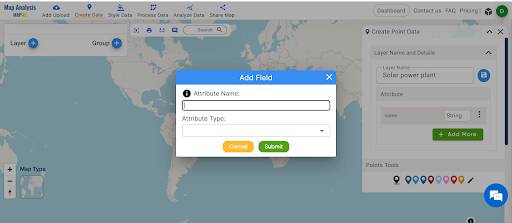
Then, add attributes as per your requirement by clicking on the “Add More” button. Then a panel window will open named “Add Field”. Now give the attribute name and attribute type as per your data and submit. You can add multiple attributes like this.
Step 4:
After that, first, select the suitable icon from the point tool. Now you can drop points to the map.
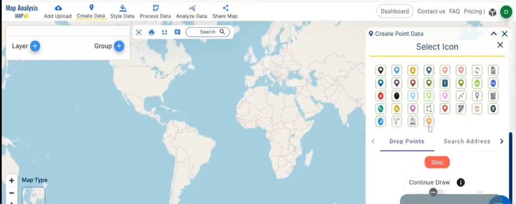
Step 5:
There are three different modes to put the point on the map.
- Drop Point: Manually place the point on the map.
- Search Address: Enter PIN codes or addresses to locate the place.
- Latitude or Longitude: Input specific latitude or longitude values to find the desired location.
You can choose your desired option and go for it. For this particular work latitude and longitude would be the best option for dropping the location.
Step 6:
Then, put the latitude and longitude, then click “plot location”, now another window will open on the screen named “Add Value”, fill in the value of the attribute here and “Add.”
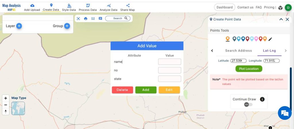
Step 7:
The point layer named “solar energy plant” is added now.
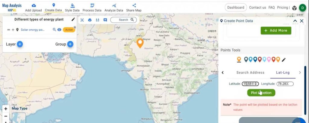
By following the same process, one can put multiple-point data similarly in a single layer.
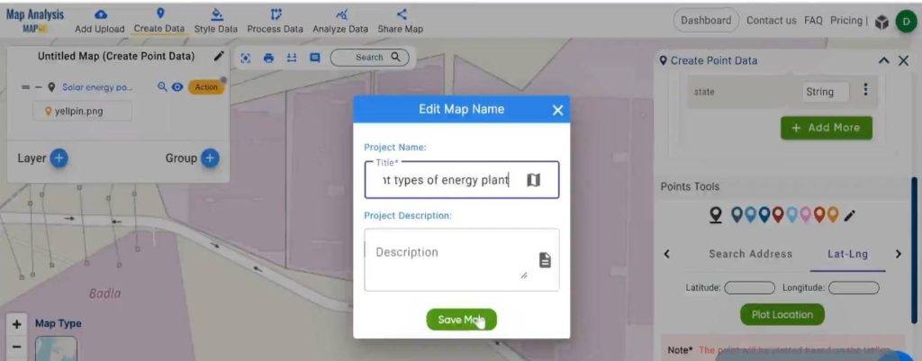
Step 8:
After adding one layer now, give a name to the Untitled Layer by going to the pencil icon. A new panel window will open named “Edit Map Name”, give a suitable map name and click “ Save Map”.
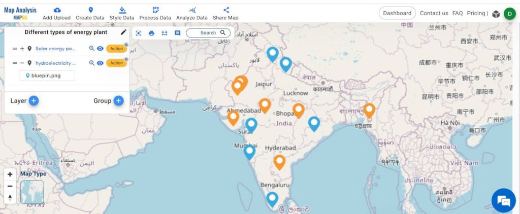
Step 9:
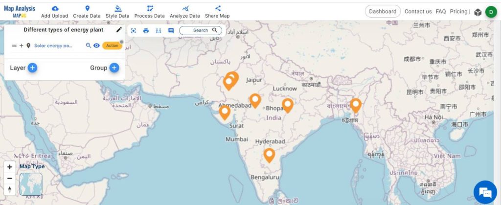
For different energy plants, one can use different layers and different colors, So it’s easy to interpret the map.
To create another layer first after completing one layer you have to turn off the “Create point data tool” from the cross button showing at the left corner of the tool. Similarly, by following the same process you can add multiple point layers as per your requirement.
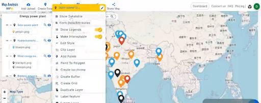
Step 10:
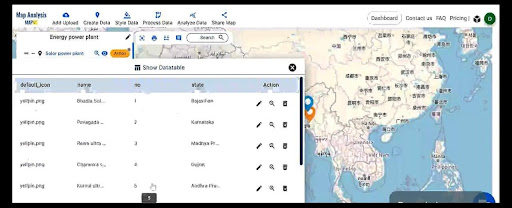
You can see your attribute table. Click on the “Action” button beside your selected layer and then press “Show Database”.
The table is now shown on the screen.
The final Output Map is ready now.
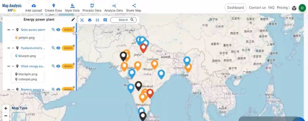
MAJOR FINDINGS FOR DIGITIZING RENEWABLE ENERGY POWER PLANTS:
Solar Energy Plants:
- It is denoted by orange icons on the map.
Hydroelectric Power Plants:
- Represented by blue icons for easy identification.
Wind Energy Plants:
- Indicated on the map by black icons.
Biomass Energy Plants:
- Identified by red icons, showcasing biomass energy locations.
The color-coded map simplifies recognition, allowing users to easily pinpoint and understand the distribution of different types of renewable energy plants for a more sustainable future.
DOMAIN AND INDUSTRY:
Boosting Green Energy Growth:
- Our tools help speed up the progress of green energy projects.
- With a clear map, developers can make smart choices, making energy development better and more eco-friendly.
Improving Energy Tech:
- Our impact goes beyond just looking good; it helps make energy tech better.
- By using our tools, we encourage new and improved technologies that push renewable energy forward.
Getting Thumbs Up from Eco Planners:
- Planners who care about the environment really like our tools.
- Our maps assist planners in creating nature-friendly areas and fitting renewable energy into plans for greener cities.
Must-Have for Green Advocates:
- People who support a green future find our tools super important.
- The visual map we create is like a superhero cape for promoting eco-friendly projects and getting more people excited about going green.
CONCLUSION FOR DIGITIZING RENEWABLE ENERGY POWER PLANTS:
A Visual Guide to Green Energy Transition. MAPOG map unveils the diverse landscape of renewable energy plants, creating a visual symphony of sustainability. Let this guide steer towards a cleaner, brighter future.
3 thoughts on “Create Map – DIGITIZING SOLAR, HYDROELECTRIC, WIND AND BIOMASS POWER PLANTS – RENEWABLE ENERGY ”