In the fight against climate change, understanding carbon stocks is essential. Carbon stock refers to the amount of carbon stored in various ecosystems, primarily in forests, soils, and oceans. This knowledge helps us identify crucial areas for conservation and reforestation, providing a roadmap for mitigating the adverse effects of climate change. ‘Carbon Stock Estimation Mapping’ through MAPOG offers valuable insights into carbon distribution and its significance.
Key Concept:
Our main target is to provide an interactive and easily interpretable visualization of carbon stocks using the MAPOG platform. This work impacts environmental management and climate change mitigation by identifying critical areas for conservation and effective resource management. Check our other blog Create a Map to Identify Pollution-Affected Regions. Links of the data are attached at the end of the blog.
Process:
To map carbon stocks using the MAPOG platform, follow these steps:
Upload Data:
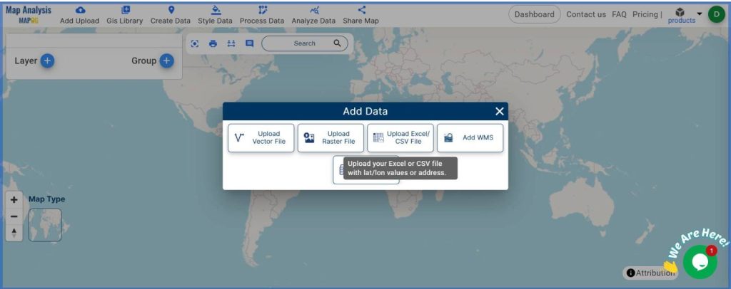
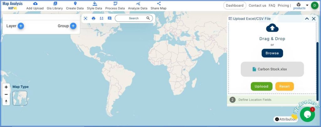
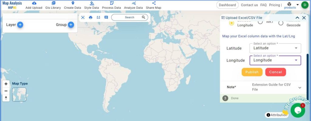
Navigate to ‘Add Upload‘, then select the ‘Upload CSV or Excel File‘ option. Then browse and upload your data file. After that, Select the Type of Data you have in the Excel file uploaded. Here you get 3 options latitude and longitude, WKT, and Address or Geocode. We choose the latitude and longitude. Then, click Publish.
Name the Map:
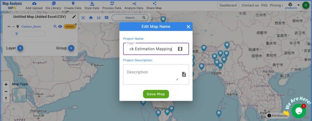
Provide a suitable name for your map, go to Edit Map Name from the pencil icon. Put the name as per your choice, then hit Save Map.
Style the Map:
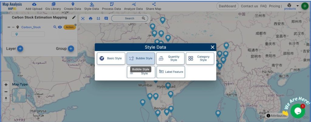
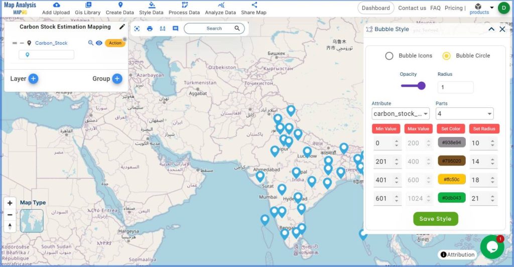
Go to ‘Style Data’ and select ‘Bubble Style‘. Choose the layer first. Then select the layer, then choose Bubble Circle. Although bubble Icon is an option, bubble Circle is preferred for this work. Choose the attribute ( Carbon Stock ) for styling. Adjust the size of the radius and minimum values as needed, and customize the color. After all selections, click Save Style.
Show Legend:
Activate the Show Legend button for easy interpretation of the color codes from the ‘Action’ button.
Add Labels:
To increase the readability, add labels by selecting ‘Label Feature‘ from ‘Style Data’. Choose the layer first, then select the Feature that you want to show as a label ( Here Carbon Stock Value in Million Tonnes is shown as the label). Customize the font size and color as per your preference, then click Submit.
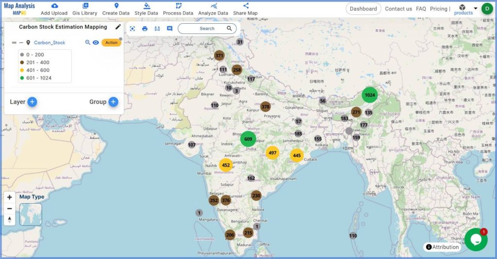
The Final Map Output map is ready to visualize carbon stock with bubbles of different sizes and colors.
Major Findings:
- High Carbon Stock Areas: Regions with larger, darker bubbles indicate high carbon storage, highlighting critical zones for conservation efforts.
- Low Carbon Stock Areas: Smaller, lighter bubbles show areas with lower carbon storage, which may require enhanced conservation measures or reforestation initiatives.
- Interactive Data Presentation: The bubble-style map, with labeled carbon stock values, offers an interactive and easily interpretable visualization, aiding stakeholders in making informed decisions.
Industry And Domain:
The carbon stock map created using the MAPOG platform is beneficial for various industries, including:
- Forestry and Conservation: Identifies key areas for preservation and reforestation, aiding in the maintenance of biodiversity and ecosystem services.
- Urban Planning: Facilitates the planning of green spaces and carbon offset projects within urban environments.
- Pollution Control: Helps in understanding the role of natural carbon sinks in mitigating pollution levels.
- Environmental Conservation and Climate Change Mitigation: Provides critical data for developing effective strategies to combat climate change. Guide to increasing Carbon Sequestration Rate.
Conclusion:
Mapping carbon stocks using the MAPOG Map Analysis platform provides a vital tool for understanding and managing our natural resources. By visualizing carbon distribution across different regions, we can identify key areas for conservation, enhance sustainable land management practices, and develop effective strategies for climate change mitigation.