Within the expansive realm of Geographic Information Systems (GIS), the creation of population density maps emerges as a crucial tool for comprehending the dispersion of human settlements. This article guides you through the process of crafting illuminating population density maps using the robust MAPOG platform, uncovering the far-reaching implications of this technique across various domains. Explore the journey of Creating Population Density Maps: A Guide to GIS Mapping.
Key Concept to Creating Population Density Maps
Navigating the GIS Landscape – Crafting Population Density Maps with MAPOG. Uncover the intricacies of human settlement distribution through insightful spatial analysis. This guide demystifies the process, providing a transformative perspective on population dynamics. Empower decision-makers across diverse domains with the art of Creating Population Density Maps using the powerful MAPOG platform. Access the data links at the end of the Article for comprehensive insights.
Below, we deconstruct the step-by-step process that unveils the mysteries of our GIS endeavor, turning it into an accessible and enlightening journey.
Step 1: Data Preparation
Begin by collecting settlement data for . Ensure your dataset includes essential variables such as population figures.
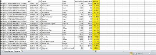
Step 2: Calculate Population Density
Leverage the analytical power of MAPOG to calculate population density using specialized tools or, if needed, external applications like Excel.
Step 3: Upload Data to MAPOG
Navigate through the user-friendly interface of MAPOG to seamlessly upload your prepared data.
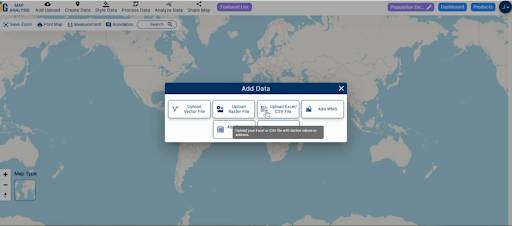
1.Click on the “Add Data” Button and choose “Upload CSV or Excel File” option.
2. You can see “Upload CSV or Excel File” and here choose you csv file and upload it.
Step 4: Configure Grid Parameters
Define the parameters of your grid within MAPOG, tailoring it to the specific characteristics of your dataset.
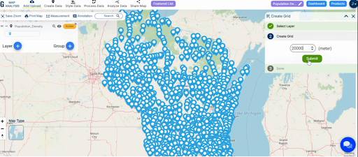
1. Click on the “Process Data” option and choose “Create Grid” option.
2. Set your grid range – 20000
3. click on the “Submit” Button.
Step 5: Apply Heat Map Style
Utilise MAPOG’s heat map styling options to visually represent population density, transforming your grid into an insightful and visually compelling map.
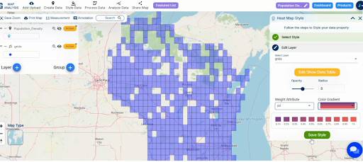
1. Click On the “Style Data” option and choose “Heat Map Style“.
2. Here Choose the attribute and select the color Gradient.
3. Click on the “Save Style” option.
Step 6: Analyse and Interpret
Conduct a thorough analysis of the resulting map, extracting meaningful insights and patterns revealed by MAPOG’s visualisation tools.
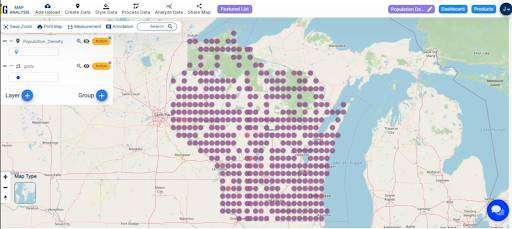
Result and Analysis:
Examine the resulting population density map, interpreting the patterns and insights unveiled by MAPOG’s visualization tools.
Findings:
The journey through population density mapping with MAPOG reveals profound insights into the distribution of settlements. Patterns emerge, highlighting areas of high and low population density, and providing a visual representation of the state’s demographic landscape.
Beneficial Domains:
The implications of population density mapping extend across diverse domains
- Urban Planning: Optimize city layouts and resource allocation for sustainable development.
- Environmental Sciences: Understand the impact of population distribution on the environment and promote eco-friendly practices.
- Healthcare Planning: Strategically allocate healthcare resources based on population density insights.
- Government and Policy: Inform governmental decisions and policy formulation with spatial population data.
The utilization of MAPOG for population density mapping offers a transformative perspective on spatial dynamics. The precision of the grid, coupled with the elegance of MAPOG’s heat map styling, empowers decision-makers across various domains.
Link of the Data:
Explore the data further through our GIS Data product, uncovering valuable information for in-depth analysis and understanding.