Dive into the world of Disability Population Heat Map Analysis, where advanced mapping techniques provide district-wise insights with ease. By leveraging heat maps, we simplify complex data interpretation, offering a clear visual representation of disability distribution. This approach empowers policymakers, urban planners, and organizations to make informed decisions for improved accessibility and resource allocation. Explore how MAPOG’s intuitive heat mapping solution transforms demographic analysis into actionable insights.
Key Concepts
District-wise insights effortlessly with heat maps, showcasing population distribution for easy disability analysis. By this we can overcome the challenge of complex data interpretation with MAPOG’s intuitive heat mapping solution, simplifying demographic analysis for informed decision-making.
Steps to create Easy Disable Population Analysis Using Heat Maps for District-Wise Insights
Step 1: Upload Disabled Population data
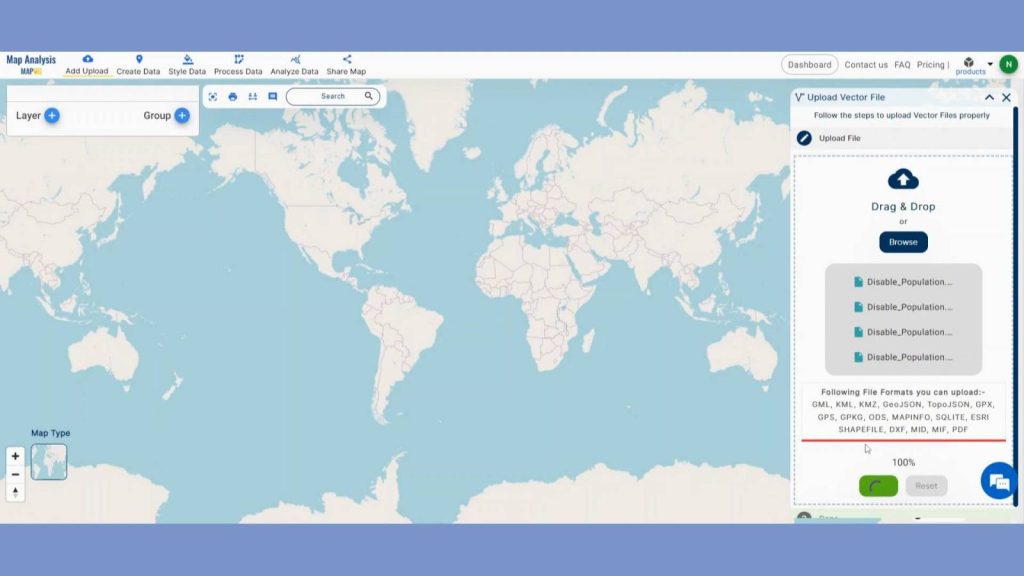
First, navigate to the Map Analysis interface. Then click on the “Add upload” button in the upper left corner. A dialogue box will open. Click on “Upload Vector File” to add data.
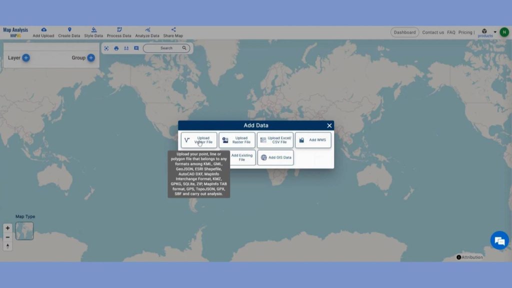
A box will open on the right side of the screen, select Browse option to browse the District wise disabled population data & click Upload to upload the data.
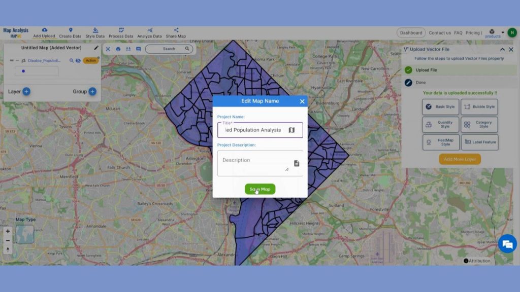
Step 2: Save Project
Now, click on the pencil icon situated right after the “Untitled Map” text to save the project. In the dialogue box write proper name and description that describe the project accurately. And click on save map option. Your project will be saved.
Dive into the world of population density mapping with a twist: Enhance your insights by integrating WMS data. Explore the benefits and learn how to elevate your analyses in ‘Create Population Density Map: Add WMS Data’.
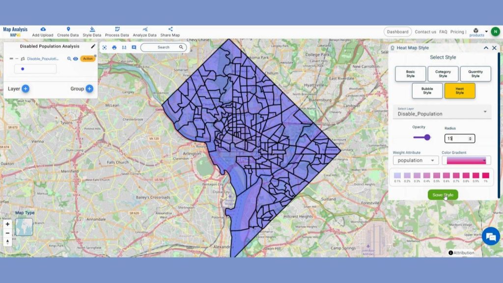
Step 3: Add Thematic Style
Enhance the visualization of district Area and using style data option in the header. Click on Heat Map option.
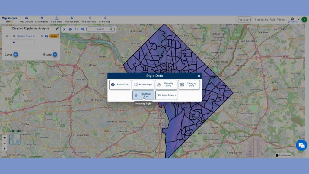
In data selection select the district layer. Select the Population with disability attribute. MAPOG gives opportunity to reclassify radius, opacity and change the colors of layer. Click on save style after you are satisfied with your changes.
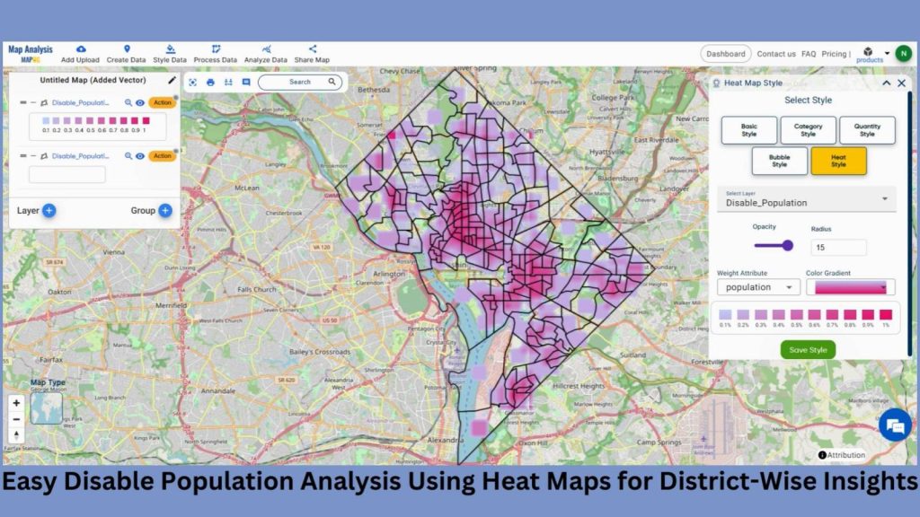
Step 4: Results & Analysis
The final map presents a clear visual representation of population distribution, allowing for easy identification of areas with higher concentrations of disabled individuals at the district level. Heat maps provide intuitive insights, aiding in targeted resource allocation and accessibility planning for improved inclusivity and support.
Discover the hidden impact of pollution with a heatmap-style map pinpointing affected regions. Uncover the insights in ‘Create a Map to Identify Pollution-Affected Regions‘ for a deeper understanding of environmental concerns.
Major Findings
1. Concentration of Disabled Population: Heat maps reveal hotspots of disabled population density within districts, aiding in the identification of areas with higher demand for disability services and infrastructure.
2. Spatial Disparities: Analysis of heat maps uncovers spatial disparities in disability prevalence across districts, highlighting regions requiring targeted interventions and resource allocation for equitable access to services.
3. Accessibility Mapping: By overlaying heat maps with transportation networks and amenities, insights can be gained into the accessibility challenges faced by disabled individuals, informing urban planning and policy decisions for inclusive development.
Domain and Industry
This map is a powerful tool for Accessibility Planning, Healthcare Services, Tourism and Urban Development and beyond.
Dive into the art of mapping and coloring country regions with category-wise styles, elevating your cartographic creations! Explore ‘Mapping and Coloring Regions of Country – Category Wise Style Your Map‘ for a vibrant journey in cartographic design.
Questions
1. How does the utilization of heat maps in GIS aid in visually representing population distribution for disability analysis at the district level?
2. What are the advantages of employing heat maps in GIS for visualizing population density in different districts, particularly in the context of disability analysis?
3. How can GIS-based heat maps provide valuable insights into the geographic distribution of population density, facilitating targeted interventions and resource allocation for disability services across various districts?
Conclusion
In conclusion, employing heat maps for district-wise population analysis offers a straightforward approach to understand population distribution for disability considerations. This visual tool enables quick identification of areas with higher population density, aiding in targeted interventions and resource allocation for disability support services.
Here are some other blogs you might be interested in