The difficulty of visualizing and analyzing earnings data is addressed in “Easy Income Analysis Using Thematic Maps for County-Wise Insights,” where we use quantity thematic styling to depict earnings across several geographic counties.
Key Concepts
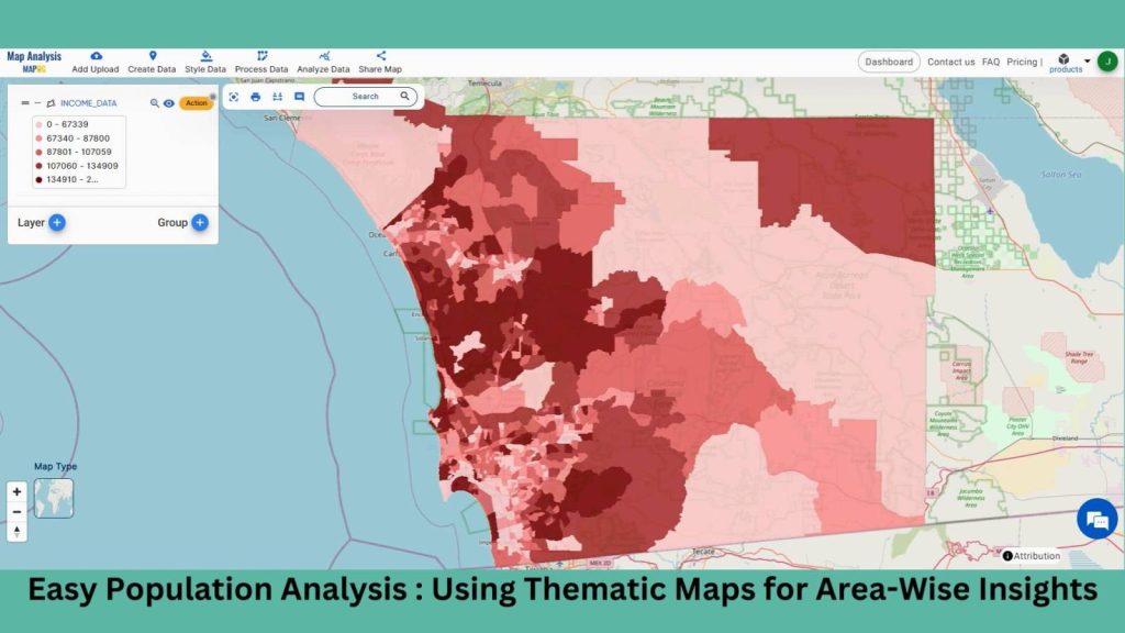
Using quantity thematic design to visually display the income distribution across geographic blocks, the county-Wise Earnings Analysis in MAPOG offers insights for well-informed decision-making in a variety of sectors.
Steps to create Easy Income Analysis Using Thematic Maps for County-Wise Insights
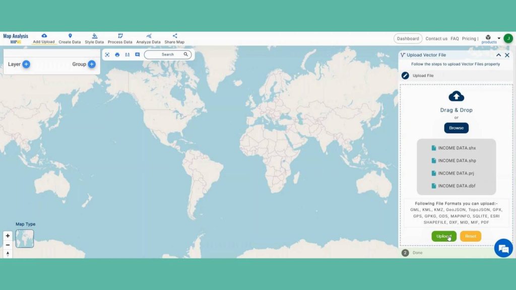
Step 1: Upload Income data
Go to the Map Analysis interface first. Next, select the “Add upload” option located in the top left corner. There will be an opening dialogue box. To add data, click “Upload Vector File.”
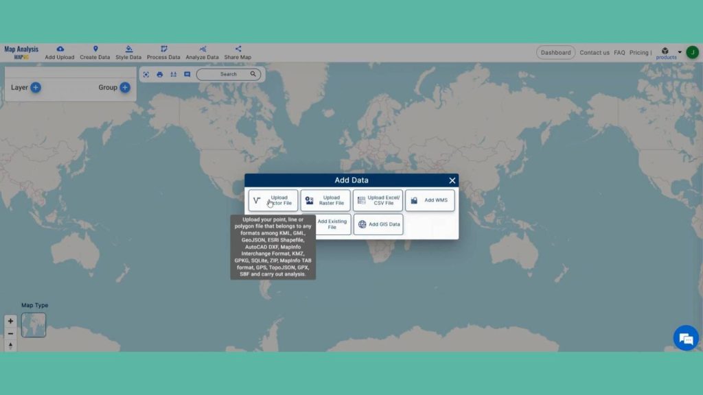
A box will open on the right side of the screen, select Browse option to browse the County-wise income data & click Upload to upload the data.
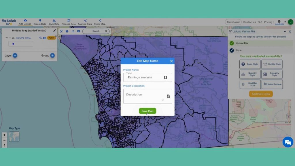
Step 2: Save Project
Now, click on the pencil icon situated right after the “Untitled Map” text to save the project. In the dialogue box write proper name and description that describe the project accurately. And click on save map option. Your project will be saved.
Create a sustainable future with landfill optimization using spatial analysis techniques. Dive into how buffers, split polygons, and grid creation revolutionize waste management strategies in “Create Map for Landfill Optimization: Spatial Analysis Approach”
Step 3: Add Thematic Style
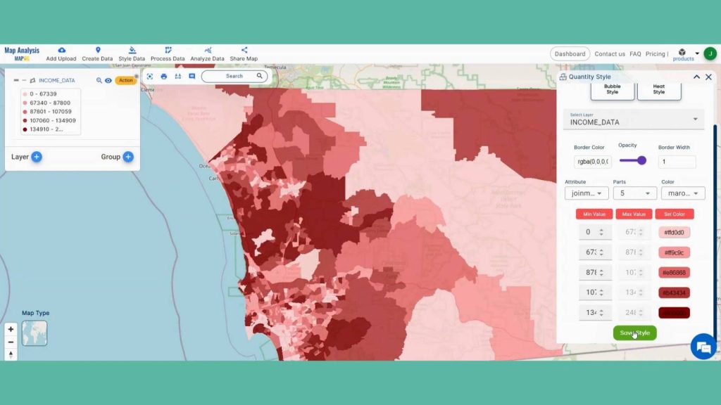
Enhance the visualization of County Area and using style data option in the header. Click on Quantity Style option.
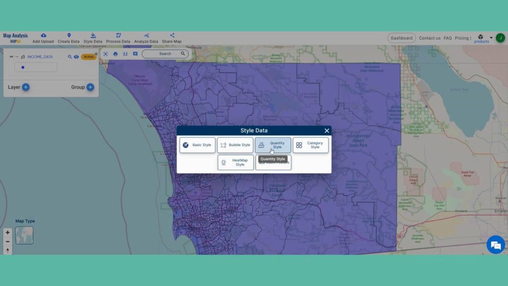
In data selection select the county layer. Select the Income attribute. MAPOG gives opportunity to reclassify attributes and change the colors of layer. Click on save style after you are satisfied with your changes.
Step 4: Results & Analysis
Thematic maps created in MAPOG reveal county-wise income disparities with clarity, aiding in insightful spatial analysis. The quantity style visualization provides a nuanced understanding of income distribution, facilitating informed decision-making for socioeconomic policies and resource allocation.
Explore the art of mapping natural wealth! Delve into “Creating Quantity Style Map: Styling Natural Wealth” to visually showcase abundance and distribution, unlocking insights into resource management and conservation.
Major Findings
1. Income Disparities: Thematic maps reveal significant income disparities across counties, highlighting regions of affluence and poverty for targeted intervention and policy planning.
2. Spatial Patterns: Patterns of income distribution emerge, indicating urban-rural divides, economic corridors, and areas of concentrated wealth or deprivation, aiding in socioeconomic analysis and resource allocation.
3. Regional Disparities: Thematic mapping unveils regional variations in income levels, providing valuable insights for economic development strategies, social welfare programs, and equitable resource distribution.
Domain and Industry
This map is a powerful tool for Retail Industry, Real Estate Sector, Tourism and Hospitality and beyond.
Explore the world of literacy rates with our captivating guide! Learn how to create compelling maps using quantity styles, shedding light on educational disparities worldwide in ‘Create Map on Literacy Rate’.
Conclusion
In conclusion, employing thematic maps with quantity styles in MAPOG facilitates a straightforward income analysis, offering valuable county-wise insights at a glance. This visualization method aids in identifying income disparities and informing targeted socioeconomic policies for equitable development.
Check Out MAPOG App on Play Store
Here are some other blogs you might be interested in