GIS plays a crucial role in air quality monitoring and pollution control. It maps sources, tracks emissions, and Identifies Hotspots for better decision-making. GIS supports in Air Quality mapping, Urban Planning, Evaluates Control Measures, and helps reduce key pollutants like PM, NOx, SO2, CO, O3, and VOCs through technology and regulations, promoting sustainability.
Key Concept in Air Quality Monitoring with GIS
Monitoring air quality relies on data, sensors, GIS mapping, and historical trends. Key factors include pollution sources, emission levels, hotspots, and regulatory compliance, ensuring informed decisions for effective pollution control and public health protection.
How to Map Air Quality Data ?
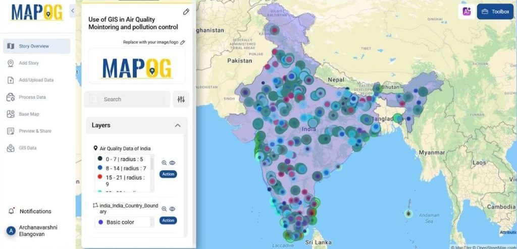
Creating an air quality monitoring map with MAPOG is straightforward. By using a Bubble Tool, we can can generate “AQI Index Maps” and conduct “Pollution Impact Analysis“. MAPOG enables customization of visual elements, enhancing data interpretation and decision-making.
Steps to Create an Air Quality Monitoring Map
1. Select Your Information
- First, gather all the necessary air quality data.
- This may include survey results, pollutant concentrations, or geographic locations of monitoring stations from GIS data in MAPOG.
- Utilize government databases, environmental reports, and monitoring networks for enhanced accuracy.
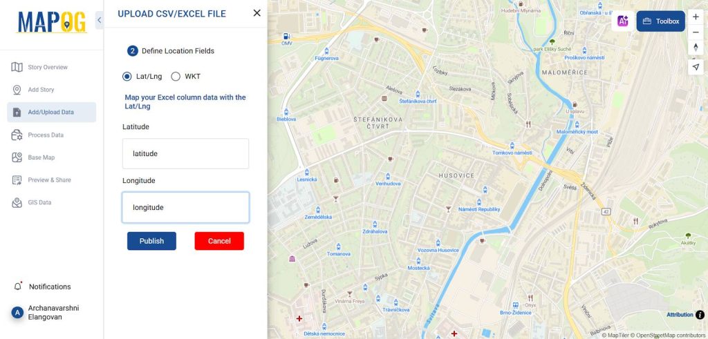
2. Upload or Enter Your Information
- You can manually input your data or, more efficiently, Upload a CSV file with your Data .
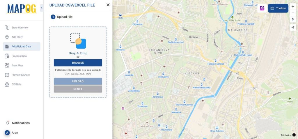
- Which includes location coordinates and pollutant levels.
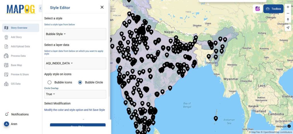
3. Choose a Bubble Tool
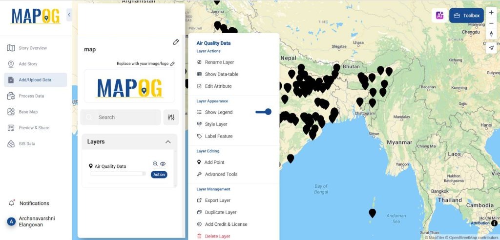
- Select the action to be taken as a Style layer as Bubble.
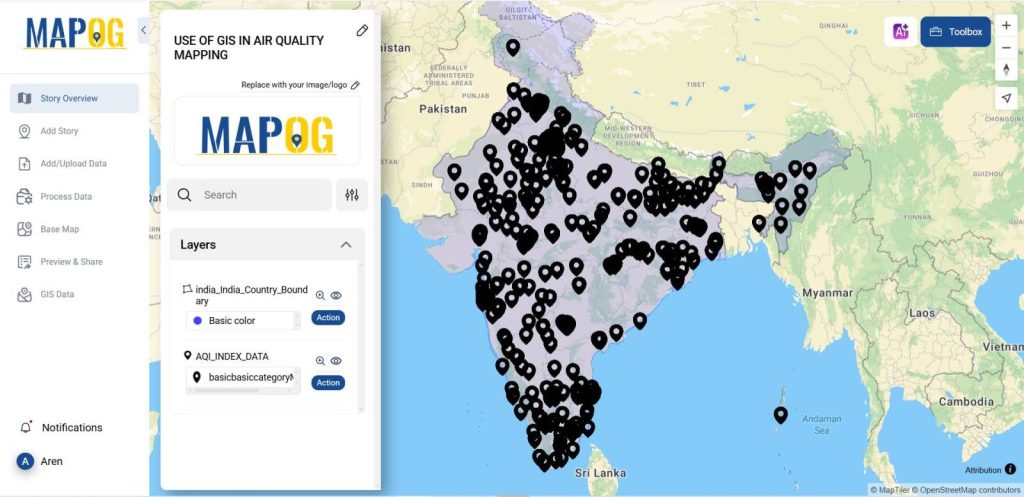
4. Upload Boundary Layer
From the GIS data library add the Boundary layer of the country. By selecting GIS Data>> Select the country >> Boundary layer.
5. Personalize Your Map
- Customize your map by adjusting features like layers, opacity, and color gradients to enhance visual accessibility and engagement.
- These modifications help highlight air quality patterns, making complex data easier to interpret.
- A well-designed map improves communication, raises public awareness, and supports informed decision-making for environmental policies and air quality improvements.
6. Analyze and Disseminate
- After building your map, analyze the visualized data for trends and insights.
- Once creating a map displaying air quality data, can share it with your audience or stakeholders to raise awareness and support informed decision-making.
- Visualizing air pollution levels helps communities understand environmental impacts, prioritize interventions, and implement policies to improve air quality, promoting healthier living conditions for all.
Major Findings in Data Mapping for Air Quality:
Air quality mapping identifies pollution hotspots, Air Quality Index mapping, emission sources, and historical trends. It enables data monitoring, aids urban planning with green spaces and filters for effective pollution control and sustainability.
Industry and Domain:
- Environmental organisations, urban planning, healthcare, transportation, industry, agriculture, energy, research, real estate, and disaster management all employ air quality mapping.
- It helps monitor pollution, optimize green spaces, regulate emissions, assess health impacts.
- It ensures compliance, and support sustainability, aiding decision-making across multiple industries for cleaner air and better public health.
GIS Data Used
For the process the data are added from the GIS data library on the website are mentioned below:
Conclusion
Air Quality Index mapping enhances pollution control by identifying hotspots, tracking emissions, and analyzing trends. It supports urban planning, policymaking, and sustainability efforts, ensuring healthier environments and improved public health through data-driven decision-making.
- How to Use Convex Hull for Contagious Disease Mapping & Outbreak Control
- Isochrone Analysis in GIS: Optimize Travel Times for Faster Delivery & Urban Planning
- How to Geocode Excel Data and Create an Interactive Map (Step-by-Step Guide)
- Creating Point Data for Urban Planning: Digitizing Settlement Features & Infrastructure Mapping
Final thoughts
Creating a monitoring map with MAPOG is simple and easy, making it accessible for individuals, educators, or organisations looking to share insights about air quality. Have you ever tried creating a monitoring map? If so, what was your experience like? It’s a fantastic way to engage with your audience and visually explore data.