In this article, we will explore how to create and analyze heat maps to understand disease spread, specifically focusing on COVID-19 death rates. Utilizing the powerful MAPOG Map Analysis tool, we’ll walk through the process of visualizing data using heat maps, making it easier to identify patterns and make informed decisions. This step-by-step guide will demonstrate how to leverage MAPOG‘s capabilities to create insightful and visually appealing maps that highlight the intensity of the disease across different regions.
MAPOG Map Analysis isn’t just for disease tracking; it has versatile applications across various domains. In urban planning, it helps visualize population density and infrastructure needs. In environmental science, it can map areas affected by pollution or deforestation. In marketing, businesses can analyze consumer behavior and optimize their strategies. By exploring MAPOG’s diverse functionalities, you can unlock powerful insights across multiple fields.
Key Concept
A heat map is a data visualization tool used in Geographic Information Systems (GIS) to represent the intensity or density of data across a geographical area using color gradients. This technique transforms complex datasets into intuitive visual formats, highlighting patterns and trends. MAPOG Map Analysis enhances heat map creation, aiding in various domains such as public health for tracking disease spread, urban planning for visualizing population density, environmental science for mapping pollution, marketing for analyzing consumer behavior, and disaster management for assessing impacted areas. By leveraging MAPOG’s capabilities, users can make informed decisions and uncover valuable insights from spatial data.
Step-by-Step Process
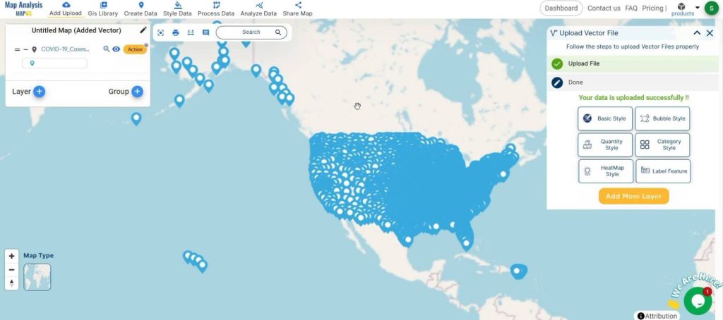
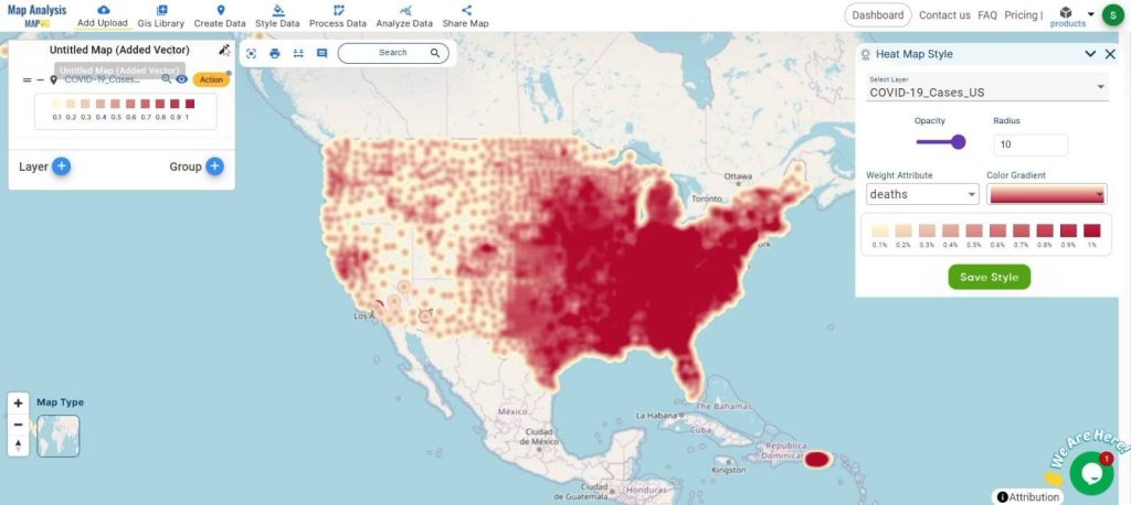
Add GIS Data:
- Begin by uploading your GIS data into the MAPOG Map Analysis tool. This dataset should include relevant information about COVID-19 deaths in the region of interest. Ensure your data is clean and formatted correctly for accurate analysis.
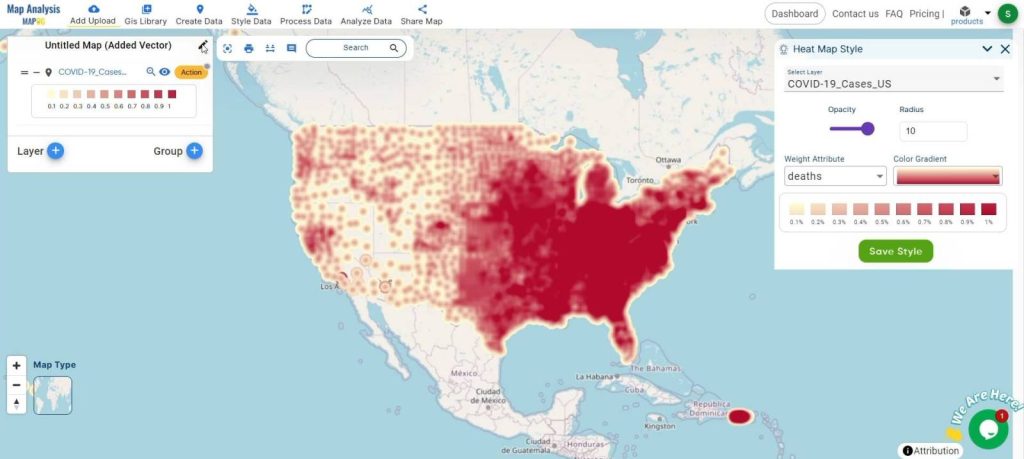
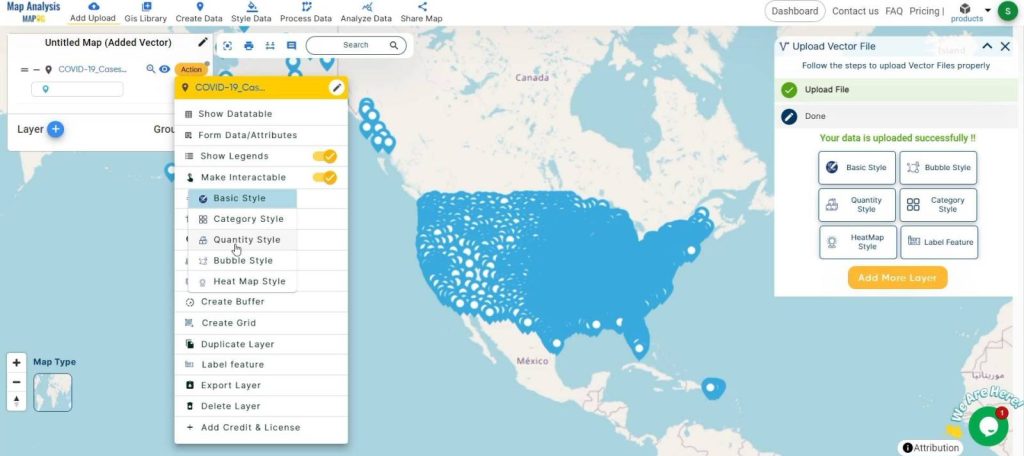
Apply Heat Map Style Tool:
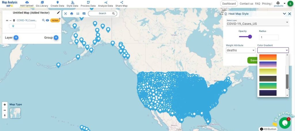
- Use the Heat Map Style tool within MAPOG to visualize your data. Select your COVID-19 death dataset and apply the heat map style. Adjust the color gradients to represent different intensity levels, with darker shades indicating higher death rates and lighter shades indicating lower death rates.
Customize Visualization:
- Customize your heat map by adjusting parameters such as color schemes, intensity thresholds, and map overlays. This step allows you to highlight specific patterns or areas of interest more effectively.
Share and Collaborate:
- Once your heat map is complete, use MAPOG’s sharing features to distribute the map to stakeholders. Collaborate with colleagues and public health officials to discuss findings and plan interventions.

Key Findings:
Using MAPOG Map Analysis, critical insights were gleaned to combat the COVID-19 pandemic. Hotspots of high death rates were pinpointed, guiding targeted resource allocation and intervention strategies. Analysis revealed distinct trends in death spread over time, aiding in evaluating public health interventions’ effectiveness. Geographical and socio-economic correlations were uncovered, enabling tailored responses to affected regions. MAPOG facilitated efficient resource allocation by prioritizing high-impact areas, optimizing medical supply distribution. Additionally, visual representations enhanced public awareness, fostering compliance with health guidelines.
Domains and Industries Benefiting
- Healthcare
- Urban Planning
- Environmental Science
- Marketing
- Disaster Management
Conclusion
In conclusion, MAPOG Map Analysis emerges as a versatile and indispensable tool in the fight against disease spread, exemplified by its role in visualizing COVID-19 death rates. Through the creation of heat maps, MAPOG facilitates the identification of hotspots, trends analysis, and efficient resource allocation, ultimately aiding in informed decision-making and strategic planning. Beyond healthcare, MAPOG finds application in diverse domains such as urban planning, environmental science, marketing, and disaster management, underscoring its significance as a transformative technology for spatial data analysis. As we navigate through complex challenges, MAPOG remains an invaluable asset, empowering stakeholders to unlock insights and drive positive change in their respective fields.
If you have any questions or need assistance, please don’t hesitate to reach out to us at support@mapog.com. Thank you for joining us on this journey, and we invite you to explore the diverse applications of MAPOG in your own projects.
Other Articles
- Create a Map to find suitable sites for constructing a new house
- Create Map for Analyzing Water Quality using Heat Map Style
- Create Map – School Map Area Coverage Through Buffer Analysis
- Mapping Safety Create GIS Map : Game-Changing Approach to Hospital Risk Analysis
- Create Map for Real Estate Developer for Best Site Selection
- Create Map for Landfill Optimization: Spatial Analysis Approach