Forest Cover Maps a fundamental tool within GIS, serves as a potent visualization method. It utilizes colors to represent the density or intensity of data across a geographic area, offering valuable insights into various phenomena.
Key Concept to Creating Forest Cover Maps: Using Heat Map Style
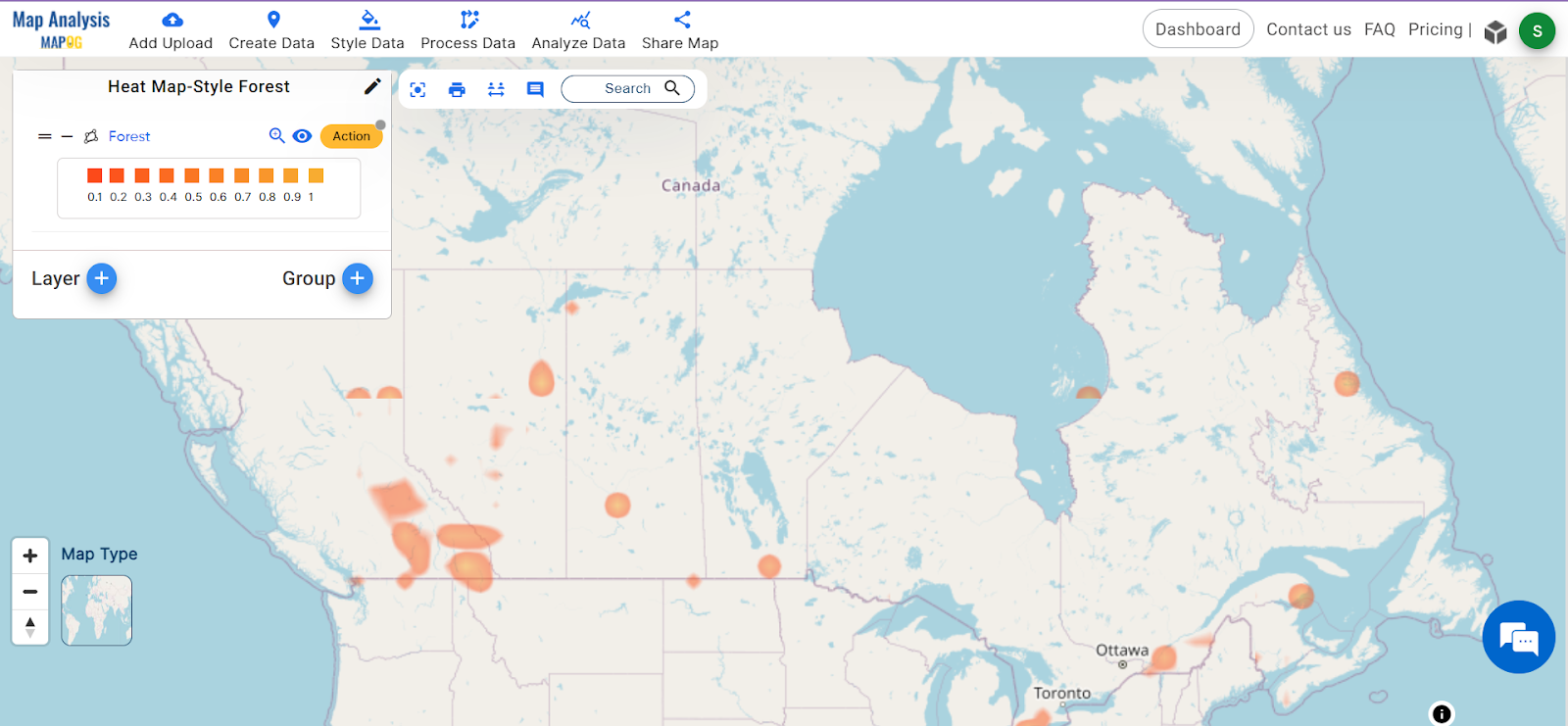
Heat maps are super helpful when we want to understand nature better, like forests. By looking at these maps, we can figure out where forests are thick or thin, helping us make smart decisions about protecting nature and planning how to use land. Additionally, readers can access the provided data at the end of this article. Moreover, explore other blogs, such as “GIS Analysis in Urban Planning: Reshaping Transportation Future Insights of state/city” and “Make Routes for Military Aerial Planning- Through Bearing angle and Distance calculation – Online Route Compass” for additional insights and applications.
MAPOG Map Analysis, a simple tool designed to simplify the creation and interpretation of heat maps.
Unlocking the power of understanding forest cover through heat map styling becomes simple with our advanced navigation tool for armies and rescue teams, following a step-by-step process. Let’s illustrate with an example of creating a heat map.
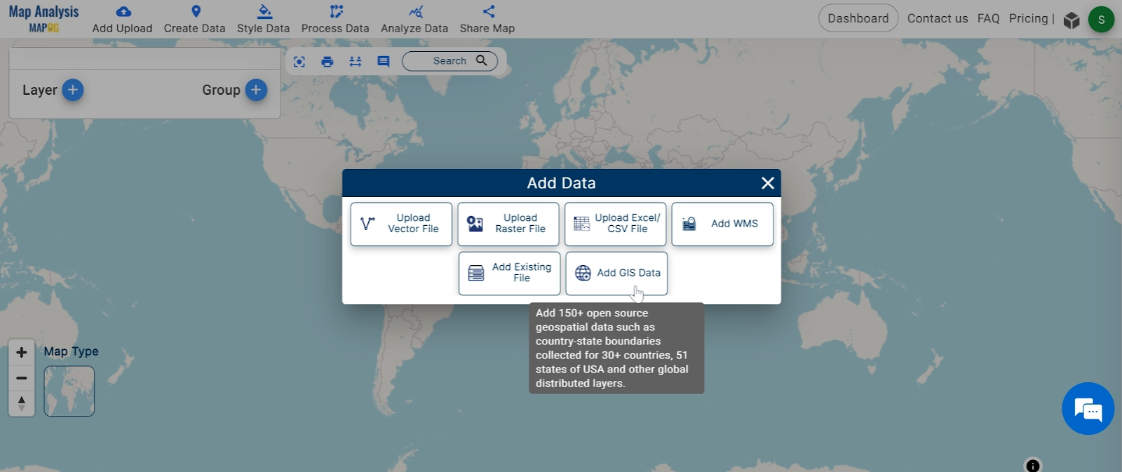
Step1: The first step is to add our GIS data, which includes information about forest cover in the region of interest.
1.Click On the “Add Upload” button and choose the “Add GIS Data” option.
2.Search the country name
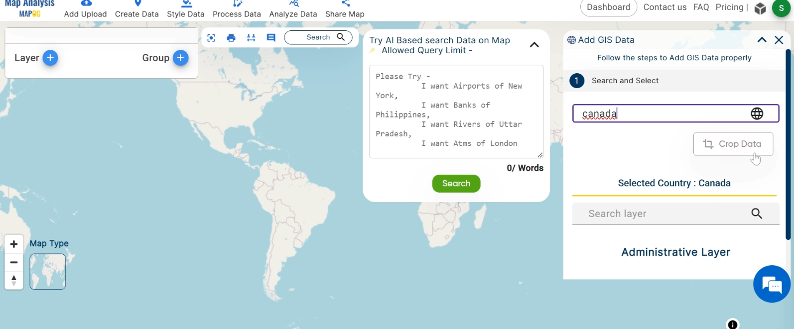
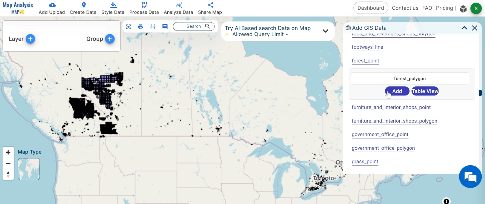
3.Add the Forest and Water Body Data. Click on the “Add” Option.
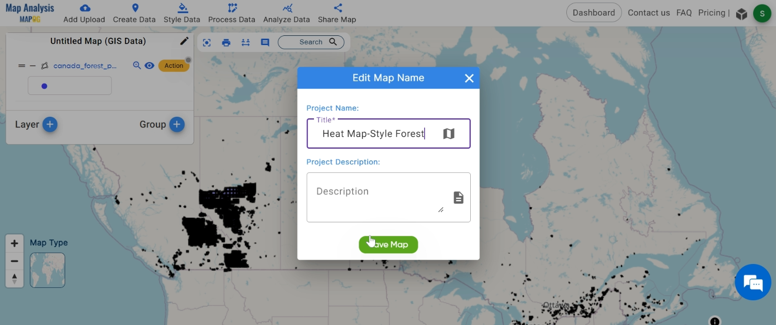
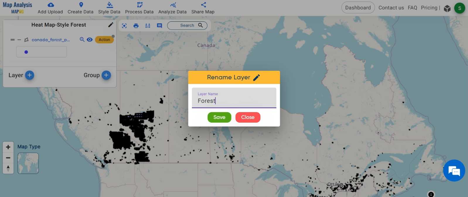
Step 2: Name the untitled map and Rename the layer:
1.Here you have to name the untitled map
2.Rename the layer
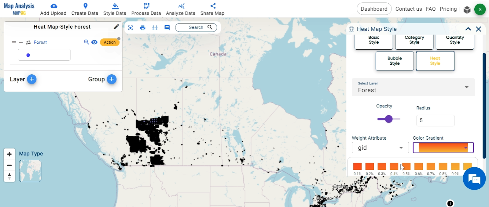
Step3: Here’s where the Heat Map Style tool comes into play. By applying this tool to our forest cover data, we can visualize the area of trees in a way that’s both informative and visually appealing.
1.Click on the ‘Style Data‘ button and choose the “Heat Map Style” option.

2.You can see the “Heat Map Style” Tool successfully opened on the right side of the screen.
Here, select the layer. then change the colour and click on the “Save Style”.
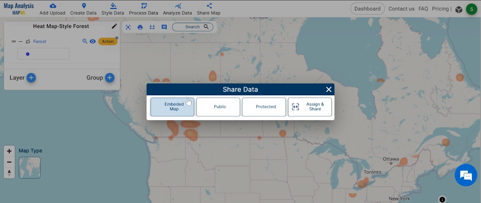
Step4: We can easily share it with others for further analysis or presentation.
Major Findings:
With heat maps made using MAPOG Map Analysis, we can learn a lot about forests. These maps help us see where forests are most dense, guiding us to make smart decisions about taking care of our environment.
Conclusion:
Heat maps are awesome tools in GIS that help us understand data better. With MAPOG Map Analysis, anyone can make cool maps to solve problems and protect nature.
Link of the Data:
Explore the data further through our GIS Data product, uncovering valuable information for in-depth analysis and understanding.
Exploring Our Previous Blogs: