Interactive maps are powerful tools for visualizing data in a way that’s easy to understand and engaging. Style Maps by Categories or Quantities in MAPOG allows you to highlight trends, differences, and relationships effectively. Whether you’re mapping demographic data, business insights, or geographical patterns, the ability to customize styles is crucial for making your data shine.
Introduction to Map Styling
Map styling is the process of applying visual differentiation to elements on a map. Categories refer to distinct groups (e.g., types of land use like residential, industrial, or agricultural), while quantities focus on numerical values (e.g., population density or rainfall levels). By styling maps, you can:
- Create visually appealing presentations.
- Make complex data easier to interpret.
- Highlight specific insights relevant to your audience.
Discover how Isochrone Maps for Business Growth & Location Planning can help you pinpoint the best locations for expansion, optimize service areas, and enhance customer accessibility. MAPOG’s Isochrone Tool makes it easy to visualize travel times and uncover hidden opportunities.
Here’s a step-by-step guide to styling maps by categories or quantities, tailored to platforms like MAPOG.
Steps to Style Maps by Categories or Quantities
1. Prepare Your Data
Before diving into styling, ensure your data is organized and uploaded properly. You’ll need:
- Quantitative Data: Examples include numerical metrics like sales figures or rainfall.
- Categorical Data: Examples include region names, land use types, or customer segments.
2. Define Styling Rules
Styling rules determine how your map elements look. For categories:
- If you’ve already prepared your data, you can upload them or else you can add the layer instantly and start working on it with MAPOG.
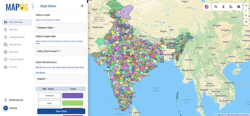
- After adding a layer, go to the action button and select style layer, then select “Category Style” from the Select Style option.
- Assign unique colors or patterns to each group and save the style (e.g., red for urban areas, green for parks).
For quantities:
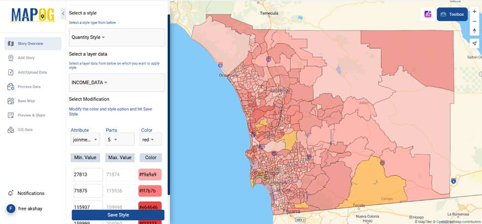
- The process is the same for “Quantity Style” also, just select quantity style from the select style drop down menu.
- Select the attribute you want to visualize and use graduated color scales to represent different ranges (e.g., darker shades for higher populations).
3. Preview and Adjust
Always review your styled map to ensure clarity and relevance. In MAPOG, the real-time preview feature lets you adjust styles seamlessly to achieve the desired impact.
Want to turn raw GIS data into interactive maps effortlessly? A Beginner’s Guide to Mapping GIS Data Online walks you through MAPOG’s powerful GIS tool, helping you upload, visualize, and customize spatial data with ease.
Tips for Effective Map Styling
- Keep it Simple: Avoid overwhelming your audience with too many colors or patterns.
- Choose Contrasting Colors: Ensure categories or ranges stand out clearly.
MAPOG is a great choice for creating compelling, data-driven maps. Explore how its intuitive tools can transform your mapping projects into engaging visual stories.
Conclusion
Styling maps by categories or quantities doesn’t have to be complicated. By organizing your data, defining clear styling rules, and leveraging platforms like MAPOG, you can style maps by categories or quantities in MAPOG to create visually impactful maps tailored to your needs.
Have you styled a map for your project? Share your experiences or tips in the comments below!
Here are some other blogs you might be interested in
- Protecting Wetlands: Guide to Create GIS Map for Nature
- Mapping Tiger Attack Hotspots – Create an Online Map and Share
- Make Routes for Military Aerial Planning- Through Bearing angle and Distance calculation – Online Route Compass
- Mapping Healthcare Efficiency: GIS Buffer Analysis of Hospital Locations
- Add WMS- Two step online view of WMS layer on a map
- Plot ATM locations on a map and embed on your website
- Map habitat locations of endangered animals & keep track of their living