In recent years, the importance of disease surveillance has been underscored by various global health challenges, including pandemics and emerging infectious diseases. Disease surveillance plays a pivotal role in public health management, enabling the timely detection, monitoring, and control of infectious diseases. MAPOG is a powerful tool for health authorities to augment traditional surveillance methods. This article explores the utilisation of MAPOG in disease surveillance by mapping outbreaks, focusing on its capabilities in mapping disease occurrences and delineating affected areas for targeted interventions.
Key Concept– Mapping Disease outbreak
MAPOG facilitates the spatial representation of disease occurrences by plotting reported cases on the map. Then, MAPOG Point to Polygon tool helps to delineate the area affected by each outbreak from the plotted locations on the map. Expand your reading horizons with our blog’s diverse array of articles, including Mapping Safety Create GIS Map: Game-Changing Approach to Hospital Risk Analysis, and thought-provoking articles like Fast Emergency Response: Using GIS and Isochrone Maps for 10-Minute Ambulance Arrival, offering an enriching journey through our platform.

Follow the below process Step-by-step for Mapping Disease outbreak
Step 1: Open Map Analysis
Open Map analysis interface from MAPOG platform.
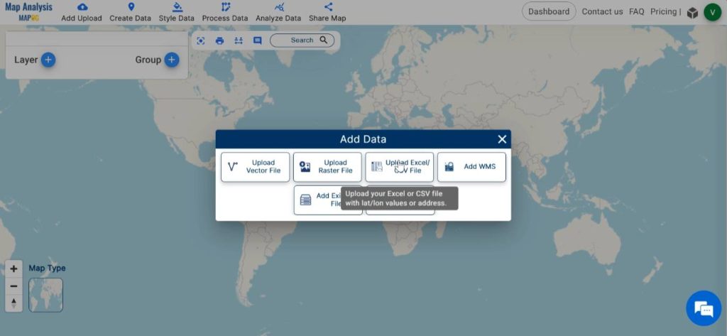
Step 2: Upload data
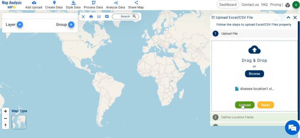
Begin by adding the data of disease outbreak locations to the map. For this click on the Add Upload option from the menu bar at the upper left end, and then go to the Upload Excel/ CSV Files option.
Browse for the file stored in the system containing disease outbreak location data.
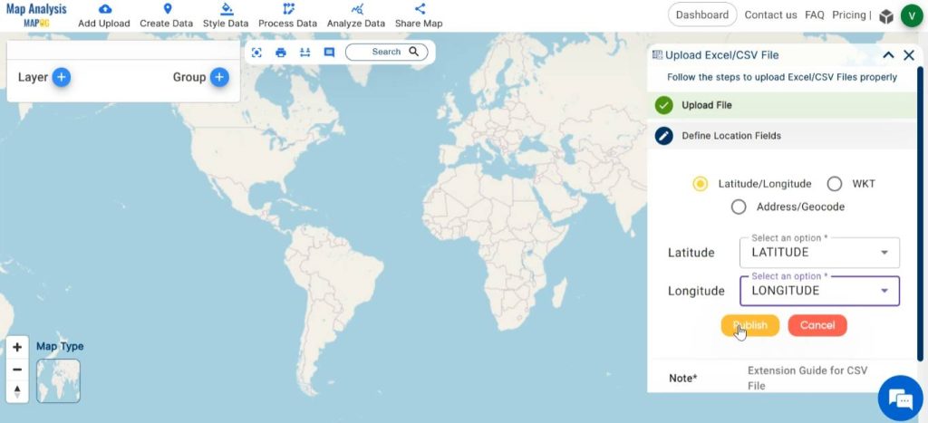
The file may contain location data in various formats such as latitude-longitude, WKT, or addresses. Depending on the type of data available in the file, choose the suitable format for the location field. Then, locate and designate the column header in the Excel sheet that holds the corresponding data. Here, we are uploading a file having latitude and longitude data. So, in the location field select latitude and longitude. Lastly, click on “publish” to showcase the CCTV points on the map.
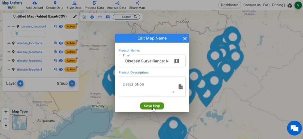
Step 3: Save map
To save your map, select the pencil icon adjacent to the “Untitled Map” label. Enter an appropriate name for your map, and optionally, include a description of your project. Upon completion, save the map by selecting the “Save Map” button.
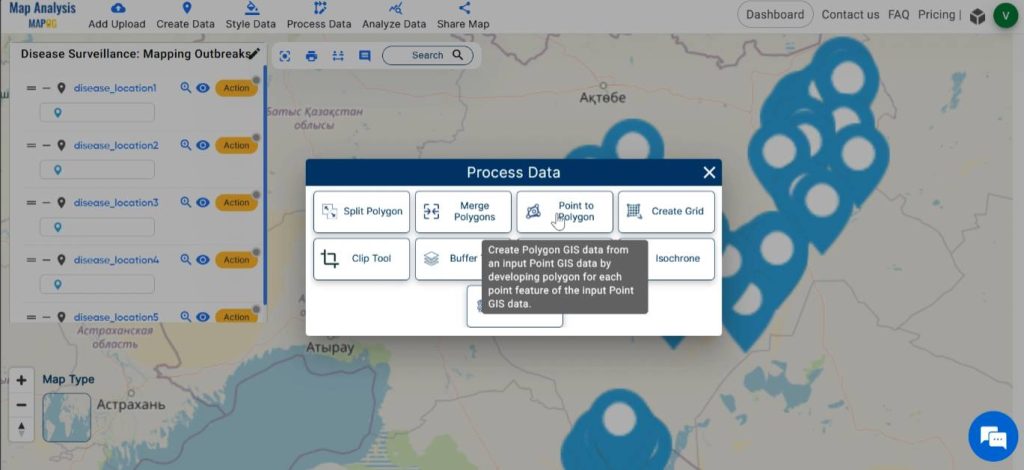
Step 4: Delineate the Area
In order to identify the regions that are affected by disease, click on Process Data and select the Point to Polygon tool.
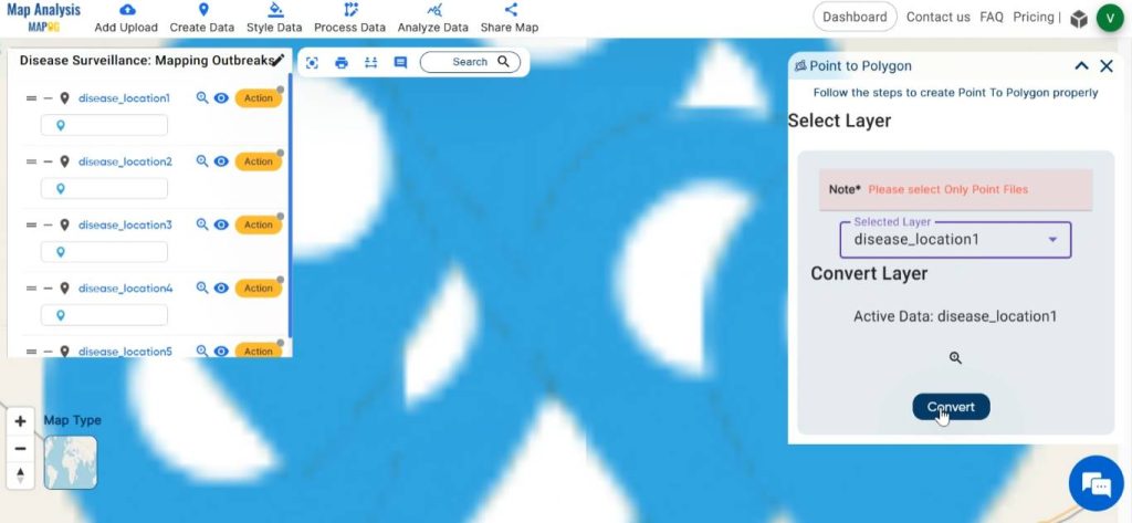
Select the disease location in the given tab and click on convert. Do the same for each of the layers containing disease location data.
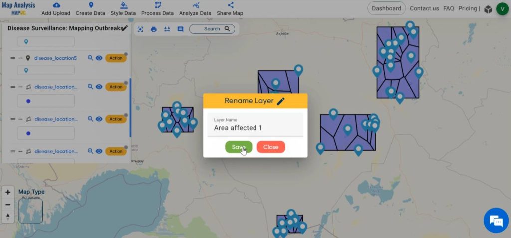
Step 5: Rename the Layers
To rename the layers, initiate by clicking on “Action” and then proceed to select the pencil icon. Subsequently, input the suitable name for the layer and then click on Save.
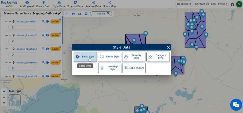
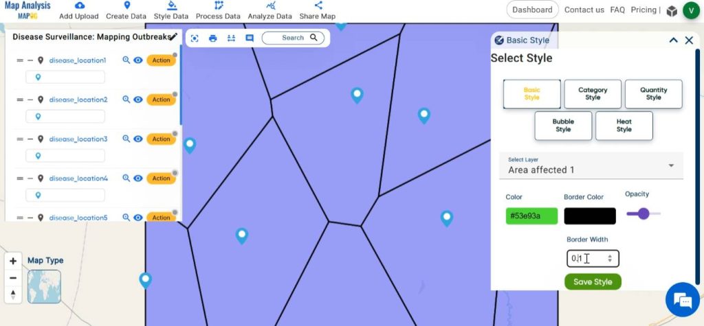
Step 6: Enhance the Map
To enhance the visual representation of the map let us style the map. For this, click on Style Data and select Basic Style.
Select the created polygon layers one by one. Choose suitable colour gradients for each layer. Adjust border width and opacity as desired. Finalise the changes by clicking on Save style.
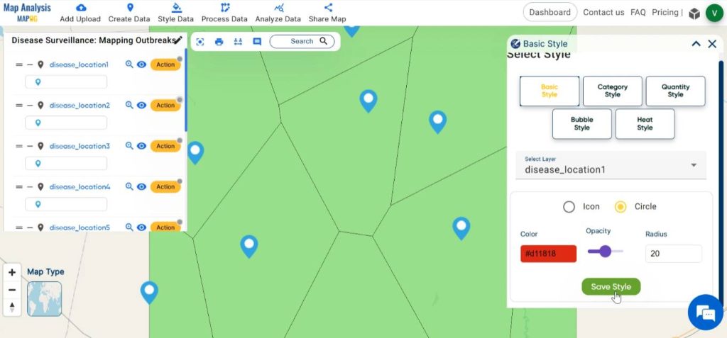
Next, select the disease location layers one by one. You have the option to either pick a fitting icon from the provided list or upload your own icon. Alternatively, you can style with an icon circle. Select the colour for the icon and then adjust the radius and opacity as needed. Once done, confirm the changes by clicking Save Style.
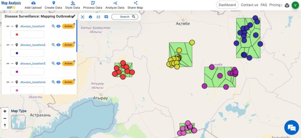
Finally, utilising the MAPOG tools, we have generated a map illustrating the locations of disease outbreaks and the impacted areas.
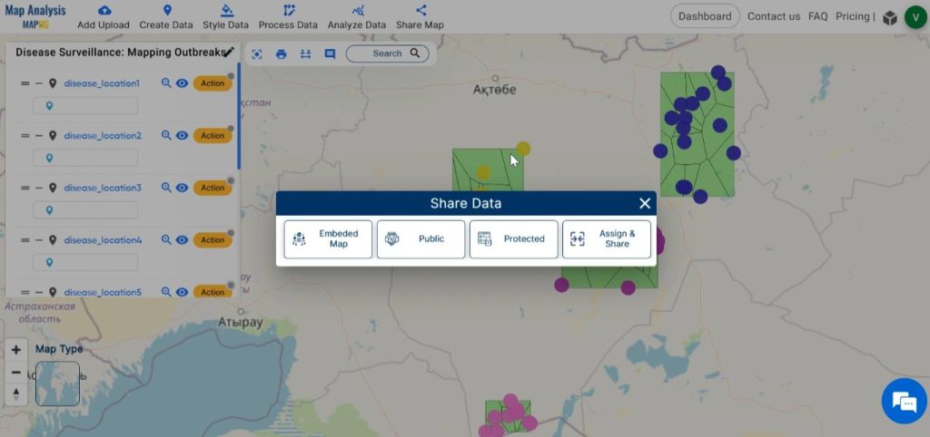
Step 7: Share the Map
Using the Share tool, share the map with your friends or post it on social media.
Major Findings
- Visual Insights: This map provides intuitive visual insights into the spatial distribution of diseases, enabling health authorities to identify high-risk areas and prioritise interventions.
- Precision Targeting: This enables precise targeting of interventions, ensuring that resources are directed to areas with the greatest need.
- Epidemiological Understanding: Spatial analysis of affected areas provides valuable insights into disease transmission dynamics and risk factors.
Industry and Domain
- Public health officials: This map can gain insights into the spread and distribution of diseases. Thus, enabling them to identify high-risk areas, allocate resources effectively, and implement targeted intervention strategies.
- Researchers: This analysis of disease locations is valuable for understanding patterns of disease transmission and developing more effective prevention and control measures.
Conclusion–Mapping Disease outbreak
In the realm of disease surveillance, MAPOG serves as a powerful tool for visualising, analysing, and responding to public health threats. By plotting disease locations and delineating affected areas, MAPOG tools facilitate informed decision-making and proactive interventions.
Explore more content on our blog:
Protecting Wetlands: Guide to Create GIS Map for Nature
GIS Analysis in Urban Planning: Reshaping Transportation Future Insights of state/city
Fast Emergency Response: Using GIS and Isochrone Maps for 10-Minute Ambulance Arrival