Delve into GIS mastery with MAPOG as we guide you through ‘Creating Population Range Maps with GIS: A Step-by-Step Guide.’ Uncover spatial intricacies, from data analysis to dynamic bubble maps, offering profound insights. This comprehensive guide navigates the utilization of MAPOG, focusing on population ranges and spatial patterns. Join us in decoding geographical complexities through GIS mapping expertise. Explore the step-by-step process to harness the power of MAPOG in understanding population dynamics.
Key Concept to Creating Population Range Maps with GIS
The key concept revolves around leveraging MAPOG, a powerful GIS tool, to analyze population ranges. The article guides readers through a step-by-step process, exploring spatial intricacies, creating dynamic bubble maps, and conducting proximity analysis. The goal is to provide a comprehensive understanding of population dynamics through GIS mapping expertise, offering valuable insights for diverse applications such as urban planning, public health, real estate development, and telecommunication planning.
Here, we demystify our GIS endeavor through a step-by-step process, transforming it into an accessible and enlightening adventure.
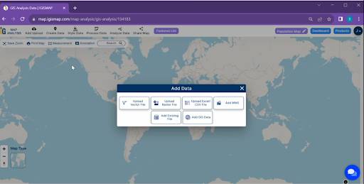
Step.1 Upload Settlement Data:
1.First, upload our settlement data into MAPOG.
2. In the upper toolbar, click on the ‘Upload Data‘ button. Choose your population data file, ensuring it includes relevant information like settlement names and population figures.
3. Click ‘Upload’ and your settlement data is now uploaded into MAPOG.
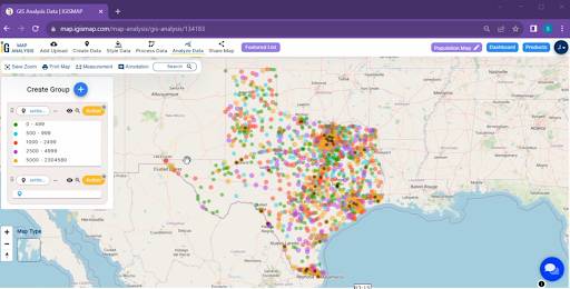
Step.2 Add Population Range-wise Bubbles:
Now, enhance our map by adding population range-wise bubbles. In MAPOG, you can easily visualize population data by customizing the size and color of these bubbles.
1.Click on the “Style Data” button and choose “Bubble style”
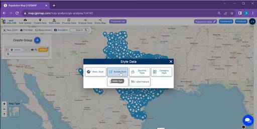
Step.3 Customize Bubble Sizes and Colors:
For a more tailored presentation, customize the bubble sizes and colors. MAPOG provides options to make your map visually engaging and informative.
1.Here choose the “Bubble Circle” option.
2. In the “Bubble Style” tool, you have to select the attribute and click on the “Save Style” button.
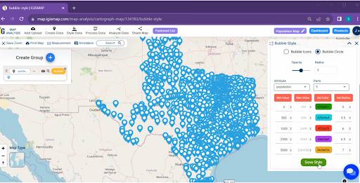
Utilize the MAPOG tools to create a bubble map, assigning population ranges to different-sized bubbles. This step involves linking the dataset to the map and configuring the symbology appropriately.
Step.4 Apply Area Filters (Proximity Analysis with Settlement Types):
To refine our map, apply area filters. MAPOG allows you to filter settlements by town, village, city, or hamlet types. This helps us focus on the areas of interest.
1.Click on the “Analyze Data” option.
2. Here choose the “One Layer”.
3. Select the layer and choose the field and Option.
4. click on the “Get Result‘ Option.
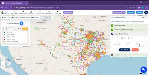
Implement proximity analysis tools to filter the data by settlement types (town, village, city, or hamlet). This step will enhance our understanding of settlement patterns and clustering based on the specific characteristics of each type.
Step.5 Exporting the Map:
Once satisfied with our map, let’s make final adjustments and export it from MAPOG. This exported map can be used in various presentations or reports.
Results and Analysis:
Upon completion of the above steps, the MAPOG will generate a visually compelling population range-wise bubble map for , highlighting settlement types and their spatial distribution. Analyzing the map will reveal insights into population distribution, settlement type prevalence, and potential areas of interest for further investigation.
Findings:
The findings may include identifying densely populated regions, understanding the dispersion of settlements based on town, village, city, or hamlet types, and recognizing any spatial trends that could influence future planning and development.
- Urban Planning: Planners can use the information to identify areas with high population density and specific settlement types, aiding in the development of infrastructure and public services.
- Public Health: Health authorities can leverage the spatial insights to identify regions with higher population concentrations, enabling targeted public health interventions and resource allocation.
- Real Estate Development: The real estate sector can benefit from understanding settlement patterns, guiding property developers in making informed decisions about construction projects and housing developments.
- Telecommunication Planning: Telecommunication companies can optimize network planning by identifying areas with high population density, ensuring efficient coverage and service delivery to meet the communication needs of residents.
In conclusion, MAPOG proves to be an invaluable tool for spatial analysis, and the creation of a population range-wise bubble map coupled with proximity analysis, focusing on settlement types, enhances our understanding of settlement dynamics. The insights gained from this analysis can inform various domains, from urban planning to demographic studies, making it a valuable resource for decision-makers and researchers alike.
Link of the Data:
Explore the data further through our GIS Data product, uncovering valuable information for in-depth analysis and understanding.
Exploring Our Previous Blogs: