Explore the future of farming with our GIS analysis, powered by the user-friendly MAPOG Map Analysis tool, “Farm-to-Store Mapping: Smart Farming with GIS Analysis,” using as a guiding example. This innovative approach links farms and supermarkets, aiding farmers in optimal decision-making. By visually mapping proximity and accessibility, we simplify the complexities, showcasing what becomes a blueprint for connected and efficient farming. Join us on this journey, where simplicity meets transformative agricultural insights.
Key Concept for Farm-to-Store Mapping: Smart Farming with GIS Analysis
In “Farm-to-Store Mapping: Smart Farming with GIS Analysis,” we focus on connecting farms and nearby stores, making decisions easier for farmers. Using as an example, we draw circles around farms and find the closest supermarkets, simplifying the process. Plus, you can check out all the data we used by clicking the link at the end of the article, giving you a closer look at the information supporting our insights. Additionally, we showcase the versatility of GIS analysis in two other contexts: urban planning, where it reshapes transportation futures, and military aerial planning, where it facilitates route optimization through precise calculations and online tools.
Below are the steps to transform our mapping adventure into a reality using the user-friendly MAPOG Map Analysis tool. Think of it as your guide, effortlessly illustrating the proximity of supermarkets to farms . Let’s delve into the straightforward process that makes creating a cool map a breeze.
Step 1: Uploading Data
Begin by effortlessly uploading agriculture and store point data.
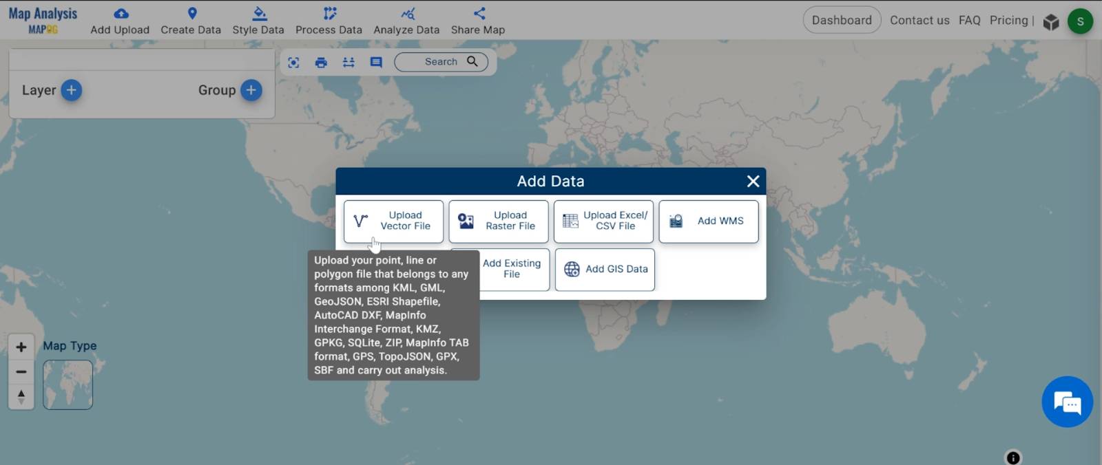
- Click on the “Add Data” button and Choose “Upload Vector File” option.
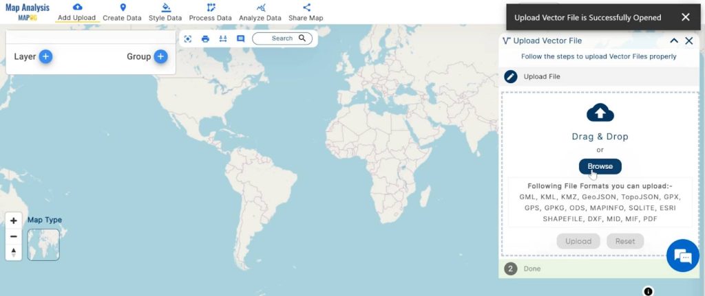
2. You can see the “Upload Vector File” Tool successfully open on the right side of your screen. Here You have to select your Agriculture data. Click on the “Browse” button.
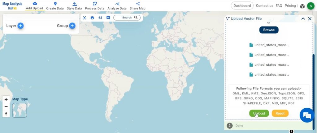
3. Click on the “Upload” button.
Step 2: Rename the Title and the layer
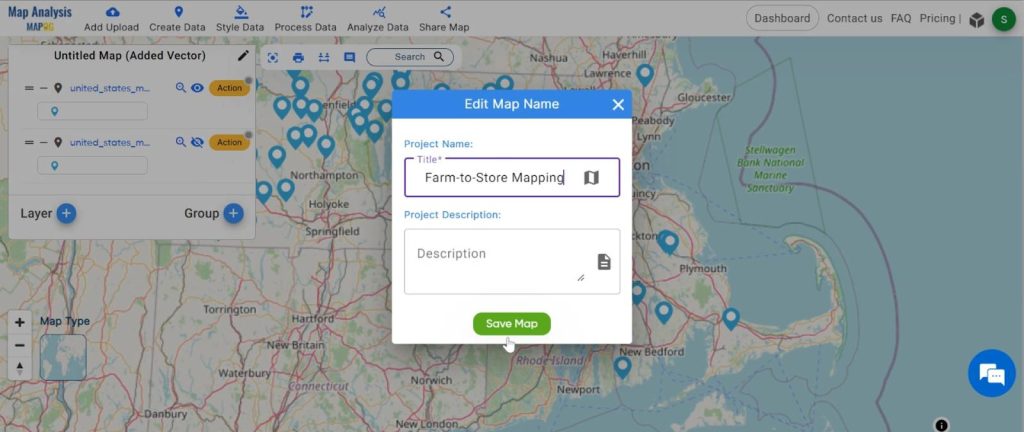
- Click on the rename button on the left side of your untitled map.
Name the untitled map and click on the “Save Map” option.
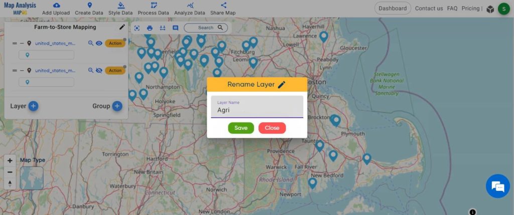
2. Change the layer name for better understanding.
Click on the “Action” button of the layer and then rename the layer.
Step 3: Style Data
Enhance the visual appeal of your data, making it more accessible and understandable.
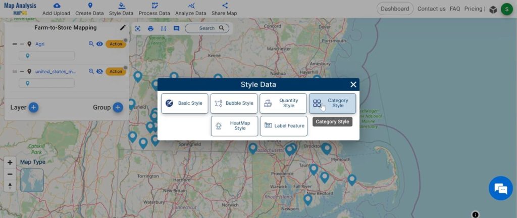
- Click on the “Style Data” button and choose the “Category Style” option.
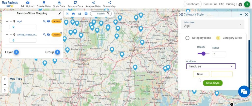
2. Here you have to select the agriculture layer and click on the “category circle” option. change the circle radius now select the attribute “LandUse” and click on the save style button.
Step 4: Proximity Analysis
Filter the data based on supermarket locations in .
- Click on the “Analyze Data” button and You can see the “”Proximity Analysis” Tool successfully open on the right side of your screen.
Here select the “One layer” option.
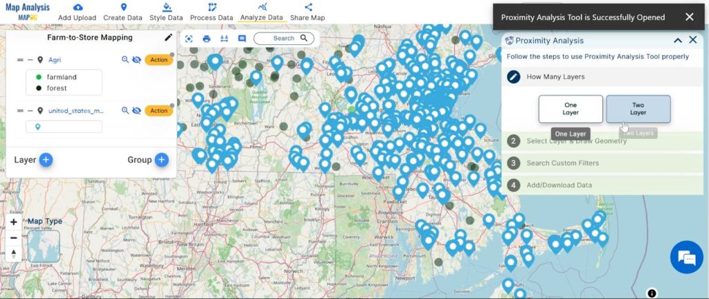
2. Now select the feature store point data and click on the next option.
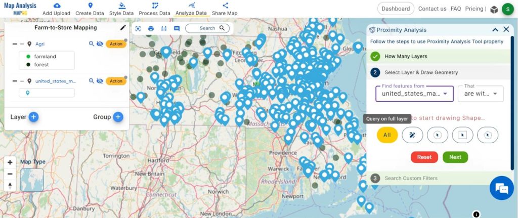
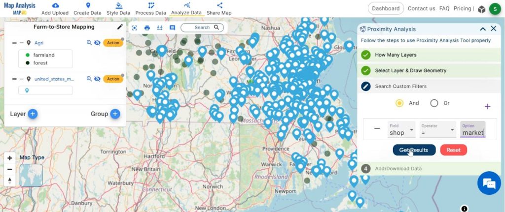
3. Choose the field “Shop” and option “Supermarket” and click on the get result option.
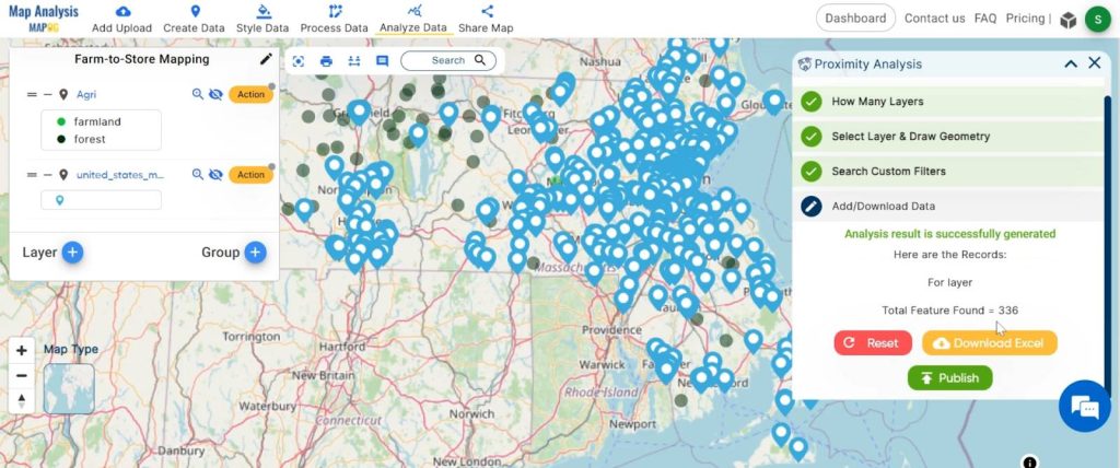
4. We found 336 point data for supermarkets. for visualisation click on the “publish” button.
Step 5: Isochrone:
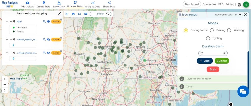
Create 20-minute isochrones around ‘s agriculture points, providing a unique visualisation of accessibility.
- Click on the “Process data” option and choose the “isochrones“.
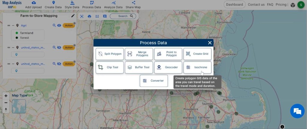
2. You can see the “Isochrones” Tool successfully open on the right side of your screen. Now select the layer. “Agriculture”.
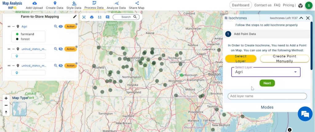
3. The duration is 20 minutes and click on the “Submit” button.
Step 6: Proximity Analysis (Again)
Identify the nearest supermarkets to ‘s agriculture points, refining the connection between farms and stores.
- Click on the “Analyze Data” button and You can see the “Proximity Analysis” Tool successfully open on the right side of your screen.
here select “Two Layers”.
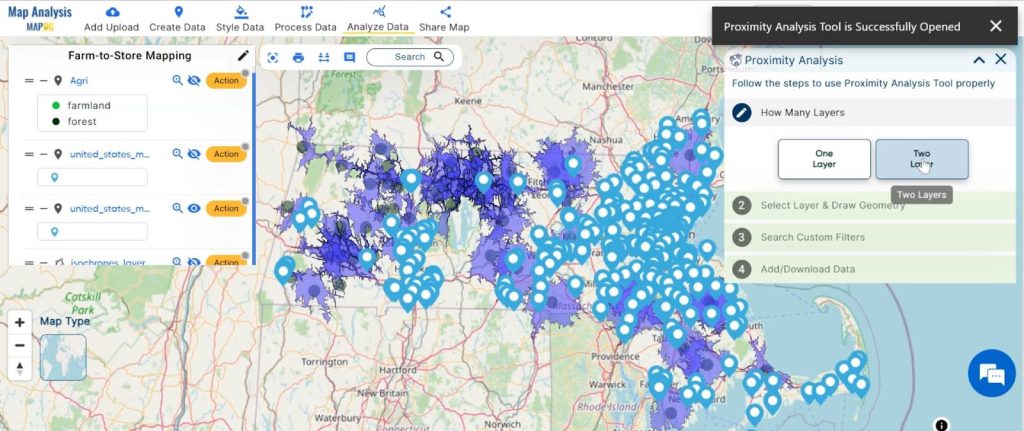
2. Finding feature “Supermarket” data is within the selected feature “Agriculture isochrones” and click on the next option.
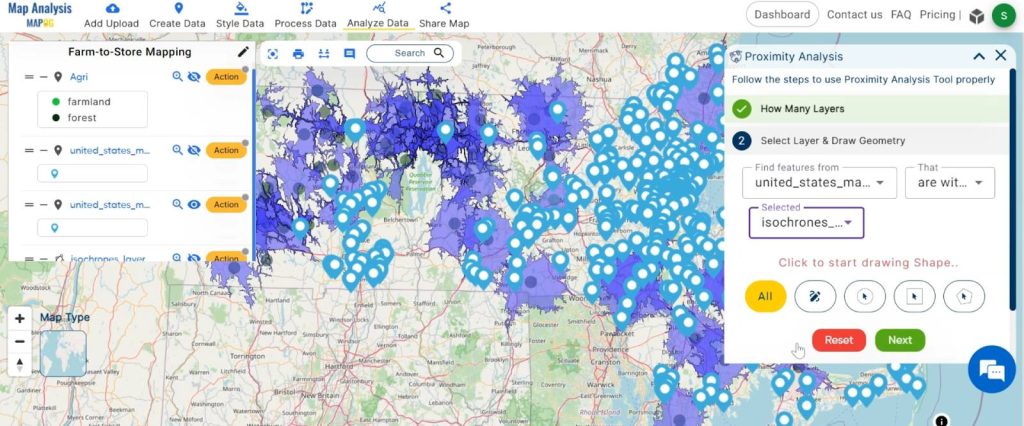
3. Here choose the field and option and click on the “Get Result” option.
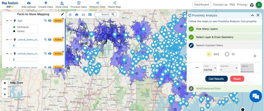
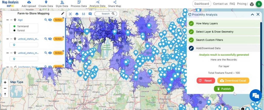
4. We have identified a total of 100 supermarkets located within the 20-minute isochrones. To visualise this data, click the ‘Publish’ button.
Step 7: Basic Style
changes the basic style of the findings data.
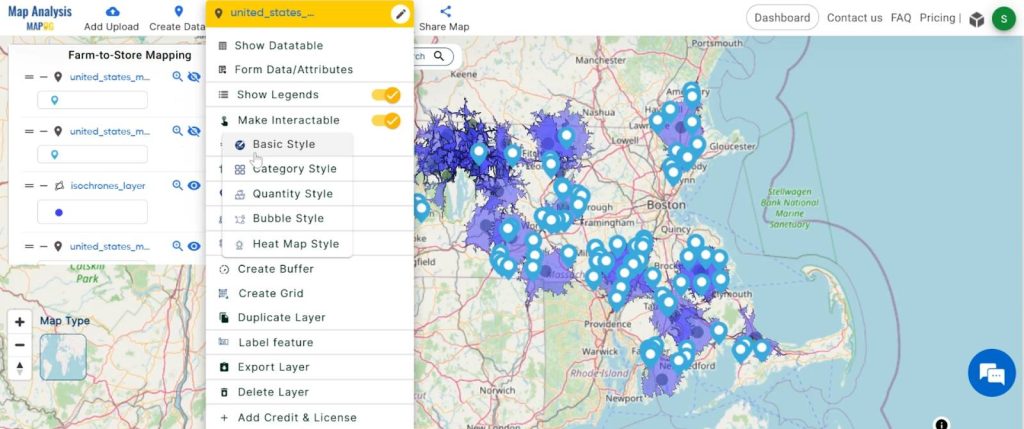
- Click on the “Action” button and choose the “Edit Layer” then “Basic Style”.
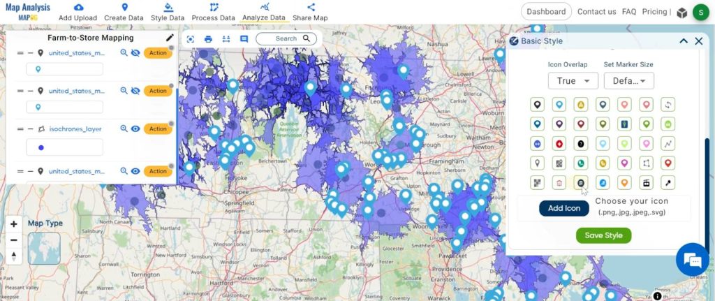
2. You can see the “Basic Style” Tool successfully open on the right side of your screen.
Select the icon and click on the “Save Style” button.
In the agricultural landscape, farmers encounter hurdles in selling their crops due to inefficient connections with nearby supermarkets. This challenge directly impacts productivity and the freshness of produce. To address this issue, our solution utilises the step-by-step process of the MAPOG Map Analysis tool. The result is a powerful GIS-driven solution that empowers farmers to make informed decisions, fostering improved efficiency and connectivity within the agricultural supply chain.
Major Findings:
- Our analysis uncovers a symbiotic partnership between farms and supermarkets, highlighting a mutually advantageous collaboration.
- Deciphering the proximity between farms and supermarkets equips farmers with the knowledge to make informed decisions, optimising their agricultural practices.
- With this newfound understanding, farmers can streamline their operations, enhancing efficiency in planting, harvesting, and distribution processes for a more productive agricultural ecosystem.
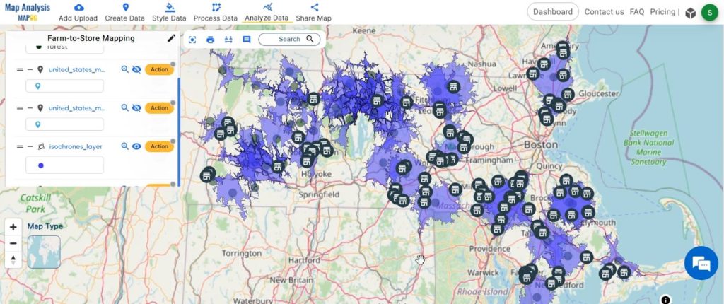
Our GIS analysis transcends the complexities of data, ushering in a more connected and productive farming landscape. By bridging the gap between farms and stores, we pave the way for a sustainable and efficient future in agriculture. The power of geospatial insights is not just in the maps but in the transformative impact they can have on an entire industry. Here’s to smarter farming, where every decision is rooted in data-driven precision!
Link of the Data:
Explore the data further through our GIS Data product, uncovering valuable information for in-depth analysis and understanding.