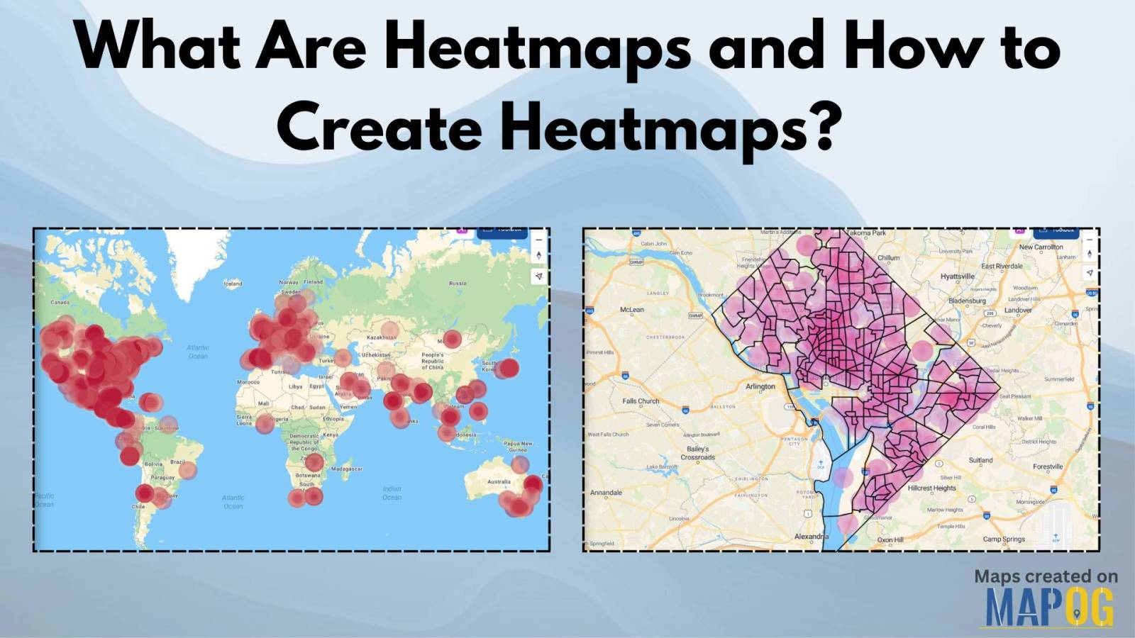
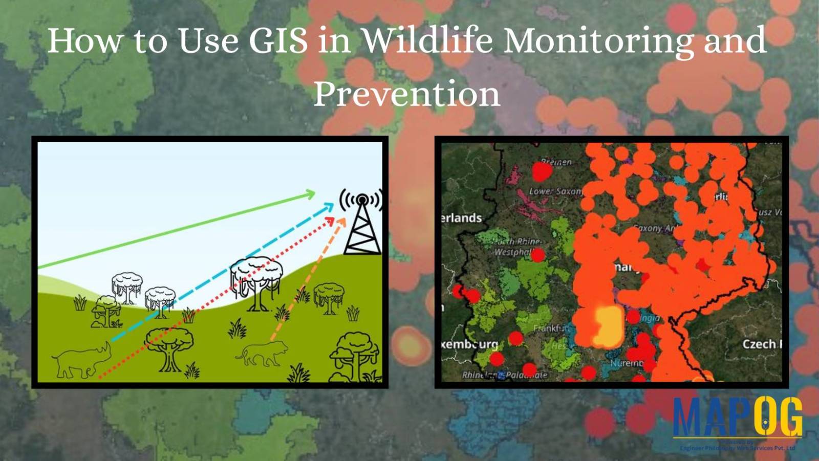
MAPOG

District-Wise Disability Population Analysis Using Heat Maps | Easy Insights & Mapping

Dive into the world of Disability Population Heat Map Analysis, where advanced mapping techniques provide district-wise insights with ease. By leveraging heat maps, we simplify complex data interpretation, offering a clear visual representation of disability distribution. This approach empowers policymakers, urban planners, and organizations to make informed decisions for improved accessibility and resource allocation. Explore … Read more

Mapping Top University Nations A Quantitative Approach

Mapping Top University Nations: A Quantitative Approach

Welcome to our exploration of the world’s top university nations through a quantitative lens. Using MAPOG map analysis, we delve into the geographical distribution of universities globally.  Join us as we uncover insights that inform education policies and international partnerships. KEY CONCEPTS Our goal is to create a world map of countries with the highest … Read more

GIS In Air Quality Monitoring and Pollution Control

GIS plays a crucial role in air quality monitoring and pollution control. It maps sources, tracks emissions, and Identifies Hotspots for better decision-making. GIS supports in Air Quality mapping, Urban Planning, Evaluates Control Measures, and helps reduce key pollutants like PM, NOx, SO2, CO, O3, and VOCs through technology and regulations, promoting sustainability. Key Concept … Read more

Create a Tourist Itinerary Map for the Ultimate Travel Experience

Create a Tourist Itinerary Map for the Ultimate Travel Experience

Planning a trip can be one of the most exciting yet overwhelming tasks. With multiple locations to visit, and routes to plan, having everything in one place can make all the difference. That’s where a tourist itinerary map comes in handy! Instead of juggling multiple travel apps and notes, you can organize your entire trip … Read more

How to Style Maps by Categories or Quantities in MAPOG?

Interactive maps are powerful tools for visualizing data in a way that’s easy to understand and engaging. Style Maps by Categories or Quantities in MAPOG allows you to highlight trends, differences, and relationships effectively. Whether you’re mapping demographic data, business insights, or geographical patterns, the ability to customize styles is crucial for making your data … Read more

How to use GIS for Mapping Disease Affected Area

 Geographic Information System is an emerging field that combines spatial analysis, statistical modeling and data visualization. We can create maps by pinpointing the location of disease outbreak by using a “point to polygon tool” and help us lineate the affected area smoothly and effortlessly. Key concept  Analysis of disease affected areas by using point to … Read more

Isochrone Analysis in GIS: Optimize Travel Times for Faster Delivery & Urban Planning

In the fast-paced world of urban logistics, the ability to understand and optimize travel times is essential for businesses like food and grocery delivery services. One powerful tool in their arsenal is isochrone analysis. Isochrone Analysis: Mapping Travel Times, Let’s explore what isochrones are, how they work, and the significant impact they have on streamlining … Read more

How to Geocode Excel Data and Create an Interactive Map (Step-by-Step Guide)

Have a spreadsheet full of addresses or coordinates and wondering how to plot them on a map? Geocoding Excel data into an interactive map can transform raw location information into valuable insights. Whether for business analysis, logistics, or research, mapping your Excel data helps visualize trends and make data-driven decisions. This guide will walk you … Read more