Ever wondered how to visualize data patterns effectively? Heatmaps are an excellent way to analyze trends, highlight intensities, and make data-driven decisions. Whether for website analytics, business insights, or geographic trends, heatmaps simplify complex datasets into easy-to-understand visuals. The best part? You can create heatmaps for free using tools like MAPOG’s Heat Map Style. Let’s explore what heatmaps are and how you can build them effortlessly.
Key concept
The use of heatmaps presents data patterns by employing color gradients which enables complex information to become simple and understandable. Heatmaps serve various purposes to analyze geographical zones and derive business insights along with statistical representations. MAPOG’s Heat Map Style provides an easy-to-use platform with various capabilities that enables users to prepare visual heat maps while controlling settings and analyzing data trends without complex procedures. Mapmakers benefit from heatmaps because these graphics produce easy-to-understand yet interactive visual explanations which promote clear decision making.
What Is a Heatmap?
A heatmap is a graphical representation of data where values are depicted using varying colors. The intensity of colors represents different data points, making it easier to identify patterns. Heatmaps are widely used for:
- Business insights – Analyzing customer behavior and sales distribution.
- Geographic data visualization – Understanding population density or weather patterns.
Types of Heatmaps
- Geographic Heatmaps – Used for mapping locations and highlighting high-density areas.
- Data Heatmaps – Represent statistical data in a color-coded grid.
Discover how Best GIS Tools for Healthcare Analysis: Enhancing Accessibility & Resource Allocation leverages MAPOG’s Isochrone & Buffer tools to optimize healthcare reach and resource planning—transforming data into actionable insights!
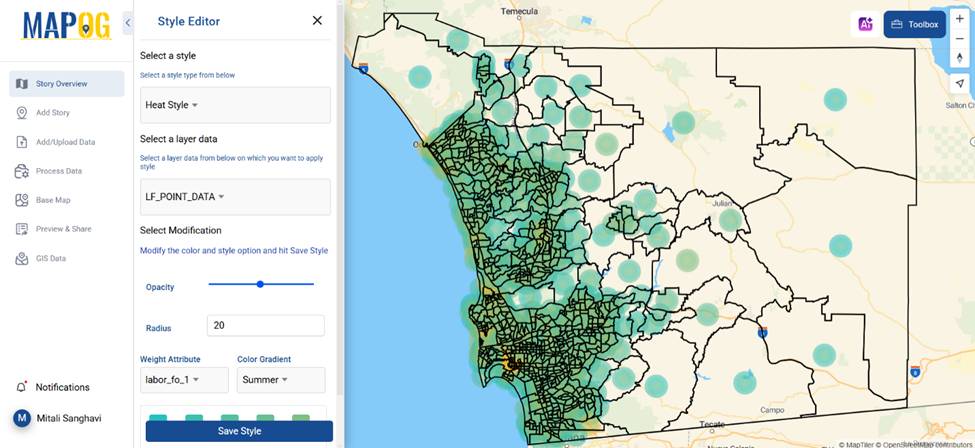
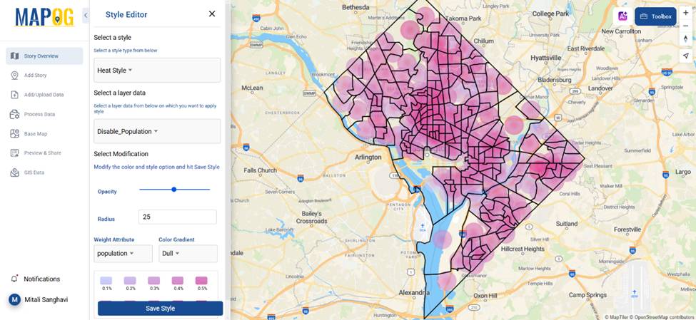
How to Create Heatmaps
Creating a heatmap doesn’t have to be complicated. Platforms like MAPOG offer an intuitive way to generate heatmaps without any cost. Follow these steps to get started:
1. Upload Your Data
MAPOG supports various formats such as CSV or GPS coordinates. With MAPOG, you can upload your location-based data even in point and polygon format and visualize it instantly.
2. Customize the Heatmap
Enhance your heatmap by:
- Go to the action button of the recently uploaded data and select “Style Editor” option from there.
- Filtering data for better insights. Select the “Heat map style” from the various options available there.
- Choose the proper weight attribute and Switch between different color gradient and opacity for clarity.
- When satisfied, save the style.
3. Analyze and Share
Once your heatmap is ready, use it for decision-making, share it with your team, or embed it in reports.
Easily Geocode Excel Data and Create an Interactive Map using MAPOG’s powerful tool—just upload your file, convert addresses to coordinates, and visualise insights effortlessly on a dynamic map! Try it now to transform raw data into actionable geospatial stories.
Why Use MAPOG’s Heat Map Style?
MAPOG provides an easy way to create heatmaps with interactive features. Whether mapping customer hotspots, temperature variations, or urban growth, MAPOG simplifies the process. With its user-friendly interface, anyone can create heatmaps for free without technical expertise.
Final Thoughts
Heatmaps transform raw data into actionable insights. If you’re looking for a free and easy way to create heatmaps, MAPOG’s Heat Map Style is worth exploring. Try it out and see how it enhances your data visualization!
Have you used heatmaps before? Share your experiences in the comments below!
Here are some other blogs you might be interested in
- Protecting Wetlands: Guide to Create GIS Map for Nature
- Mapping Tiger Attack Hotspots – Create an Online Map and Share
- Make Routes for Military Aerial Planning- Through Bearing angle and Distance calculation – Online Route Compass
- Mapping Healthcare Efficiency: GIS Buffer Analysis of Hospital Locations
- Add WMS- Two step online view of WMS layer on a map
- Plot ATM locations on a map and embed on your website
- Map habitat locations of endangered animals & keep track of their living